Portraits of Sarah

Private Joker

TPF Noob!
Joined
Jun 3, 2010
Messages
46
Reaction score
1
Location
Reno, NV
Website
www.flickr.com
Can others edit my Photos
Photos NOT OK to edit
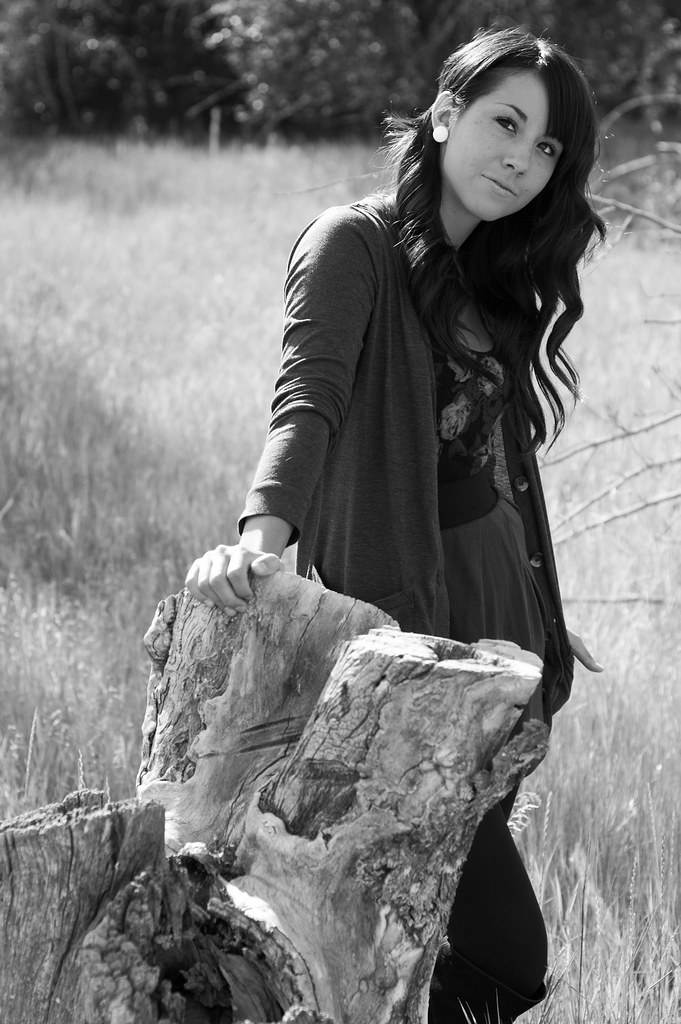
Hey everyone! I took some photos of my friend Sarah today, just for fun. I hadn't shot in a while and was dying to get something done. Let me know what you think!

Thanks,
Cody

4940491390_66e570811f_b.jpg

Sarah. | Flickr - Photo Sharing!


4940489638_b07aa76a25_b.jpg

Untitled | Flickr - Photo Sharing!

4939902175_a664f02438_b.jpg

Untitled | Flickr - Photo Sharing!

4940486552_26a09dac9a_b.jpg

Untitled | Flickr - Photo Sharing!

4939900433_4e0021d5ff_b.jpg

Untitled | Flickr - Photo Sharing!
 
Last edited:
1. I cant help but to be bothered by the huge amount of overexposed space on the right of your subject.
2.Theres a strip of light or something going *through* your subject.....
3. Amazing shot!!!!! ( favorite out of the post)
4. Great shot! well done.
5. Eh... cant quite put my finger on it.. maybe its her big white spot of an earing or the tree stump... just not feeling this shot.
 
Thanks for the feedback, PerfectlyFlawed!

According to my histogram in lightroom, none of the negative space in photo #1 is actually overexposed. I've edited the curves in PS and neither the blacks or whites blow out. It does seem quite bright though, I agree. The lens flare in photo #2 was unintentional, but I enjoy the flaw. I'm suppose I'm a little strange in that regard :].
 
#3 for the win! nice lighting, focus, and composition. I might clone out that one pink spot in the background though.
 
agree with number 3 the clear winner, also agree it might be improved by removing that pink spot, it is kinda distracting, but good job overall
 
#1. I like it, Im a big fan of bokeh, and I like the the blurry bricks.
#2 I'm not a huge fan, Maybe the space above her head, and the deadly sun flare going through her is annoying me.
#3 The photo is no longer available.
#4 I like what you did with the foreground, I wish she was a little closer and the back ground was a little more blurry.
#5 I like the pose,and the B&W looks nice!
 
Thanks GotaLuvThosPens and kiwiluke! Haha, to be honest, I hadn't even noticed the pink spot before. It's been removed and I updated the photo. It really does help to have some other eyes check these out; reminds me why I joined this forum in the first place.
 
#1. I like it, Im a big fan of bokeh, and I like the the blurry bricks.
#2 I'm not a huge fan, Maybe the space above her head, and the deadly sun flare going through her is annoying me.
#3 The photo is no longer available.
#4 I like what you did with the foreground, I wish she was a little closer and the back ground was a little more blurry.
#5 I like the pose,and the B&W looks nice!
Sorry Stephen.C! I just replaced the photo a moment ago. I hope you have another look.
 
There we go!
Shes very sharp, I like the pose, and bokeh bokeh bokeh hooray!!
#3 and #5 are my favorite!
EDIT: #3 whats the EXIF data?
 
Last edited:
Thanks GotaLuvThosPens and kiwiluke! Haha, to be honest, I hadn't even noticed the pink spot before. It's been removed and I updated the photo. It really does help to have some other eyes check these out; reminds me why I joined this forum in the first place.

much better, nothing to distract from the model now :D
 
my favourite it's the #3 for the focus and the colours, and the #5 for the composition
 
I like, but maybe because it reminds me of my own work, lol.

Great images for a portfolio, or even better as Senior Pictures.

However I wonder if some more editing could help these? A slight vignetting could eliminate the feeling that these images go on forever.
 
I like, but maybe because it reminds me of my own work, lol.

Great images for a portfolio, or even better as Senior Pictures.

However I wonder if some more editing could help these? A slight vignetting could eliminate the feeling that these images go on forever.

Thank you for the kind words, RM! I like that... I definitely don't play around with vignetting enough, and that might be just what the first one really needs.
 

Most reactions

Back
Top