Pre-Dinner Cheese? (BESP)

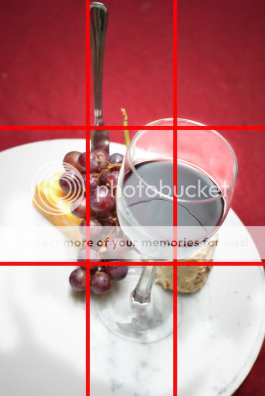
I feel the third one is strongest, so that is the one I will critique.

The knife competes with the glass in height, I'd adjust the angle or lose it completely.

The glass is dirty, doesn't help me want to drink it and loses the possibility of I think what could be the best part of the photo: the reflections and light bouncing around the inside top of the glass.

the background is distracting since the vertical lines take away from the vertical line of the glass. and also since there is so much good stuff that could be going on with the grapes and cheese it'd be nice to have a simple background and really get in close (I think this would help nail the 3 of 4 intersections of the ROT too).

Overall, nice work, I can tell you put thought and effort into this.
 
These are real newb shots.

What's BESP?

Good observation!

BESP stands for: "Bitter's School of Photography"

So where ever you see (BESP) you'll see newb photos - or at least people who are trying to grow in their photography skills.

If you'd like to add some constructive criticism and comments, maybe even encouragement where you see fit. We'd love for you to post on the (BESP) threads.

Peace
Fast Eddie
 
I have to say whether in color or b&w I really like the angle. I’m not sure if its my monitors but the marble setting seems very bright to me and there is a bit of a distraction in the reflection of the glass. I wonder how it would differ if you tried it with a Polarized filter? May be bit blue so you might have to dial in the temp but it may help with the reflective surfaces in the shot. I wish you had used a bit smaller aperture, the DoF is a bit shallow. I know the subject is the glass and it does well to isolate it, but inevitably my eye is drawn to the grapes and utensil and I kind of wish it were in focus more. The bottom left is a bit empty and has a shadow I believe perhaps try a tighter crop and instead leave some room top-right instead -- just a smidge bothered by the cutoff of the marble (tray?) on the right side I think. Also with the empty space on the outsides of the image the vignette in #1 works :)

Disclaimer – C&C given without reading any previous comments in the thread, per the instructions of the group; redundant comments possible and probable.


yeah i actually had a polarizing filter on im not sure what happened there
 
You should have picked #3....that is the one that I liked!.

Ok, under the assumption you picked 2 I'll provide my feedback for that shot.

The composition from that angle doesn't fill the thirds as requested by bitter. It looks to me that all the participants in the photo are too close. In fact, the cup is hiding some of the food there.

For me the shot is a bit overexposed; the reason why I am saying that is the colors of the wine and the grapes don't look real, they are pale.

I like you tried a new angle for the shot. I think those unusual angles grab the attention easily.
 
These are real newb shots.

What's BESP?

Good observation!

BESP stands for: "Bitter's School of Photography"

So where ever you see (BESP) you'll see newb photos - or at least people who are trying to grow in their photography skills.

If you'd like to add some constructive criticism and comments, maybe even encouragement where you see fit. We'd love for you to post on the (BESP) threads.

Peace
Fast Eddie

It was sarcasm.

Sorry, don't know you well enough to get your sarcasm. Now I know you can be a smart ass like me.

Just trying to have the back of a "schoolmate".

Peace
Fast Eddie
 
I could've sworn that I C&C'd this last night. :confused:

I'm really not fond of the B&W, so I'll move on to the color version. To me, the glass looks more like it has a scoop of ice cream in the bottom with a chocolate layer on top than a glass of wine. Although there is an interesting play with the red hues, it does not hold my interest and the pale pink color through the top of the glass actually makes it look rather dirty. I'm trying to find your focal point and it is not easy to locate.

The lower elements seem awfully packed in and the cheeseball (?) to the right is a little shy. I'm not sure if the plate is poorly marbled or if overhead elements are at play, but the crockery is not very appealing to me. Also by cutting off the edge of the plate on the right really breaks up the nice gentle dueling curves with the wine glass. The random green grapevine sticking up out of no where is really a ball buster.

The top of the image is cropped too tight and does not leave any room to linger. In fact, I don't think the cheese knife really contributes much to the scene, as is. I'm not saying this is a bad image, just a few tings I see.

As far as hitting 3 out of the 4 intersect points....
ibatsP1.jpg


Thanks for sharing.​
 
I like the idea, and your setting and accessories are fitting to the main subject, but in the top down view everything seems too bunched up into the center. There's a lot of empty space around the outside of the photo.

The second angle has too much space to the top, and I think it would be better off if ou just cropped the top off to make it a landscape orientation shot. That would also better meet the 3 ROT points I think.

The only other nit I have is the marble base looks a little overexposed/"blown out" in the first angle, because I don't see any detail in the stone, but I know it's there because I see it in the second angle.

It does make me want some cheese and wine.

Sorry if anything is a duplication, I haven't read the other c&c yet
 

Most reactions

Back
Top