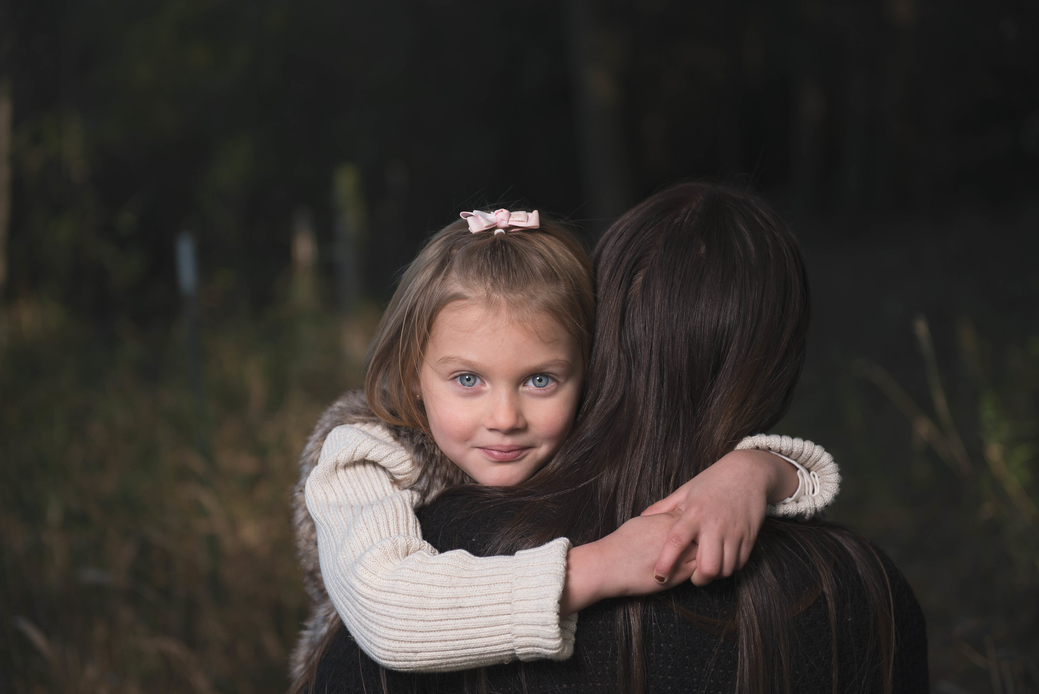
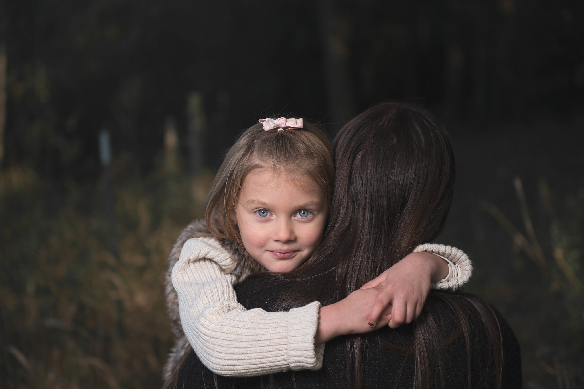
Well you seem pretty comfortable.
I like to look at the full size pictures so I can isolate the face from the surrounding color.
I also like to try first to get the whites of the eye to be a nice close to neutral milky white.
In this situation, her skin looked a bit blue to me so I tried adding some yellow in the mid-tones and the highlights.
The bluish eyes faded nicely.
Then I added a bit of red saturation to make her look a little more rosy.
If this was fill flash it may have been a bit too bright and too much on axis because it looks a tiny bit flat.
All that being said, I think it is just a gorgeous shot.
Full size it is wonderfully sharp and clear and nice.
Helped of course by her beautiful symmetrical face, essentially perfect skin (if you retouched that, bravo) and the totally great arrangement of the people.
I don't think that wide crop does the picture justice. It doesn't seem to add and does minimize the balance of the pose.
Your arrangement of people is so right on that you could crop much closer, still understand teh background and set off the beautiful arrangement of limbs and people. (and I brought down the brightness of the barette on top of her head.)
As you can tell I am a fan of this shot.
View attachment 110412


![[No title]](/data/xfmg/thumbnail/39/39420-c7c6e6f01cdeeceeb81ee717b24dd629.jpg?1734173503)
![[No title]](/data/xfmg/thumbnail/37/37170-3e18af574ed51cce5bdf99af9d3cab40.jpg?1734169892)


![[No title]](/data/xfmg/thumbnail/35/35869-2e4166624c383d0d2dec81e5b0f6e5dd.jpg?1734167593)