Professional Portraits for a brochure

Reverend

TPF Noob!
Joined
Jun 1, 2006
Messages
150
Reaction score
0
Location
St. Louis
Website
www.alsphoto.com
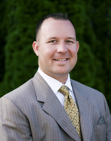
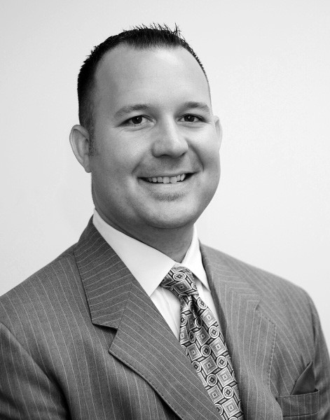
This is my first attempt at "Professional" portrait photography. The subject here is a Financial Services representative sales manager, and wanted pictures taken for a couple of brochures that he'll be putting together. One of the photos will be published to the company website as part of his bio.

I don't have a good backdrop for this sort of thing, so I had to make do with an empty office and some outdoor landscaping. I need to mention that his suit and tie patterns are just too busy, but that's what he chose to wear.

We're going for friendly and approachable here. Tell me what you guys think, what you might change, or have done differently.


IMG_5284.sized.jpg


He really likes this one for a brochure, maybe in B&W. I don't agree, but he can use them any way he wants.

IMG_5284_1.sized.jpg
 
move the subject away from the backgrounds. indoor exposures are bad.
 
I agree about the suit.

For the outdoor ones, it looks like you used on-camera flash at full power, which robbed you of one of the benefits of shooting outdoors. He's lit mostly by harsh direct light that overpowers the natural light. I personally think on-camera flash should only be used to fill in shadows when in direct sunlight (by setting it's power lower than full) or if you just want a snapshot. It also looks like the shrubs are trying to eat him. :p 
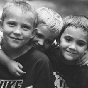
Positioning him further from them and using an aperture of around 5.6 or less would keep him in focus and help blur out the background.

The indoor shots are lit by unflattering overhead lights. On-camera fill flash would have helped here, but having him sit near a window would be best. Try that with a wide aperture.

The last one is a hoot!
 
In the first one, if you would have converted using the channel mixer, and change to b/w through the red, green, or blue channel, you could get a much better conversion. The last one in the first thread, he looks dead lol..his skin tone is completely washed out and there is a blue hue over his face. Adjusting the original's curves would do a lot for the phone. I also agree that he is too close to the tree background..moving him away from it a little to give some depth would really enhance this photo as well as asking him to wear a darker suit lol.
 
All of these shots were with the Canon 50mm 1.8 prime lens and a Sigma flash which is always set on auto, since I don't know WTF I'm doing with it.

I'm going to ask him if he can try it again with me tomorrow, and I'll try to put some of your suggestions to use. Let me see if I have the gist of the suggestions:

1.) Move the subject away from the background, open the lens, create DOF

2.) Move the Flash somewhere other than directly at him (maybe upward?) so that his face doesn't wash out.

3.) Try a shot near a window for the indoor one.

4.) Make him wear a darker suit, sans-patterns

5.) convert to b/w using a channel mixer vs a simple desaturate.

Thanks!! I'll post the next session, and we'll see if I've improved from my lessons. :)
 
Hi, I trust you didn't mind me "fiddling" with you second image. Your redo of that image is worse than the first one.
[1] Don't shoot staright up in this situation, it's boring.
[2] As previously mentioned, get subject further from background
[3] less confusing background needed.
[4] Flash overpowers available light.

IMG_5260_copy.jpg


Could comment further, but have to do a shoot myself.

www.philipweirphotography.com
 
ok, well what I have to work with is:

a.) ferns
b.) white walls.

That's it. I'm not ready to get a whole backdrop rig just for my salary job, unless my boss pays for it, and I doubt I'd use it that often otherwise.

Also, this is for his professional brochure. Its just supposed to be a "Sears Portrait Studio" kind of pic to slap on a boring cookie cutter brochure that talks about IRA's, Mutual Funds, and Life Insurance. I'm not trying to do anything cutting edge. Just make some mediocre portraits with VERY limited resources.

I'll try again and report back.
 
Reverend said:
I'm not ready to get a whole backdrop rig just for my salary job, unless my boss pays for it, and I doubt I'd use it that often otherwise.
You don't need to buy a thing. Have your subject take 1 or 2 steps AWAY from the ferns and/or white walls (towards you and then you also take a few steps back) and open that aperature up to completely put the background out of focus.

Michael.............
 
I definetly agree with the comments... a wider aperture would give you great DOF and put your subject in focus... the 50 1.8 should easily supply that along with a crisp image! Shoot outdoors, and... get creative, I have gone and gotten white posterboard at a craft store and used that bounce sunlight or even a flash... it can produce more natural fill, and is cheap! You will need someone to hold them up for you tho. Open sky might make a good background, if it's available. If you go with ferns, keep them out of focus, and in the background... Green could be a good choice if it doesn't compete with the rest of the image, like the shot above... it's a very calming assuring color phsycologically, and it's the color of money!
 
OK, I've redone the shoot. Same locations, with some minor changes.

Let me know if these are any improvement over the last batch.

In these, I brought the subject out from the background by about 4 or 5 feet, opened the lens, and pointed the on-camera flash straight upward & back, so it was just fill light.
IMG_5295.sized.jpg


B&W version
IMG_5295_BW.sized.jpg


I think the colors look better in this one.
IMG_5296.sized.jpg


On this one, I opened up the windows to let in more natural light, and bounced the flash off the wall behind me. These colors still look funny to me. :meh:
IMG_5310.sized.jpg


B&W version -- I'm really happy with the way this one looks. Converted by just changing the mode to grayscale.
IMG_5310_BW.sized.jpg
 
Much better! Nice jorb. The outdoor ones look a little soft. Did you open up the aperture all the way? f1.8 gives a very shallow DOF. If you go that far, you have to make sure that the focus is perfect on the eye, and even then his whole head may not fall into focus. Something like 2.8 or 3.5 would be easier. You might be able to get away with a little sharpening, though. The second one is definitely better.

Do you mind if I play with these a little? I can show you some ideas as far as contrast and such goes.
 
The new ones look much better to me. Good job.
 
Thank G-d for RAW files. I was told, and thought myself, that the outdoor pics looked a little flat, so I played with them a little. Here are the updated versions:

Dropped the exposure, and bumped the shadows just a hair. I think it helped the coloration of his skin a little bit.
IMG_5295_v2.sized.jpg


IMG_5295_BW_v2.sized.jpg


Dropped the exposure a little bit to create more shadows. It really helped the B&W, and I just left the curves alone.
IMG_5310_v2.sized.jpg


IMG_5310_bw_v2.sized.jpg


markc, sure, you can play with them as much as you like. Just make sure you tell me what adjustments you made, so that I can learn from it. :thumbup:
 
Here's what I came up with. I've included a link to the PSD files so you can see the adjustements I made. I did everything in layers.

IMG_5295_v2.sized-mod.jpg

http://www.photogs.net/tpf/IMG_5295_v2.sized-mod.psd

IMG_5310_v2.sized-mod.jpg

http://www.photogs.net/tpf/IMG_5310_v2.sized-mod.psd

I personally wouldn't use the second image. The overhead light is still too strong compared to the other lights, and shows up as a shine on his forehead and the way the light falls in general. I didn't spend too much time on that one.

For the first one, I used masked layers so that I could adjust his face separate from the background. It needed a different curve adjustment and more red taken out in the color adjustment. I copied the background layer and cloned out the two blue spots on the right, and then sharpened the whole thing. I went back with the eraser and erased the sharpening on the skin of his face, leaving the eyes and mouth sharp.

Let me know if you can't open the files and I'll post screenshots of the layers.
 

Most reactions

New Topics

Back
Top