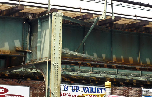
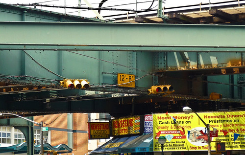
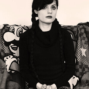
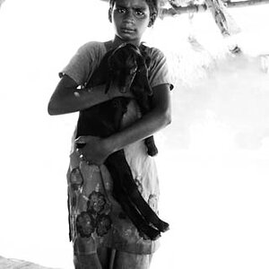
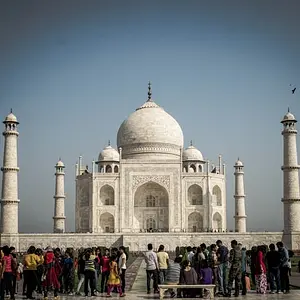
The first two are way to busy and do not do anything for me. I do like the colors in the 2nd one though and a better composition with a clear subject probably would have come up pretty nice.
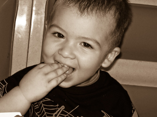
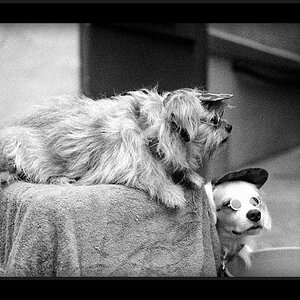
The third one is okay exposure-wise, but that light on the left bothers me. Also, composition is lacking here. You cut off the top of the head, which is fine in certain cases where you want to have a close-up of the face, but not here.
Also, the lines in the background all tilt to the right and adding the fact that the subject's head is also tilted to the right drives me a bit crazy. You could try to rotate it, but I think that'll just take off even more of the head, which should not be done.
All in all, decent exposure but composition needs a bit more work.



![[No title]](/data/xfmg/thumbnail/36/36666-189f65b1addbb68da2a43dc6f7206a01.jpg?1734169172)
![[No title]](/data/xfmg/thumbnail/42/42484-fe2beb05d743deaf21681664722538d4.jpg?1734177008)


![[No title]](/data/xfmg/thumbnail/37/37612-989c0c475619355f32a5941a187cfa74.jpg?1734170738)
![[No title]](/data/xfmg/thumbnail/36/36662-242aa39f5cb3a23494857864779f669b.jpg?1734169171)
![[No title]](/data/xfmg/thumbnail/33/33339-c5b461af62b32f6b6529f1b334d818ba.jpg?1734163231)