Random C&C

mommy22

TPF Noob!
Joined
Dec 13, 2009
Messages
191
Reaction score
0
Location
Oregon
Can others edit my Photos
Photos OK to edit
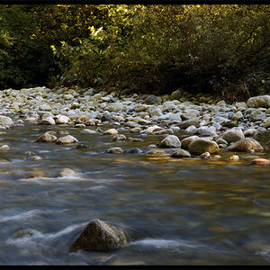
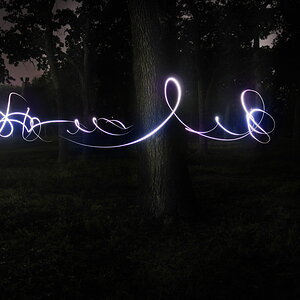
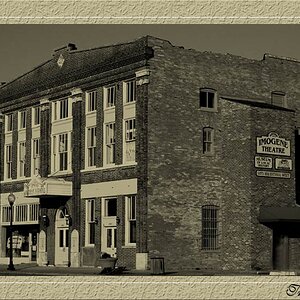
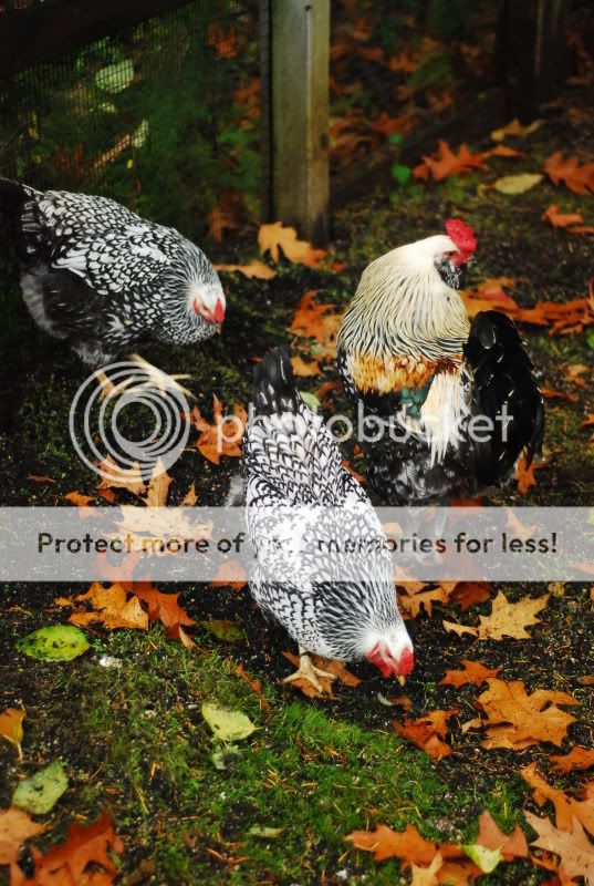
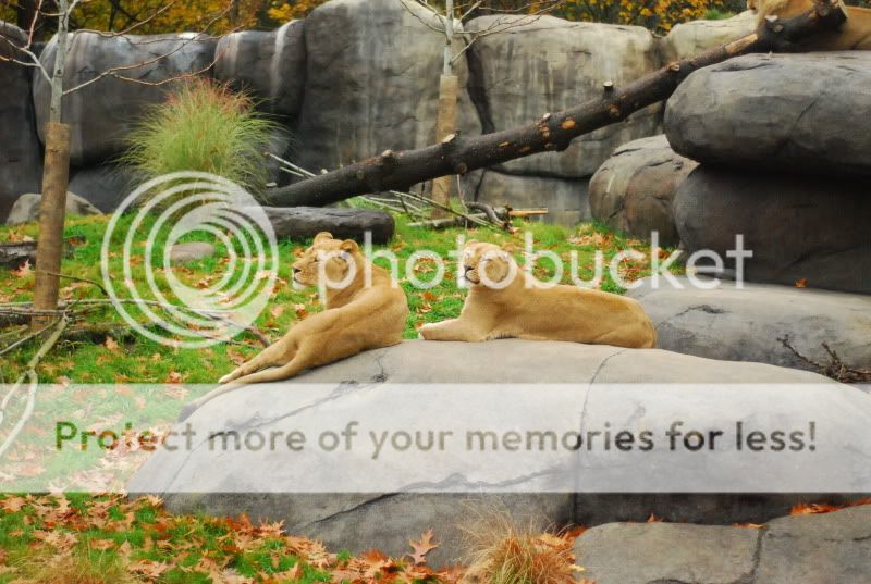
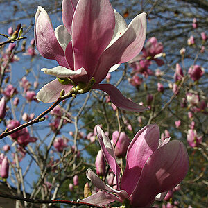
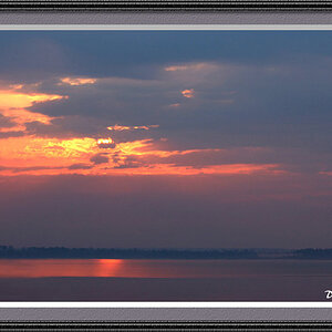
So these are some pics that I like and I wanted some good opinions on them. The first 3 were done a few years ago with a little point and shoot. Death Valley and Sunset over San Joaquin Valley. The latter 2 were at our local zoo and done with my D80, 50mm 1.4. Be brutal, I am trying to get better.

Thanks, Khristina

MudinDeathValey2-1.jpg


MudinDeathValley.jpg


SanJoaquinValley-1.jpg


chickens.jpg


lionesses.jpg
 
The only one I somewhat like is the third with the sunset. But to go in CC order:

1- the horizon is not level, the sky is blown out, the sun is very evident, there is too much blurry in the foreground which makes the image feel really in your face. Lack of contrast.
Maybe look at cropping out some sky and some foreground, adding in some contrast or work with Levels / Curves ajustements, and throw it in black and white.

2- Ok...no. I can see going with the abstract lines in there, so good job in trying to see something with a different eye. But the image comes off as flat. You can do straight on pictures of things but you need something that still attracts the eye like a really obvious line or some great texture. Seems under exposed as well.
All just my opinion though.

3- Nice silhouette here. Composition might of been improved by being a bit closer in on the cross and having it a bit more to the left. Love the sun.

4- When shooting animals or children, get down to their level! Standing straight up and shooting straight on are often things that people do with P&S cameras. Explore different angles to shoot things that are lower than you. Get in closer on your subjects as well.

5- Nice exposure on the lions and an interesting composition. I would of preferred being closer in on the action though to really make the lions your main focus of the image and not just a scene that has lions in it. Those faces look too precious and cute to be from far out.
 
Thanks! I want to go back to Death Valley with my D80 at some point and try to "retake" some photos that could have come out alot better. Next time I go to the zoo I will bring my zoom instead of just my 50mm that way I can get some up close pics.
 
bigtwinky already made some great points, very well done.

Only thing I would add is on number 5 with the lions. I agree zoom in would be better (if possible with your equipment). But also, give the animals space to look into. When animals, people, etc. are looking in a given direction I like to give them some space in the direction they are staring (same for vehicles, action, etc. Some place to go). Briefly mentioned here under 'Lead Room'. It's just a guide, that isn't the only way to compose images, sometimes centered will look better or convey a different message.

How long have you had the D80? That's a nice camera.
 
I agree with twinky's assessment as well.

I like the vibrant colors in the chicken shot, but beside that, it doesn't portray any emotion or communicate anything to me. Wide shots of chickens feeding is fairly dull.
 
I have had the D80 for about 2 years now and am still learning new things about it.
 
I suppose your'e right about the chickens lol...
 
I think the one with the sun and cross is interesting but I agree with bigtwinky (nice name btw) in that the cross should be more to the left of the frame and I would've like to see just a little more space between the sun and cross.

The lions is a nice shot. I do agree that there should be more background to the left of the frame and I think more up from the top would be nice too. There is a third lion at the top right of this picture that is not wholly distracting (not sure if anybody else even saw it, so probably not distracting at all) but I would cut it out of the frame from the right and only leave a small portion of the rocks on the right. I really like that the background is not to indistinguishable because I really like the log.

I say to get more of the frame up from the top rather than crop it from the top because even though the rock wall looks very unrealistic, cropping it would make it even more so. And the trees behind these rocks give more credence to their realism.

Just my opinion though. :mrgreen:
 

Most reactions

Back
Top