What's new

Rebecca C.

e.rose

Been spending a lot of time on here!
Joined
Jan 27, 2011
Messages
4,789
Reaction score
1,985
Location
Nashville, Tn
Can others edit my Photos
Photos NOT OK to edit
1.
_U5A2158.webp

2.
_U5A2229 copy.webp

3.
_U5A2253.webp

4.
_U5A2286.webp

5.
_U5A2307.webp

6.
_U5A2315.webp

7.
_U5A2327.webp

8.
_U5A2351.webp
 
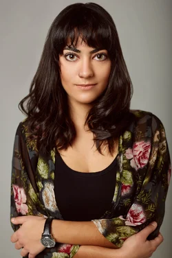
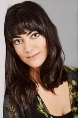
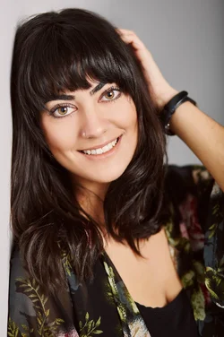
Oh God, I want to photograph her. She has the most amazing eyes and jaw line :lovey:

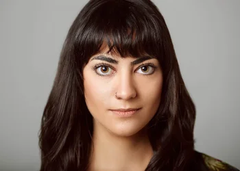
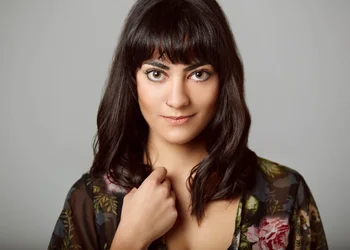
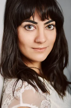
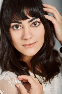
Your processing in these is pretty much spot on. I might be tempted to reduce the opacity of the frequency separation by about 5 points - 10 points to get back some of the original contours in her skin, but even if you didn't, it certainly doesn't have a negative effect on the images. The lines and edges in these are so crisp and solid - I could stare at them for hours!

Her fringe and having her hair down frame her face beautifully.

The only thing I would definitely suggest you address is the particularly prominent capillary in her left (frame right) eye. Her eyes are so big and beautiful that it's quite noticeable.

#4 is making me melt.

My God I want to photograph her! :heartpump:
 
Last edited:
The Catch Lights in 1, 3, and 4 really bother me.. I cant get over how one falls inside her pupil and the other intersects the iris and pupil. Its especially bothersome when the eyes are most defiantly the dominant aspect of the models features.

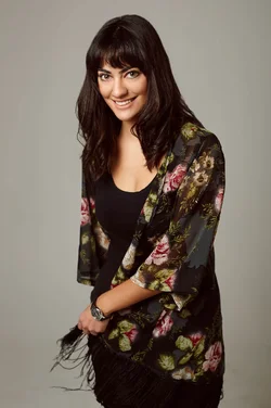
That being said.. 2 and 5-8 are really great. Definitely keepers. 2 and 8 are my favorites!!
 
Thanks for all of your feedback!!! :)
 
I really like the lighting on these. partly because its the same type of lighting I prefer to use, and partly because it really suits the subject well.

what i personally would have liked to have seen on these is a little more DOF.
especially on a shot like #6, where her right side and face are in focus, but the left side of her body, chest, and left arm are OOF. (and to a lesser degree in #5)
I think I would have preferred more of her hair in focus on the rest of them as well.

overall, it is a nice set.
 
I really like the lighting on these. partly because its the same type of lighting I prefer to use, and partly because it really suits the subject well.

what i personally would have liked to have seen on these is a little more DOF.
especially on a shot like #6, where her right side and face are in focus, but the left side of her body, chest, and left arm are OOF. (and to a lesser degree in #5)
I think I would have preferred more of her hair in focus on the rest of them as well.

overall, it is a nice set.

Thank for your feedback :)
 
Not much on #3; #6 is def a fave, followed by #7.

And #2.
 
It must have been dark in there. Her eyes are really dialated. I like it.
 
Wow, she's purdy!

I like the light and processing in all of these. The only images that I don't feel work as well as the rest are 1 and 8. The reason being is that in the first she feels quite rigid and nervous/awkward. Even if it's not reflected in her face, her body language communicates it. If this was from the beginning of the shoot, then you could understand it as she's still got to relax and get more into the flow of things.

Number 8 feels a bit too posed/staged, which in a shoot like this, I don't think she needs to do. The rest you have a much more organic feeling to. Compare the hand in 8 to 6 and it's worlds apart.

I'd also up the ambient light/modelling light to close the iris down more so you get less of the pupil. Other than that, really great stuff! :)
 
Last edited:
Wow, she's purdy!

I like the light and processing in all of these. The only images that I don't feel work as well as the rest are 1 and 8. The reason being is that in the first she feels quite rigid and nervous/awkward. Even if it's not reflected in her face, her body language communicates it. If this was from the beginning of the shoot, then you could understand it as she's still got to relax and get more into the flow of things.

Number 8 feels a bit too posed/staged, which in a shoot like this, I don't think she needs to do. The rest you have a much more organic feeling to. Compare the hand in 8 to 6 and it's worlds apart.

I'd also up the ambient light/modelling light to close the iris down more so you get less of the pupil. Other than that, really great stuff! :)

Thanks for your feedback!! :)
 
Always like your processing. Didn't you post a tutorial you made about it? I'd like that link again, please.
 
#7 is the best of the set.
 

Create an account or login to comment

You must be a member in order to leave a comment

Create account

Create an account on our community. It's easy!

Log in

Already have an account? Log in here.

New Topics

Back
Top Bottom