What's new

Recent boudoir session

Derrel said:
"just meh"???

WHAT??? Are you married to a porn star or something?? She's verrrry sexy, but in a subtle way. Too much internet erotica? (half-kidding...)

Should she flop a *** out to make herself "sexy" in each shot...or does she perhaps need a custom $7,000 boob-job?? "Meh"?

I didn't say SHE wasn't sexy. I said the photos didn't strike me as such. Probably because the other elements were distracting, but also because in many of them her breasts were totally concealed.


Honestly I perceived them as her not being comfortable and trying to cover up, and for me... A woman covering up out of discomfort is about as unsexy as you can get... Not because I can't see, but because I hate to see a woman uncomfortable. (I have some personal experience here, so that may be factoring in.

She's clearly very attractive, but I was really commenting on more than just the beefcake elements, Derrel. Sorry. I'll just drool and go "mmmmmm purdy hot lady nekkid" next time. Lol


Lol, She was probably the most comfortable client i ever had. I delivered 30 shots and these 4 are probably the only one i can show online. Do you really think i would post naked pictures of my client online? never. The agreement was I could share and use the pictures where she was covered. sorry for posting non-naked pictures of an uncomfortable woman. lol
 
Last edited:
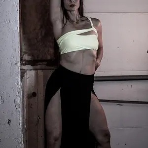
The only one of these I really like is #2, actually. I have a thing about large out of focus foreground elements, I feel they place me, as the viewer, in the frame. It feels like I personally am stepping through the door, and she's flashing that wicked smile at me -- I think it's a good concept, well executed by both photographer and model.

The others feel like good quality learning experiments. They're nice, she's very cute, but they're imitations of work that we've seen a lot which is normally done with a little more pep and pop to it. The problem here isn't really that they're bad -- they're not -- it's that the standard we're used to is absurdly high.

ETA: My wife is also absurdly hot: http://www.flickr.com/photos/amolitor/5993905573
 
The only one of these I really like is #2, actually. I have a thing about large out of focus foreground elements, I feel they place me, as the viewer, in the frame. It feels like I personally am stepping through the door, and she's flashing that wicked smile at me -- I think it's a good concept, well executed by both photographer and model.

The others feel like good quality learning experiments. They're nice, she's very cute, but they're imitations of work that we've seen a lot which is normally done with a little more pep and pop to it. The problem here isn't really that they're bad -- they're not -- it's that the standard we're used to is absurdly high.

ETA: My wife is also absurdly hot: Wife & Baby | Flickr - Photo Sharing!

What could I have done to make them PEP and POP?
 
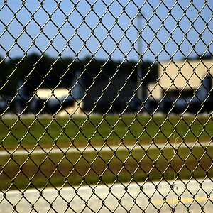
I like them all except #4, which is the opposite of some. I just don't like the pose on that one, she looks like she's checking the corners for hidden cams or something.
 
Pep and pop?

I would go with one of these in terms of overall look:

- warm them up, go for the golden/tawny look
- higher key, more of a white glowy look
- lower key, with deep shadows and more dramatic light, more key/less fill

right now the look is sort of in the middle, they're "color correct" with "good portrait light" to my eye. Now, the three suggestions I had are all "traditional" sorts of things, stuff we're used to. Feel free to experiment with something else, other lighting ideas, other things you can do in post. I do think getting away from the "straight portrait" overall look would be a good thing, though.

More attention to backgrounds and poses. You've got some great elements in every single shot, but it's not coming together to create perfection yet:

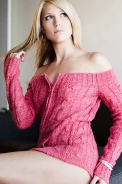
#1 would be nice with a more open frame and maybe a different outfit? I think it could benefit from a higher key treatment. I fooled around and threw on a layer that was a copy of the original, lightly blurred and brightened up quite a lot (pushing the highlights and higher midtones up) and made that like 20% opaque, and I think the result was an improvement. The pose is pretty decent, not loving the sweater.

#2 I love.

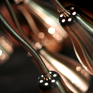
#3 might also benefit from some higher-key/glow style stuff, but mainly you weren't paying enough attention to background. The curtain is awful, and the window frame isn't much better. The pose is great, the light is great, but find a way to place her in front of something beautiful.

#4 is just awkward posing! Background's not so hot either. Solid idea to *try* it, to be sure, and there might be a pose in there somewhere that's awesome.

So, it's not that you're missing any major pieces, it's that you're having a hard time putting all of them into the same frame at the same time -- the standard we're used to in this era of internet porn is nothing short of perfection, eh?
 
ghache said:
Lol, She was probably the most comfortable client i ever had. I delivered 30 shots and these 4 are probably the only one i can show online. Do you really think i would post naked pictures of my client online? never. The agreement was I could share and use the pictures where she was covered. sorry for posting non-naked pictures of an uncomfortable woman. lol

Ummm that was sort of an obnoxious response. I wasn't suggesting you post nudes or violate a client agreement or trust. My point was merely that lots of her CLOTHED areas of Interest are covered by her arms, the bed, etc.

As I said... Might just be my perception on the comfort area. I'm super sensitive to it.
 
Pep and pop?

I would go with one of these in terms of overall look:

- warm them up, go for the golden/tawny look
- higher key, more of a white glowy look
- lower key, with deep shadows and more dramatic light, more key/less fill

right now the look is sort of in the middle, they're "color correct" with "good portrait light" to my eye. Now, the three suggestions I had are all "traditional" sorts of things, stuff we're used to. Feel free to experiment with something else, other lighting ideas, other things you can do in post. I do think getting away from the "straight portrait" overall look would be a good thing, though.

More attention to backgrounds and poses. You've got some great elements in every single shot, but it's not coming together to create perfection yet:

#1 would be nice with a more open frame and maybe a different outfit? I think it could benefit from a higher key treatment. I fooled around and threw on a layer that was a copy of the original, lightly blurred and brightened up quite a lot (pushing the highlights and higher midtones up) and made that like 20% opaque, and I think the result was an improvement. The pose is pretty decent, not loving the sweater.

#2 I love.

#3 might also benefit from some higher-key/glow style stuff, but mainly you weren't paying enough attention to background. The curtain is awful, and the window frame isn't much better. The pose is great, the light is great, but find a way to place her in front of something beautiful.

#4 is just awkward posing! Background's not so hot either. Solid idea to *try* it, to be sure, and there might be a pose in there somewhere that's awesome.

So, it's not that you're missing any major pieces, it's that you're having a hard time putting all of them into the same frame at the same time -- the standard we're used to in this era of internet porn is nothing short of perfection, eh?


I see what you mean.

In term of post processing, I would love to see what you did with these pictures. Feel free to post them as this is probably something i always try to improve on.

Posing? There is always a better pose. Sure is, there is always room for improvement. So telling me that the posing could have been better, you are totally right.

All the things you describe, better framing, better background, better clothes, different lighting, placing her in front of something beautiful. It can always be done...ALWAYS
IF you shoot in a 4 million dollars mansion that has 40 feet X 40 feet rooms with white marble floors under crazy furniture surrounded by huge window, . A 400 pieces wardrobe you can choose clothes from with the help of a good stylist, and a good team of make-up and hair stylist and 1000’s of dollars in budjet. Now you will tell my that near perfect pictures can be done without all this, you are right, but sometimes its harder than it seems.

In reality, it is not always that easy and everyone who shoot people for a living will know what I mean. Especially when this type of photography seems to be popular with the younger crowd.

Don't take it personally but i believe you didn't shoot much photos like these before
Clients see pictures all over the web. Magazines and ads and believe it can be done the same way, with no budget, no preparation in every location and all this in 2 hours. In my book, you fall in the same category.

Just to put you in context.
24 year old student, really nice small 1 bedroom apartment. Some clothing that she likes, 1 small bedroom and 1 small living room with 1 sectional sofa against 1 wall. The other wall has a TV and cabinets on it, the other one is the large building windows that extend from the living room into the bedroom. The door to the bedroom is a sliding panel that goes behind the sectional when opened and against the windows when closed.. This is what i have to work with for the next 2-3 hours and I need to create something that will please the client.


Have a look at picture number 3. The frame of the door/windows is ugly, you are right. Where do you think I took this picture from? From beside the bed you see picture 2. I am sitting on the floor of this 10X9 bedroom. The back wall is about 1 feet behind me.

Picture 2 now! You see that ugly orange blind in picture number 3? I am right beside it with my back against the wall. Sorry, no place to move back and shooting wider is not going to help with dof and would have bring more unnecessary elements in the photo The white wall you see is the wall separating the bedroom from the living room at about the same size as the bedroom. In reality, it would have been better if i could have included more or her and move a bit to my right but i was against that ugly framed window, in a corner.

Picture 1. I am stock in the same corner as picture 2 but slightly turned towards the left. You can see it the sofa placement in relation with the orange blind and the corner i am stuck in the picture #4. The initial shot was wider but had much more crap than the pipe you can see on the wall. So again, not much background to choose from and composition wise, not much choice either.

Picture 4. I am all the way down into the small eating kitchen, the background, it’s still there and it’s the only one available. If you look closely one of the only way I could setup lighting. Anything else was all natural light and reflectors.

The only point i want to make is at the end, you do the best you can with that you have to work with, in the environment you have to work with. With the clothing, you have to work with. If you think I am having a hard time, putting everything you suggested in the same frame and give me advice based on the fantasy and perfection of this internet porn you seem to have made you’re standard from, we do not live in the same world.
This is why i like to take “suggestions” like you just made really slightly as you just pointed things that would have made the photo better, based on comparison with work done by artist, who shoot with deeper pockets, much larger teams of artist and perfect venues. Something i believe you are far from having experienced yourself.

sorry for the long text.

 
You are absolutely right, I have never shot anything like these! A little this and a little that maybe, but boudoir's not really my thing. I never really worked at it and never really produced much good. I've seen a lot of photographs of scantily clad women, though!

I see what you're saying about sets and stuff, I realize that it's hard. You did well given the limited circumstances! How should I say this, hmm. It is as if you have built, using the simple tools available to you, a fairly nice mechanical watch. It keeps pretty good time, and it's moderately attractive. I am not telling you that your watch is terrible, your watch is excellent given that you had simple hand tools available to you. It's a pretty decent watch! But it's NOT as good a watch as I can buy off the shelf at any store in town.

So, on the one hand, I want to say "Hey, great job. Limited time, limited tools, you're awesome, man!" but I also want to say " ... but while it IS pretty good, I would never buy one from you since the ones I can buy down the street are cheaper and better". I mean both with complete sincerity, and I mean no insult to you or your work.

As for some ideas for post, here's what I did with #1 (with your permission). Warmed up the color a little, and then did the "copy layer, blur, curves to push the light tones way up, make it translucent" business. I like the result, but your taste may differ.
 

Attachments

  • $foo2.webp
    $foo2.webp
    97.2 KB · Views: 74
Also, let me re-iterate:

#2 is a great idea, really well executed by all involved. It feels like you were working WITH the space instead of against it. "Damn it, I cannot get a good angle except from outside the stupid room, and there's this wall here.. What can we make of this?" and then you made something pretty awesome. A little first-person/point-of-view boudoir work, great stuff.
 

Create an account or login to comment

You must be a member in order to leave a comment

Create account

Create an account on our community. It's easy!

Log in

Already have an account? Log in here.

New Topics

Back
Top Bottom