For me, there are too many elements competing with each other for it to tell a coherent story. Sorry.
Too many elements ? :shock: For a street photo? There are very few elements here and most are working for the story.. I really do not understand what do you mean..
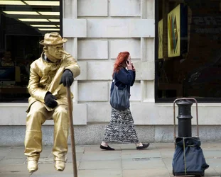
Ok, so there's the mime artist, a trolley, the fire hydrant or bollard (I can't tell), the shop windows (one with strong lights and people in it, the other with a colourful sign and a half reflection of a brick wall, car and company name from across the street). I also think the composition isn't the best I've seen from you.
All in all a bit of a jumble. Sorry! I'm not saying I could do better, but, from what I've seen of what you've previously posted, I know you can.
OK. Let us look at it closely.
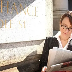
The mime artist: he is the part of the story obviously. Do not let the title fool you - this is not a portrait of a woman.
The trolley/black post: yes, i see what you mean, it does not look tidy at all. I thought about cloning it out, it s easy. But! It gives the image the needed balance, there is a visual triangle that makes it stable. And the trolley loooks like a cheap version of the woman's bag, which is funny.
The Windows: I see no problem here - it is almost symmetrical, breaks the otherwise boring wall and the fact that the right window is slightly larger that the left one, again, balances the mime guy. ( And BTW it is not windows - it is the Apple store :mrgreen:
The people in the shop: mmm..yes.. you are maybe right, I did not think about. Probably worth darkening a bit to hide the people and all that clutter... Or maybe not. I am on the fence here..
The yellow lights/colorful signs: these are very important here. Basicaly THAT is what the image is about. Look at them as the thought waves , projected right from the heads of two people here. They are on different planes, underlining the fact that these two people are both here and at the same time they are in diffrent worlds. Let me explain:
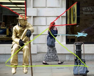
So we have the projected movements /positions underlined with these yellow patterns ( just look at these yellow lines/signs and imagine what these guys are thinking

) , we have the balance, we have the contrast between the stiil and moving subjects. We have a strong yellow/blue color scheme.
I think it is not that bad after all.






![[No title]](/data/xfmg/thumbnail/42/42276-99df5da06c3e5dc83ae4bab11e935910.jpg?1734176684)