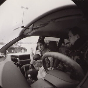
I find the lack of sharpness, which looks like camera bump, as opposed to focus (and which I think is a result of the tone-mapping) to be very annoying, regardless of mood.
So let's talk about mood. Okay, so the "mood" of the photo is sort of weathered, so to speak. More specifically, the mood of the shot, in terms of technical appearance, hearkens back to the 30's and 40's (though the car is likely a little older older). If you study the tone range of photographs from that period, you'll notice that there is an enormous amount of detail in the highlights. While the shadows are sometimes a bit blocked, they often hardly make it to zone II. What Abraxas has done here with his processing is exactly opposite (no highlight detail and a high concentration of dark shadows).
My critique here is not based upon the "modern" aesthetic of equal density across all the middle zones, but rather my own studies of photos from this era and my own experiences shooting several of the films that photos of this era would have been shot on. The shot certainly does have a "mood" to it, and one that is probably reminiscent to most people of photos from that era simply for its aged look and apparent lack of perfect exposure. But to someone with a trained eye and a knowledge of the history of these period photographs, it comes across as more of an obvious imitation than perhaps was intended.
but with mood with respect to exposure I did not refer to it representing any former times. It looks like a tone-mapped image converted to b&w, technically, nothing else.
but the "emotions" it creates with me
do not relate to any possible technique applied but just to what I subjectively feel.
Again I agree if we wanted to realise your vision of this image, then the current version is not done well. But your vision might not be abraxas' vision of how it should look like. And then it would not be an imitation but something on its own.
To me, there is no definite answer to what is better, it is simply a question of taste.
I for my taste dislike most tonemapped/HDR images, but in B&W some of them work for me.


")
![[No title]](/data/xfmg/thumbnail/37/37605-90c8efaef5b7d1f52d4bf8e7dfd33673.jpg?1619738148)