Riley's Photo Shoot Part 2

mindfloodz

TPF Noob!
Joined
Apr 5, 2011
Messages
231
Reaction score
7
Location
Chicago
Website
s116.photobucket.com
Can others edit my Photos
Photos OK to edit
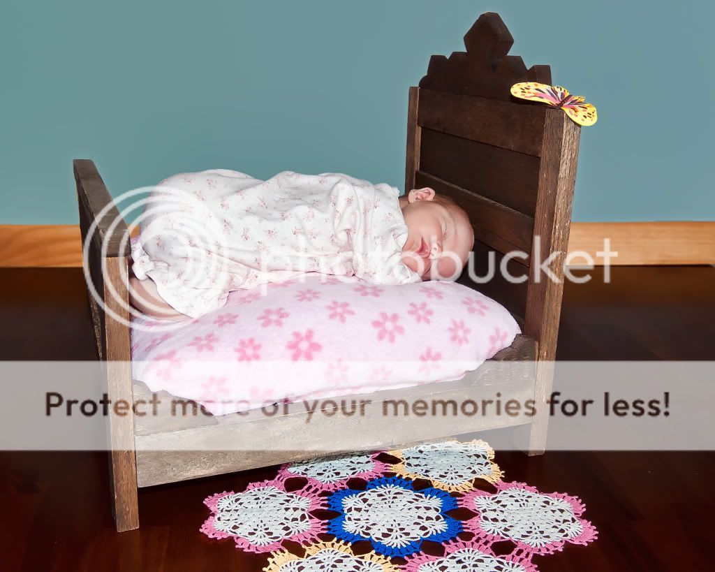
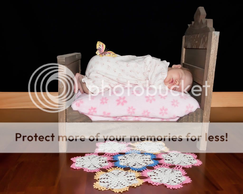
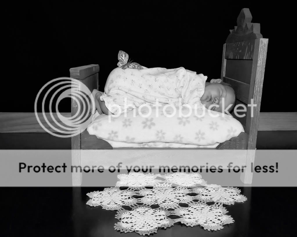
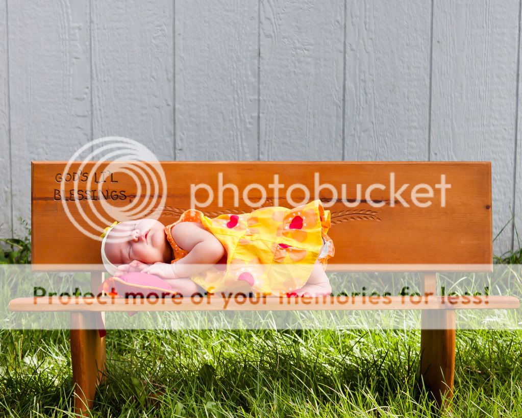
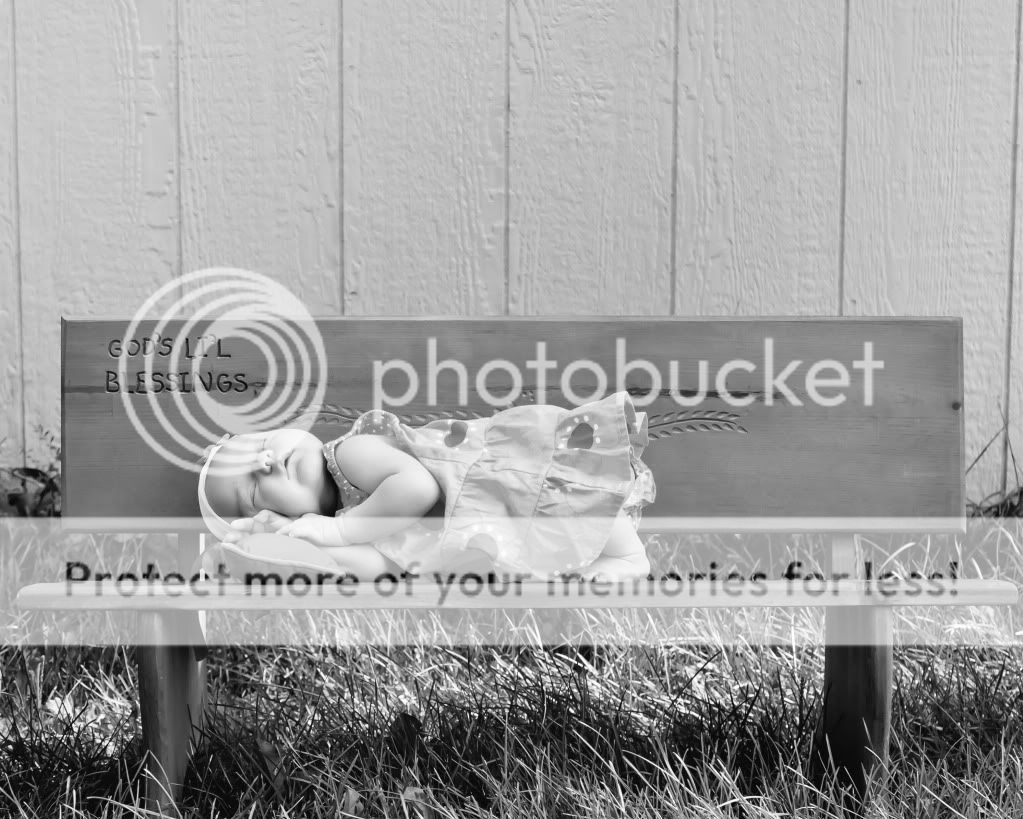
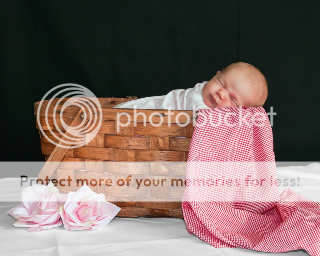
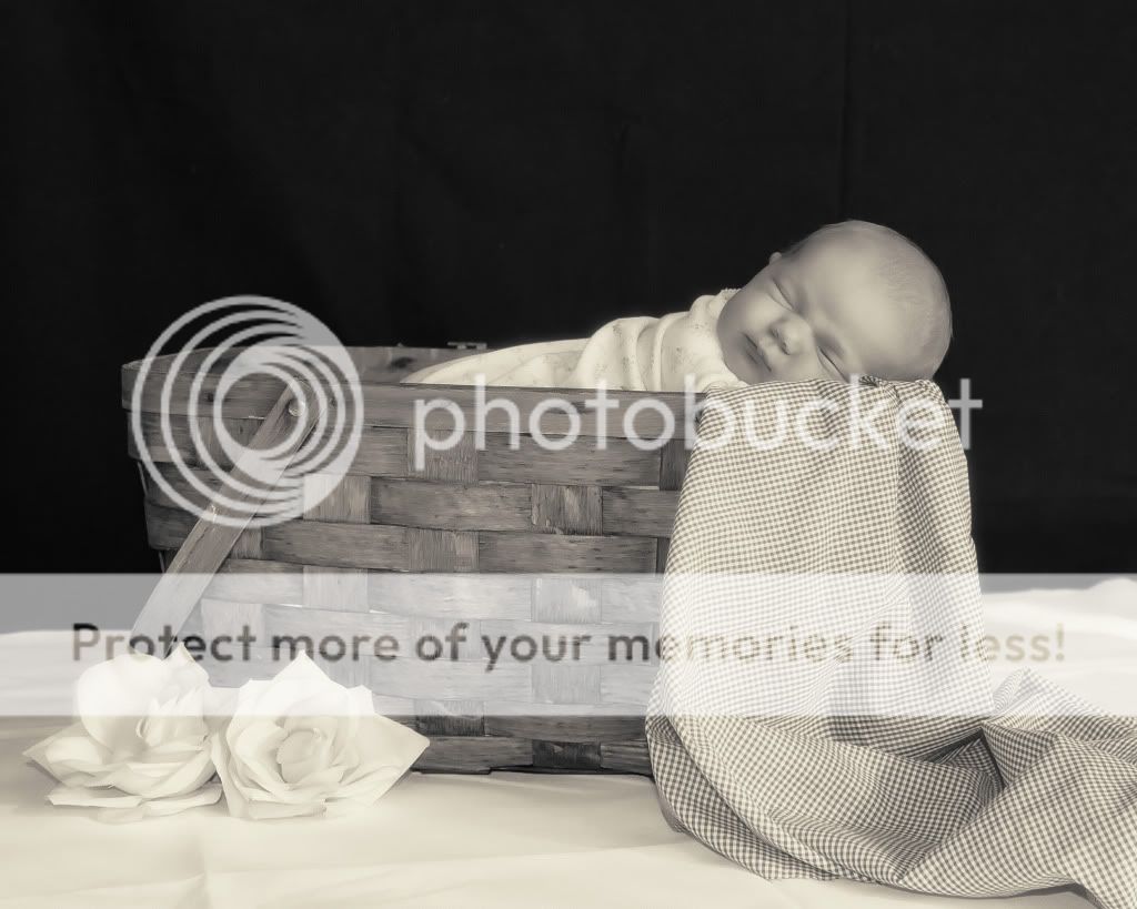
Here is a couple I did yesterday. i revisited a prop I used before (doll bed) but used different backgrounds and used a "mock" hardwood floor. I actually used a dining room table, but it worked great to give the effect of a hardwood floor. I also used a piece of trim that was lying around to give the illusion of being part of a wall. I still feel this shoot could have been better in terms of composition. I would like to maybe take the bed outside and give it a "summer breezy" outdoors type of feel to the shoot. Which brings me to the picnic basket. I did this shot last and I wasn't even going to do it because I felt that doing an outdoor shot with the picnic basket would do a whole lot more for it in terms of setting. I really don't like to use a black BG w/ a white bottom BG, but this gives the shot a "white table cloth restaurant" feel. I like it, although I know many people might hate it. The wrinkles on the white table cloth were left there on purpose. It adds to the restaurant feel. I do plan on taking this prop outdoors for a more "picnic feeling" shoot.

#1
BedwblueBG.jpg


#2
bedwblackBG.jpg


#3
bedwblackBGinBW.jpg


#4
GodsLilBlessing.jpg


#5
GodsLilBlessingbw.jpg


#6
picnicbasket.jpg


#7
picnicbaskethighkey.jpg
 
Last edited:
I can see you are trying to keep your compositions simple, but good composition is hard. For example, on the first shot you have a really busy, multi-coloured mat on the floor and a bright yellow object on the bed post. Both these elements grab attention without creating eye flow.

Your eye will pick up colours arranged in a triangle and this helps to move the viewer through the whole composition. The bright yellow only appears in two places: the bed post and the floor.

Work on harmony by simplifying your colour palette. You can purchase books that show good colour harmonies or go to your local paint store and pick up a harmonized paint chit. The elements don't go well together... three colours of wood, textured mat, and bright yellow butterfly are all fighting each other.

The shot looks nicely controlled on exposure, but needs the other elements to be dealt with.
 
I agree with you entirely and will certainly take this into consideration the when I do this for my last and final time with my daughter. I may try it with someone else's newborn at a later date, but I'm beating a dead dog with this same prop, so I want to move on after I get it right, or at least try to. I appreciate you taking your time to help to me further my education in the understanding of photography and the elements to good color composition. It's nice having someone tell me what I'm doing right as well as what could be improved upon. Many crits do not offer such insight. I would love to know what you think of the other scene (bench, and picnic basket)
 
invest in a flash, the stock flash in your indoor shots is ruining the lighting or try to simply leave it off and use other sources of light (window/lamp e/t/c)
 
I agree, the stock flash doesn't do the pics any favors....I was using window lighting for this shot and using my flash for fill lighting). I could have put tape over my flash to diffuse the light. I have no money to invest in an external/hotshoe flash, so that not an option at this time. I could have used my 50mm instead and shot close to wide open to provide me more lighting. I could also make a poor man's reflector to provide the light I need to make the portraits look more presentable. I worry about using normal "house lamps" cuz they tend to give the pictures an orange color and throw my WB out of whack. i do use a gray card, but sometime normal incandescent lighting just ruins it for me. I'd really like to get a 430ex speedlite, but really don't have any $$ to invest. I will as soon as the money becomes available. My newborn won't stop growing to wait for me to get the money together, so I will have to work with what I got at this time. :)
 
Please number your photos to make it easier for us to CC.

That said, I like your creativity. But, yes, it needs help. I agree with oldmacman and it would easily have been taken care of by adding one smaller butterfly of the same color on the other side of the bed.

The background color doesn't do much for me but that is all it means. To each his own. And it matches somewhat a color in the rug although I have a feeling it is a problem of bad PP, ie there is some blue-green in the rug but I have a feeling it should be white. You need to watch your whites.

I would much prefer the second one with the black wall except I much prefer the angled bed of the first. The bed being parallel to the wall makes it too static. I think...

Now, #4, I have a serious problem with. I can deal with the grey background (fence) although I think it could have been done better (like matching the botom of the gray with the bottom of the bench's back.) What I have a serious problem with is that your daughter has a feather coming out of her a*s... That needs to be fixed.

I very much like the basket one except the focus seems to be wrong. On the blanket rather than on the kid.

Keep shooting.
 
something with your processing it is just to much on the face because it looks plastic and doll like, it also could be the light but they just look to smooth. imo much better background though!!

for the picnic basket one you would want her completely on top of the basket, so stuff the basket with blankets and lay her nicely on top, you could also do a vertical shot, you dont have to get the whole basket in their because it can just be a lot of dead space, negative space is sometimes good, but to me thats dead space, no interest there. :-D
 
#1 the mat is not doing it for me... too much colors is distractions.. the blanket has flowers and she has flowers(i think)on her clothes..a solid color would of been better. still the angle is just not the best.. the first thing that i see is the leg of the bed being closer to the camera.
#2 I like better i can see her face better... not sure about the black b/g. is still the mat..
#3 the b/w is still kind of grey but love #5
#4 I like it!
#5 nice b/w
#6 i wonder if her head is comfortable.
#7 i see wrinkles in the b/g.
 

Most reactions

New Topics

Back
Top