What's new

River an Memorial shots! Feedback Please

Davidm310

TPF Noob!
Joined
Jun 19, 2012
Messages
15
Reaction score
0
Location
Fort Drum, NY
Can others edit my Photos
Photos OK to edit
Hi everyone,

New to TPF, you can find my introduction here.
http://www.thephotoforum.com/forum/welcomes-introductions/288408-hello-middle-nowhere-ny.html

Looking to get feedback on pictures my wife and I took yesterday.
Please exclude the big pink watermark in the photos :lmao:. Does anyone do that anymore? LOL its been a while.
Thank you gals and fellas. :-P Sorry for dumping so many pictures all at once. Figured I get it out of the way.
Let me know if size is a problem and I can make them smaller. Didnt see a size limit under the rules.
AmericanFlag2-1.jpg


Landscape2-1.jpg


Landscape-1.jpg


Landscape3-1.jpg


Lake-1.jpg


HaysHall-1.jpg


AmericanFlag-1.jpg
 
Last edited:
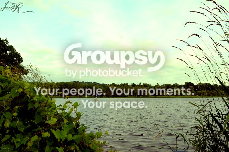
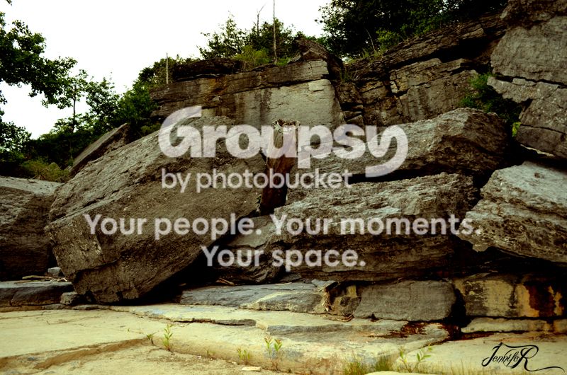
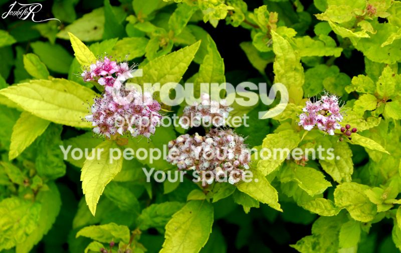
UMM I don't like to step on toes but here goes. Let your work speak for itself not your watermark (small and subtle is all you need). 1) The angle is off and it doesn't do much for me. 2) Your subject (rocks) is slightly under exposed and the sky is blown out. I'd like to see more detail on the rocks and a crop in on the right. Otherwise I like the shot. 3) It's personal preference but to me flowers look better when you fill the frame to show the detail. 4) I'm not sure what happened to the sky but it doesn't do much for me. 6) Your sky is too bright for the picture and the subject needs more exposure. It's exposed enough that you can see some detail but it could be better. That's my 2 cents.
 
I guess we are supposed to give our critique on the type Jennifer since its the main subject in each picture. Well in the first pic its too close to the top and left side. It would be clipped when you put this behind a mat when framing it. The other shots suffer the same problem. As for the color its a nice red but the first pic it seems more pink. All in all a nice looking type. Next time try to keep the clutter of background like flags, statues, water, flower and rocks out of it completely. It takes away from the name. As for composition you might want to center it more or somewhere on the line of thirds.
 
:lol: HEHE, sorry for the big watermark. This is something we used to do back in my photoshop days, where we would make the biggest watermark and slap it in our pictures for online use. The customer copy of course would have a smaller watermark. I guess it does take away from the photography aspect of it. I would go back and repost the images with a smaller watermark. Thank you Brynx and dylanstraub for feedback. :meh:
 
Please remove your watermark, rather then telling us to disregard it. It's neither appropriate in that huge size nor in that bold red color.

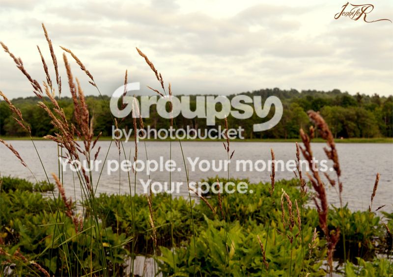
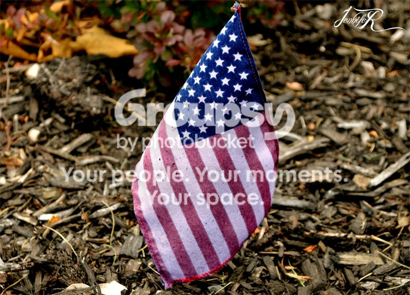
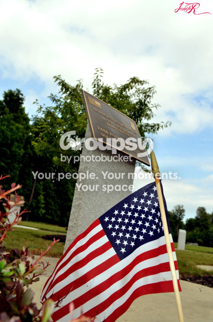
There are way too many photos for individual CC's. Generally speaking, you have tilt issues in a few pictures, especially picture #1. In the two scenics you have the horizon dead center, rather then applying the 1/3 rule. The flag picture you clipped the top of the flag, as there is no reason for such a tight crop.
 
Please remove your watermark, rather then telling us to disregard it. It's neither appropriate in that huge size nor in that bold red color.

There are way too many photos for individual CC's. Generally speaking, you have tilt issues in a few pictures, especially picture #1. In the two scenics you have the horizon dead center, rather then applying the 1/3 rule. The flag picture you clipped the top of the flag, as there is no reason for such a tight crop.

Pardon me for posting so many photos all at once. Getting down to business, I will work on tilt/image stabilization as this is something you helped me realize going back through these photos. What probably lead to the top of the flag being cut off is once again going back to photography basics as this was done by mistake by the operator, not in Photoshop. I tried to crop as close to the flag as possible in PS to distract the fact that the top of the flag was missing. :thumbdown: Guess it was a total fail. On a couple sidenotes, I never stated anything about disregarding the watermark. I stated that I would go back and reedit the pictures and repost with a smaller watermark. My new uploads havent taken effect as this is probably the reason why you are still seeing the larger watermark. As far as the watermark as a whole, I explained the reason for the large font from previous experience in photo manipulation. I wasn't trying to be, "inappropiate" by any means.
Thank you Joel_W for your feedback. I will apply your advice when I'm out shooting again. ;)
 
Here's your quote about your watermark: "...Please exclude the big pink watermark in the photos..." I took your reference to smaller in respect to the size of your posted photos.

Tilt and stabilization are two separate issues.

The viewer (me) would have no idea that the reason you clipped the top of the flag was because it was missing. I still would have preferred to see it that way the cropped so tightly.

Nothing is a total failure if you learn from what you posted and work on improving. Next time just post a few photos so we can give a more detailed CC for each one.
 
Here's your quote about your watermark: "...Please exclude the big pink watermark in the photos..." I took your reference to smaller in respect to the size of your posted photos.

Tilt and stabilization are two separate issues.

The viewer (me) would have no idea that the reason you clipped the top of the flag was because it was missing. I still would have preferred to see it that way the cropped so tightly.

Nothing is a total failure if you learn from what you posted and work on improving. Next time just post a few photos so we can give a more detailed CC for each one.

Ahh I see where the misunderstanding on my part came into play. You were referring about the 1st post, I was referring about my 2nd post. :lol:
I'll go easy on all the cropping next time. :thumbup:
Thanks
 
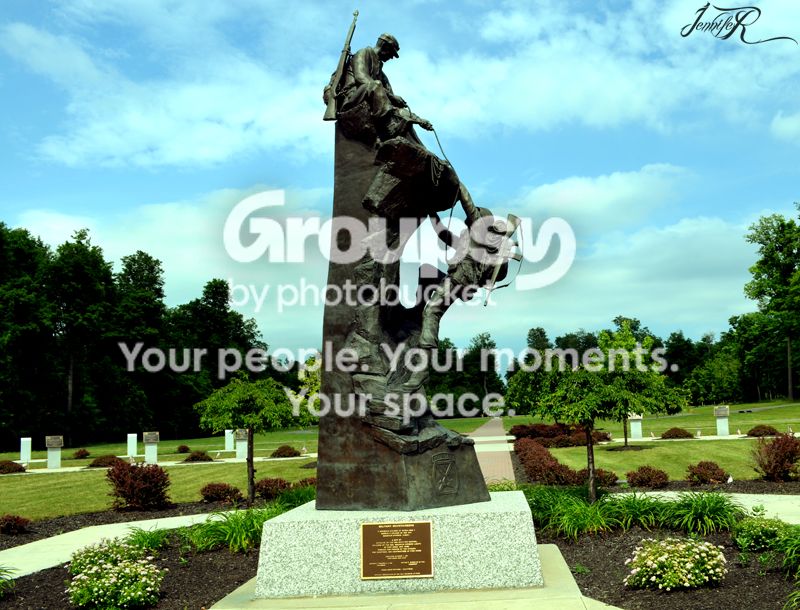
Watermarks all in a much more appropriate size. Nice touch picking a color from each pic in which to color them. In the first pic, if we discuss composition, if the placard stand is the main subject, it would be nice if we could read it. I can just make out something about a tank. Personally, I would have cropped the bottom more to eliminate those out of focus leaves. It would have been nice if all the flag was there, but its not necessary since we all know what it looks like. In the second shot it would have been nice if you shot it as an HDR. It seems kind of contrasty with all those dark areas of trees and in the rocks. Some detail would have been nice. The next shot, for what it is, is a nice composition. Just not a very pretty flower. Meaning its not a wall hanger, even if it was perfect. The next shot also has a good composition, except it looks empty to me. Large expanse of water and not a boat in sight so there is no real subject, or it looks like we are waiting for the subject to float by. There is no tilt in this shot, its dead level. The next shot has too much of the foreground (those reddish things sticking in the air) out of focus. If everything was in focus it would have been a big improvement. Not very interesting shot, but an improvement. I really like the next shot. Id like to shoot that statue, but Id do it as HDR as well for the same reasons I gave earlier about the rock picture. Also I wish I could read the placard. Like why are these guys scaling? Must be some significance to that. Finally the last shot. Its just too close to the top and bottom edge. Other than that good focus and composition.
 

Create an account or login to comment

You must be a member in order to leave a comment

Create account

Create an account on our community. It's easy!

Log in

Already have an account? Log in here.

Back
Top Bottom