Kamakazi
TPF Noob!
- Joined
- Jun 29, 2013
- Messages
- 36
- Reaction score
- 18
- Location
- North Dakota
- Can others edit my Photos
- Photos OK to edit
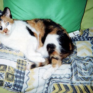
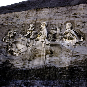
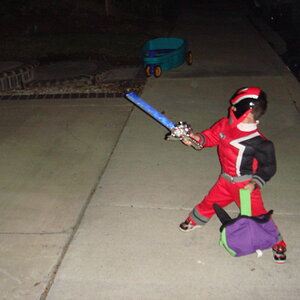
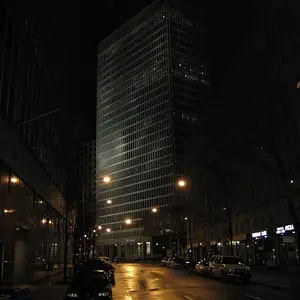
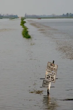
I couldn't decide if I liked the vertical or horizontal lay out better.
Thoughts?

Thoughts?


![[No title]](/data/xfmg/thumbnail/31/31011-439c1242fe08cf6b54f32bf06523a567.jpg?1734159083)
![[No title]](/data/xfmg/thumbnail/33/33906-2f9b24e4b1e1be07f68257916df0f2b3.jpg?1734164328)