What's new

Robert Mapplethorpe inspired

gsgary

Been spending a lot of time on here!
Joined
Oct 31, 2008
Messages
16,143
Reaction score
3,004
Location
Chesterfield UK
Can others edit my Photos
Photos OK to edit
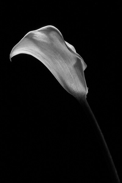
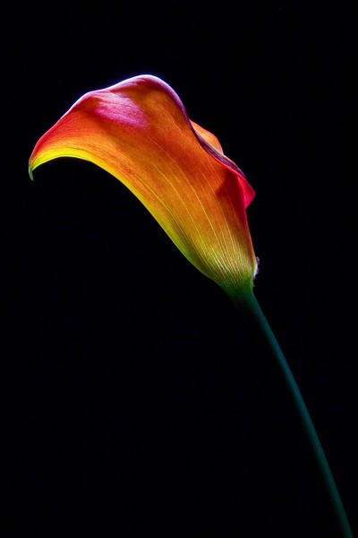
Been having a play with 1 light and reflector with inspiration fro RM

1
IMG6456RM-L.jpg


IMG6437bestb-w-L.jpg


IMG6459b-w-L.jpg
 
I like the last one much more than the other two. What I like most is the way the stalk enters/exits right at the lower right corner, and the flower seems to be in a "true profile" view, you know..."with only one ear showing". The second image has a lovely look at the pitcher's lip of the flower, but the rest of the frame drops out of focus a bit too much for my own personal visual preference. These are visually sophisticated types of shots. A lot of people who are not into photography would say, "what the ???? are you doing man!" but this is a genre that's been done for decades. Still fun to see new images made in this style!
 
I like the last one much more than the other two. What I like most is the way the stalk enters/exits right at the lower right corner, and the flower seems to be in a "true profile" view, you know..."with only one ear showing". The second image has a lovely look at the pitcher's lip of the flower, but the rest of the frame drops out of focus a bit too much for my own personal visual preference. These are visually sophisticated types of shots. A lot of people who are not into photography would say, "what the ???? are you doing man!" but this is a genre that's been done for decades. Still fun to see new images made in this style!

Cheers these were only quick shots to see how the club lights work (they bought some old lights cheap) because i'm doing a talk about my work and then showing them how they can use the lights and modifiers that they have. I'll have another go with my lights and modifiers tomorrow if i have time
Here's a quick color version of that shot

IMG6459-L.jpg
 
I think I'd like the colour version better than the black and white if the exposure was a little more even over the flower head and if the top rim was exposed more like the main body rather than (what appears to be) clipping.
 
I think I'd like the colour version better than the black and white if the exposure was a little more even over the flower head and if the top rim was exposed more like the main body rather than (what appears to be) clipping.

I don't think its clipped, i was using a large beauty dish (not the perfect tool) for these, i'm just trying to put together a small gallery together to give then an idea, when i shoot it with mine you should see a difference more tools to play with and when i get my MF camera next week that should be even better
 
I agree completely with Derrel, #3 is excellent. I love the subtle rim light on the stem all the way down. The detail in the petal is awsome.
 
Very, very nice. #3 is what I like best too. I really like the detail that comes through in the B&W version.

I have been interested in Beauty Dishes for a while and have never used one. One day I would like to pick one up and work with it.
 
Another vote for #3, B/W. Very classic look. The barely visible stem is an important part of the image. I generally love colour, but the colour image is somewhat garish in comparision to the B/W, with the colour overpowering the texture and shape.
 

Most reactions

Back
Top Bottom