I think this is close and there is a good image in there.
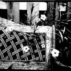
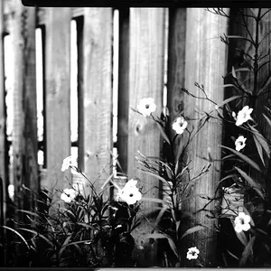
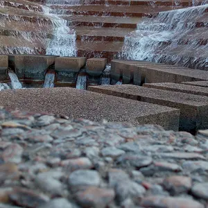
I really like the nature trapped by our structures.
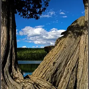
The colour is too cool, warming it up will make it pop more, it's a smidge underexposed and the horizon (the shoreline) is tilted. I think this also has great potential as a black and white.
I hope you don't mind but I did a super quick edit to make sure what I was saying worked
First I warmed up the image, straightened the shoreline and desaturated to see the B&W potential, the exposure can be brought up more. With a little TLC you have a nice keeper, I think it will work well in colour also
Thanks PR and sleist and no I don't mind the edit at all. Now that you mention it,it does look on the cool side. I was not sure about the tilt because of the reflection the tree's actual go the way there tilted so I left it. Now that you fixed that it does look better. Always good to have the extra eyes for C&C to pick out the things we miss in are own photos. I agree with everything you said but I do prefer the color.



![[No title]](/data/xfmg/thumbnail/37/37106-bbbc8e30f409f82c56bead43c7565d5a.jpg?1734169829)
![[No title]](/data/xfmg/thumbnail/35/35947-ab35bfc67d8e12ce65dda301d3bf2b66.jpg?1734167744)