echoyjeff222
No longer a newbie, moving up!
- Joined
- Jun 27, 2010
- Messages
- 643
- Reaction score
- 140
- Location
- WA
- Can others edit my Photos
- Photos OK to edit
@WesternGuy
Getting better at visualizing before I shoot now. It saves a lot of time! I saw this tiny rose growing out of some bushes a couple days ago, and I began thinking how I wanted to shoot it ... I have a habit of sitting around and doing too many shots of the same comp/subject. This was actually the first photo that I took with the camera once I set everything up, so I'm proud of myself for not wasting too much time, thanks to pre-visualization")
Anyways, I did a few edits to try to mimic what I was seeing in my mind before the shot. I was actually inspired by a portrait that I saw here by Dan Ostergren awhile back (can't find it anymore on here?)... with the model sort of melted in the leaves in the background.
hoping for some thoughts on the different edits and potential crops? I'm going out of my comfort zone with post-processing at the moment. I like this crop, even with all the negative space. For me, it conveyed the isolation and singular beauty of the rose contrasted with the dark background.
original:
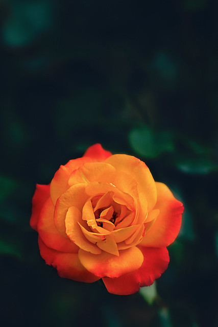 IMG_4807-2-Edit by Jeffrey Lee, on Flickr
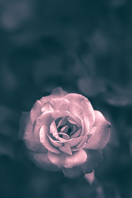
b&w
 IMG_4807-Edit-2 by Jeffrey Lee, on Flickr
red tint flower with blue tint background:
 IMG_4807-Edit by Jeffrey Lee, on Flickr
Getting better at visualizing before I shoot now. It saves a lot of time! I saw this tiny rose growing out of some bushes a couple days ago, and I began thinking how I wanted to shoot it ... I have a habit of sitting around and doing too many shots of the same comp/subject. This was actually the first photo that I took with the camera once I set everything up, so I'm proud of myself for not wasting too much time, thanks to pre-visualization
Anyways, I did a few edits to try to mimic what I was seeing in my mind before the shot. I was actually inspired by a portrait that I saw here by Dan Ostergren awhile back (can't find it anymore on here?)... with the model sort of melted in the leaves in the background.
hoping for some thoughts on the different edits and potential crops? I'm going out of my comfort zone with post-processing at the moment. I like this crop, even with all the negative space. For me, it conveyed the isolation and singular beauty of the rose contrasted with the dark background.
original:
IMG_4807-2-Edit by Jeffrey Lee, on Flickrb&w
IMG_4807-Edit-2 by Jeffrey Lee, on Flickrred tint flower with blue tint background:
IMG_4807-Edit by Jeffrey Lee, on Flickr . I think that if you fixed this up, then it would not be such a distraction/
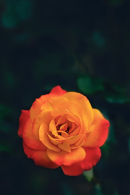 IMG_4807-2-Edit


![[No title]](/data/xfmg/thumbnail/35/35597-714b74cc48992e5353856abfe325df68.jpg?1734167220)


