Rum Product Shot C&C

picture is focused and clear, well done. Having grown up in the Caribbean I'm somewhat of a rum (Rhum) specialist but am not familiar with Brazilian labels, how is it? Why is the glass blue?

BTW I don't drink (anymore) but gold or dark rum is tastier :)
 
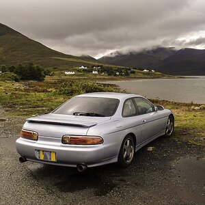
I did this shot today. There was no particular reasoning behind this, aside from wanting to practice my product photography. This is the first time I've done this.

5449758519_1c786903bf_b.jpg

For easier viewing.

Nicely done, but I am stuck on the shadow on the neck of the bottle.
 
There are some blow outs on the bottle and the glass is missing some parts on the stem and the top. Also I would suggest exposing for the cap of the bottle and then clone it into the shot
 
I made the glass blue because I felt that it would add some balance to the right side. Clear was just not doing it for me. Also, I don't think seeing the entire shape of the glass is absolutely essential. It leaves a tiny bit to the imagination.
 
I agree on the contents of the glass looking out of balance if it was clear, seeing that the glass is clear and the contents is blue contradicts the contents of the bottle. It is a good picture though, is the blue on the bottle added too or the back of the bottle?
 

Most reactions

Back
Top