What's new

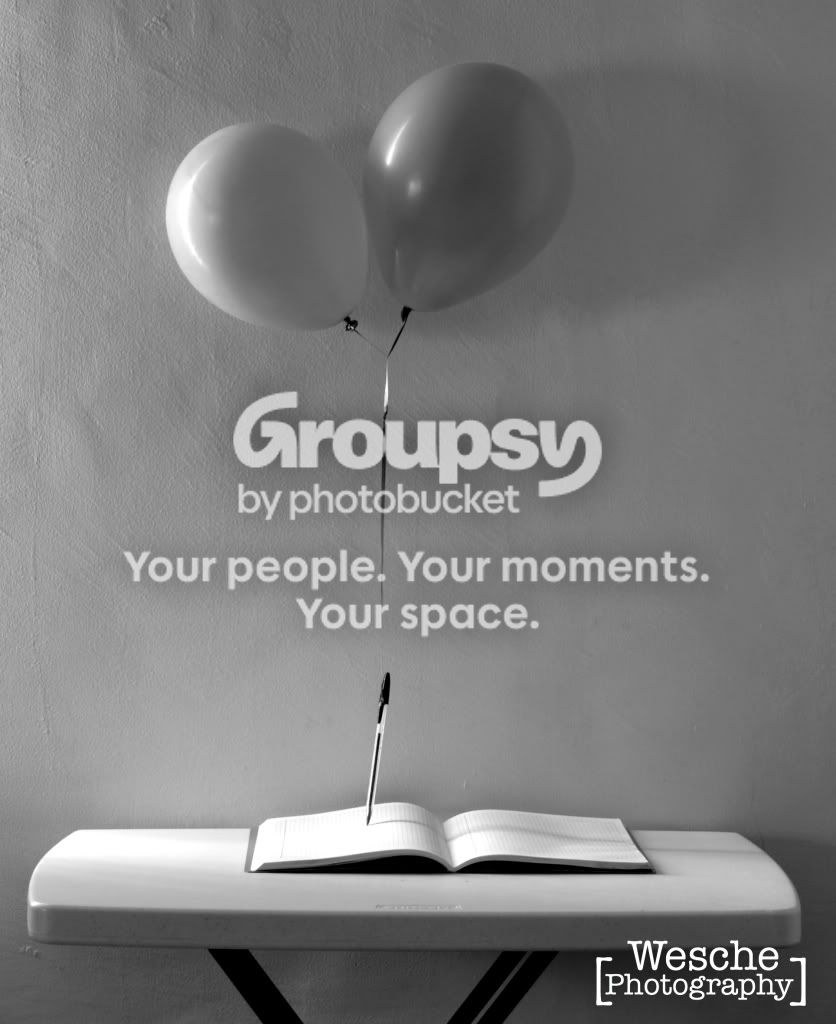
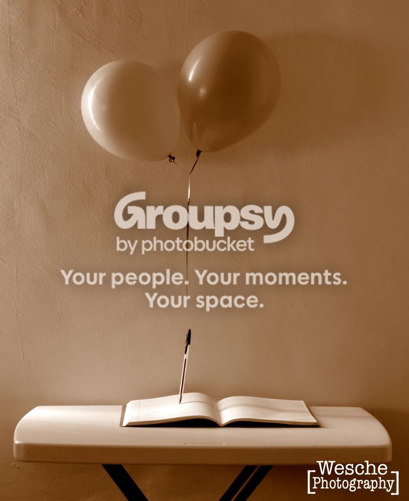
Same photo, different effect, what do you like better?

Wesche

TPF Noob!
Joined
Jan 1, 2011
Messages
107
Reaction score
2
Location
Mexico City
Can others edit my Photos
Photos OK to edit
The same photo, one is sepia and one is B&W. Which is better and why do you think so?

_DSC0047-2-2.jpg


_DSC0047-1-2.jpg
 
I like the sepia one better, but I can't really explain why. =/
 
sepia.....bur I can't tell you why.....lol
 
I think it might be because of the content of the image... balloons = happy = warm color.

I really like the concept, neat photo!
 
I prefer the first, the cold-tone image...
 
I vote B&W. The sepia one, to me at least, just looks like a colour photo with a bad white balance setting.
 
I prefer the B&W - the sepia just looks like you had the white balance set wrong. But both need a bit of work, they are both pretty flat. You need a bit more contrast on those balloons.
 
B&W for me... I like the strong contrast of the pen against the background... it doesn't seem to pop in the sepia. And the color doesn't seem inviting to me. A bit too unnatural. (Not that B&W is natural...but, ya know... )

 
One more for B&W.....sepia looks like coffee stains to me.
 

Create an account or login to comment

You must be a member in order to leave a comment

Create account

Create an account on our community. It's easy!

Log in

Already have an account? Log in here.

New Topics

Back
Top Bottom