bribrius
Been spending a lot of time on here!
- Joined
- Jan 12, 2014
- Messages
- 8,709
- Reaction score
- 1,311
- Can others edit my Photos
- Photos NOT OK to edit
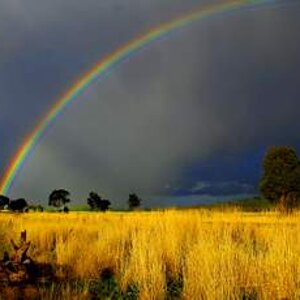
I like 1 and the sun between the buildings (nice on that).
I like 2 as far as the clouds on the horizon standing out, but I cant stand the purple blue processed looking thing going on in 2.
in both the shoreline cutting through the bottom right of the frame at a diagonal seems out of place and distracting. Prefer 1 and like what you were going for.
two cents
![[No title]](/data/xfmg/thumbnail/41/41796-690c109012575e084970902dbd3894ba.jpg?1619739896)

![[No title]](/data/xfmg/thumbnail/41/41795-6bc3a19e590a6be6bd169ab2acaee30d.jpg?1619739896)