What's new

Save the Date / Engagement shoot

kric2schaam626

TPF Noob!
Joined
Jul 5, 2009
Messages
361
Reaction score
17
Location
Fox Cities, WI
Can others edit my Photos
Photos OK to edit
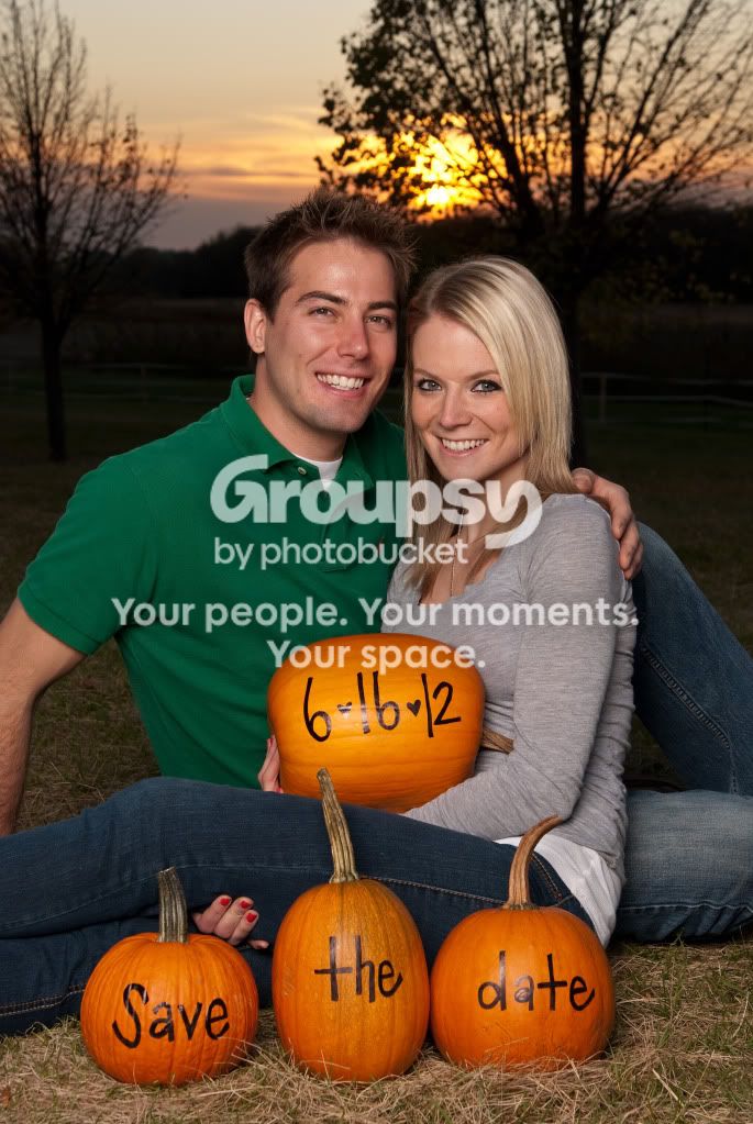
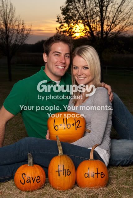
Just need some C&C on what you think of these as far as composition and lighting. Thanks!

DSC_0822.jpg


DSC_0713_BW.jpg
 
I love the first one! Great lighting, background, and concept.
 
I like the first one, just watch for those fingers appearing out of nowhere "hotdogs" as one Master called them. I like the second as it does show the engagement ring. Looks like a great couple to shoot.
Did a quick removal of fingers to give you an idea, hope you don't mind.
-
DSC_0822a.jpg

-
Shoot well, Joe
 
Last edited:
On the first one I would burn where there is a glare on the pumpkin, it's a little hard to see the date :P The second one, she is focus but he is not because your DOF was too shallow.
 
The first one has wonderful props and an awesome location and time of day, and good, solid lighting. I think maybe you could have put his right hand on top of the pumpkin, and her left hand on to of his, subtly showing the ring. His arm, missing the wrist and hand kind of bugs me. It appears that he is using his arm to actually support himself, but I want to actually "see" the hand... Still, the lighting is good. These two are much better pictures than the typical beginning professional is offering these days, IMHO. As joelcantar mentioned, at the Master level, things like fingers that appear out of "nowhere" and "missing digits" and "amputations" are what define the difference between fully finished, completed poses, and what are called "incomplete poses".

Second shot is good, serviceable. Shows the ring. Having her hand and arm that high on the chest makes it look as if she is choking him, according to some people--who feel that the hand needs to be much lower on the chest and away from his throat area. They both have good rapport with the camera. I have seen muuuuuch worse photos of this type by many,many people, so you're ahead of the pack fer sure,fer sure.

 
Love the idea!!! Very creative! The glare on the pumpkin with the date is a bit distracting and the fingers that previous poster noted. I also feel like their smiles are not very natural. On the second one, I feel that the pose is not natural and to me it looks like she's chocking him. Just my 2 cents.
 
The first one has wonderful props and an awesome location and time of day, and good, solid lighting. I think maybe you could have put his right hand on top of the pumpkin, and her left hand on to of his, subtly showing the ring. His arm, missing the wrist and hand kind of bugs me. It appears that he is using his arm to actually support himself, but I want to actually "see" the hand... Still, the lighting is good. These two are much better pictures than the typical beginning professional is offering these days, IMHO. As joelcantar mentioned, at the Master level, things like fingers that appear out of "nowhere" and "missing digits" and "amputations" are what define the difference between fully finished, completed poses, and what are called "incomplete poses".

Second shot is good, serviceable. Shows the ring. Having her hand and arm that high on the chest makes it look as if she is choking him, according to some people--who feel that the hand needs to be much lower on the chest and away from his throat area. They both have good rapport with the camera. I have seen muuuuuch worse photos of this type by many,many people, so you're ahead of the pack fer sure,fer sure.

Thanks Derrel. I have really been focusing on keeping limbs in the right place without cutting them off. I know that in the sunset shot, I was crazy focused on losing the sun. Thanks for your input, I'll be looking out for those amputations :)
 
On the first one I would burn where there is a glare on the pumpkin, it's a little hard to see the date :P The second one, she is focus but he is not because your DOF was too shallow.

As far as the glare, is there a way to prevent this when shooting? I noticed it on my LCD but I didn't know what to do :/
 
Personally I feel two is a much stronger photo then one. In one if you had shot just a bit earlier the exposure would have blended with the background better and it would not have been so obvious that OCF was used. Flash is always best when its use is subtle.

BUt two is a standard shot that you could keep making money off of for the next 20 years. Classic.
 

Create an account or login to comment

You must be a member in order to leave a comment

Create account

Create an account on our community. It's easy!

Log in

Already have an account? Log in here.

New Topics

Back
Top Bottom