Hi,
I'm finding it hard to assess these as B&W, when they are in fact monochrome. I don't think the shade used is a good one, but that is more personal preference than anything.
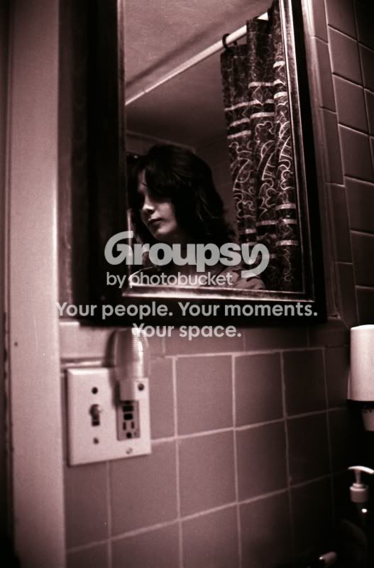
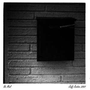
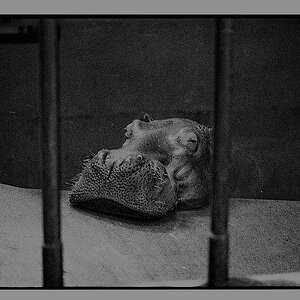
Image 1 for me is the best of the 3, it has a nice alternative composition and a dark grainy feeling to it that is right up my alley. I'd probably have cropped the bottom though, it's a bit empty.
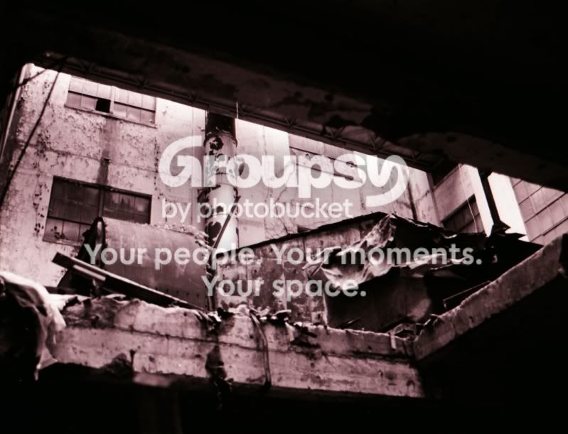
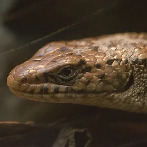
Image 2 has too much darkness on top, coupled with the bottom it's leaving a major portion of the photograph almost pure black. I'm not sure about the composition or subject either, neither is really jumping out at me.
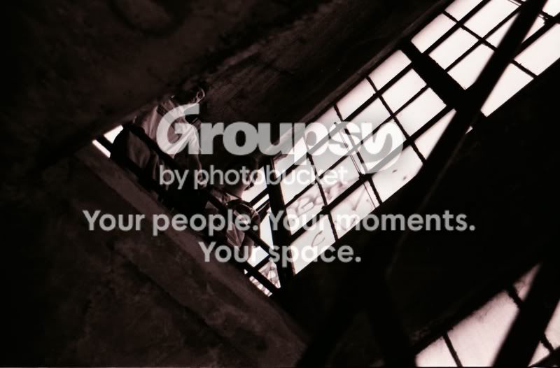
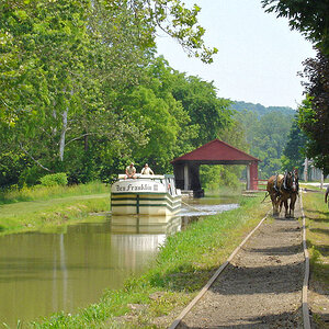
Image 3 is too dark, as a result it's hard to see any of the detail.
I'd like to see Image 1 as a traditional B&W, I think it might work better.
Steve




![[No title]](/data/xfmg/thumbnail/37/37606-3c9ffb5906173fa2aa489341967e1468.jpg?1734170733)
![[No title]](/data/xfmg/thumbnail/30/30883-04222f7ae234efdf80dff6f96ddad16f.jpg?1734158884)
![[No title]](/data/xfmg/thumbnail/32/32713-7df5aadb952fa8e00260cc48bbf6ab0b.jpg?1734162330)