No problem. Actually, I think I want to go into a little more detail about what *I* see when I look at these images, and why I said I like them. Again, my interest in these photos comes from a compositional perspective. These are not really about specific subjects to me so much as they are about basic structure elements, such as would be explored in abstract and minimalist photography. I think you have a natural eye for it at this point, and probably don't even know why you've shot what you did and in the way that you did. Anyway, here's what I see:
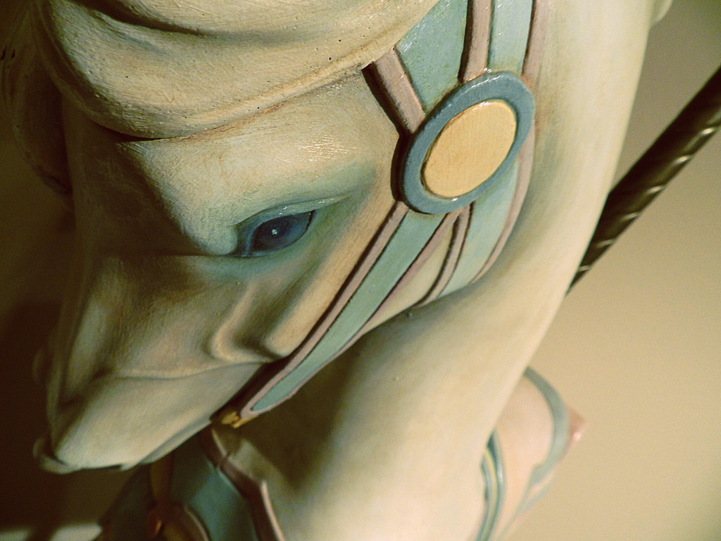
1. Yes, the left side is underexposed. Perfectly. Shadow is as important as light in a photo. Some would even say it's more important. From the interplay of shadow and light here we get 3-dimensional form and texture and tone. Note that we still have access to details in both the shadow and the light - that's a great exposure. Our eyes are naturally drawn to the lightest part of any image we look at. In this case, it's the round area where the halter comes together. It's placed off-center - a good thing. And it has all these lines radiating out from it - also a good thing, as they lead us to explore the rest of the photo, rather than just sit and stare at the bright round area. The vantage point is such that we don't instantly recognize what we're looking at, and that makes us look a little deeper at it to unscramble it in our minds - a good thing, as it captures interest. The pole is the one element in the photo that's not graceful and rounded with the other compositional elements, and it defines what it is we're really looking at here. It provides a vital visual clue to help us come to terms with what is fairly abstract at first look. I also like the subtle palette of colors, which fit the graceful curves and sweeps and feathered shadows very well. Put that all together, and this image is very compositionally pleasing to me.
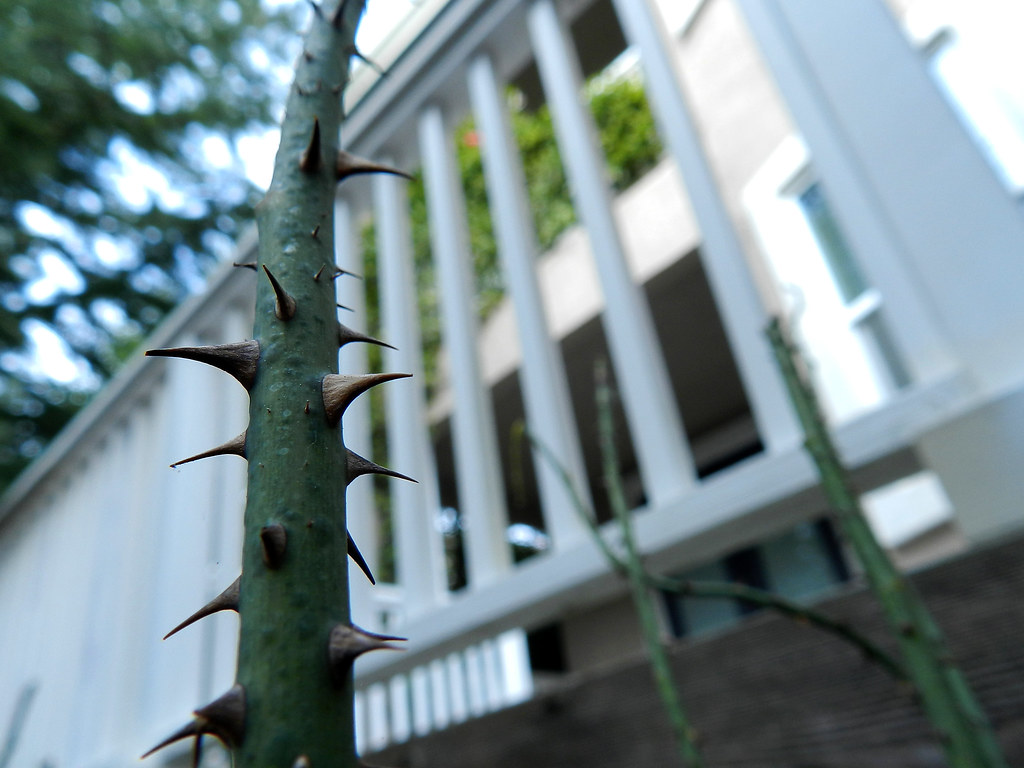
2. This composition speaks to me in terms of juxtaposition of elements: natural vs man-made, wild vs ordered, spiked vs smooth, textured vs banal, individual freedom vs a group of all the same things, etc. The background isn't out of place, it's a vital part of the composition as a whole to make those comparisons. It's what makes the thorned stem so utterly unique and dynamic and alive and wild - because it stands alone and apart in front of a line of marching sticks that have all been uniformly trimmed, sized, painted, lined up and utterly destroyed of their individualism. Both it and the background are vertical elements, but they're so different in so many ways, that they play off each other dynamically and tell a hundred stories in the process. You've also incorporated elements of perspective, which is good. Things can sometimes get very boring if they're too squared off in the frame. Diagonals are good to explore and take advantage of compositionally. Again, this image is a success to my eye.
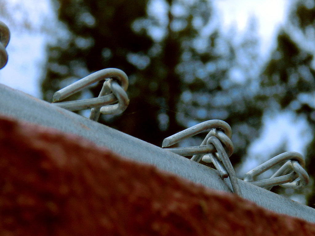
3. Repeating patterns is a common theme in photography, and that's the first thing I think of when I see this. In addition photos of things in odd numbers are usually better than things in even numbers. That said, I think I would perhaps have framed it slightly more to the right, losing the bit of fence wire on the left and getting the other three more symmetrical in the composition. Nonetheless, I think it works pretty well as is. The diagonal is again a nice compositional element. It's good that you didn't just automatically line that edge up perfectly straight light it's a horizon - it gives the image life and interest. The out of focus brick color works for me because this image, like the others, is more about basic shapes, elements and colors than about specific subjects, as I mentioned at the outset. It's a good start into an exporation of basic compositional elements.
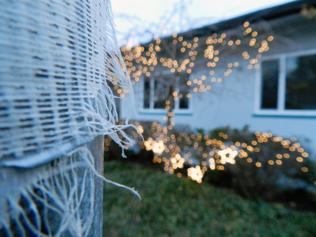
4. This one intriques me. My mind is conjuring up ideas about what I'm looking at on the left side of the composition. I don't even want to KNOW - I want to be able to IMAGINE, and this allows me to do that; It allows me to create my own story from some basic building blocks of texture, shape, light, shadow. The background is again reduced to shapes for me; Two dark line diagonals coming in from the top right and lower right corners, leading in toward the center separate colors and textures, and bring me back to that mystery object on the left. The bokeh lights add visual interest. As a whole, the composition invites me to look, explore, look, imagine and explore some more. By any standard, that's what a successful image should do.
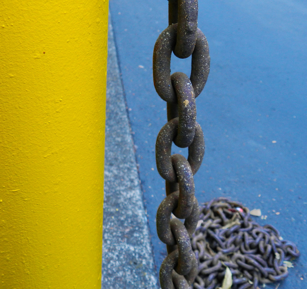
5. Basic shapes and colors. Bold yellow on the left third, bold blue on the right third, speckled chain and deck and repeating elements and action in the middle third - rule of thirds is a common compositional element, and this is an interesting example of it in use. There's even a bonus diagonal line running from the top right of the yellow area down to the bottom left of the chain, breaking up that middle section even more and giving our eyes leading lines to lead us to different parts of the image and continue to explore it. The only think I'm not really on board with is the pile of chain - I do wish that weren't in the compostion.
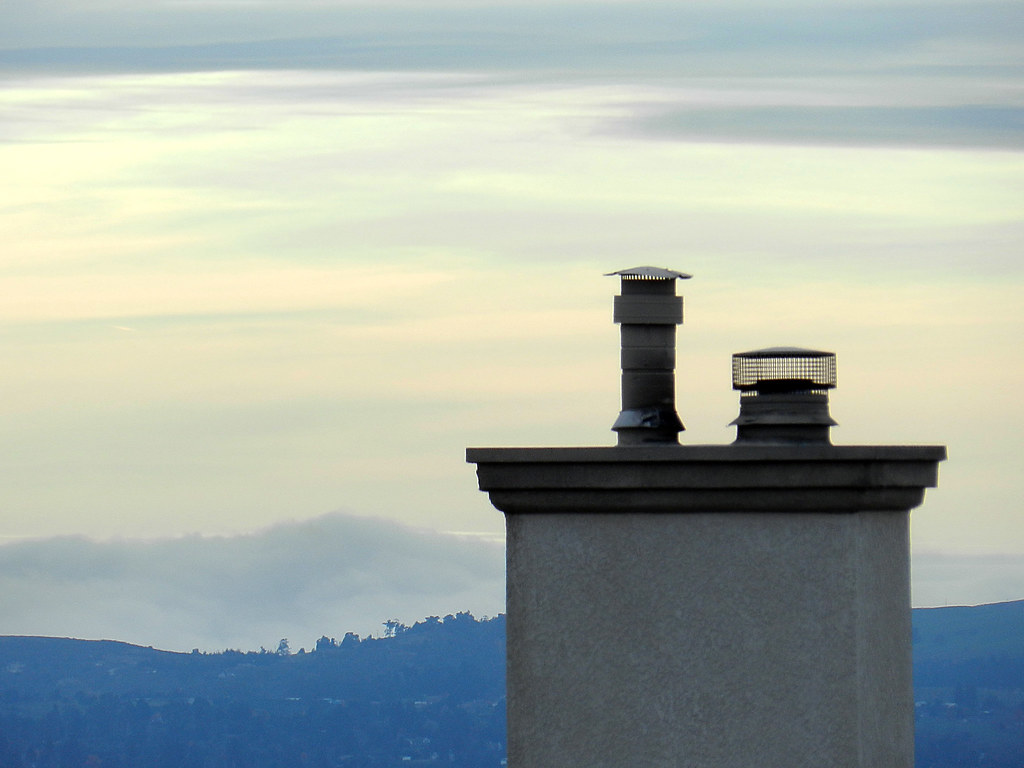
6. Basic elements, square to the camera like basic building blocks, but not centered, muted gray colors of the sky, stacks and concrete of the chimney that bring them all together into a common palette, and an interesting visual dynamic wherein our brains make lines that don't actually exist. In this case there's a diagonal formed by the tops of the two stacks - imagine drawing a straight line from one to the other, then extending it in both directions, off to the right of the composition, and up into the sky through the vertical center of the image. There's another line that's perfectly horizontal formed by the top of the chimney they're sitting on, and now we have a visual triangle, which is another basic compositional element sought after to provide visual interest. The blocks and stacks stand hard and cold like sentries against the natural sweeping elements in the sky and the free-form tree-line that form the background. We don't see the roof, we don't see the building, we don't see any other buildings - they stand here, alone, all alone, staring out at the natural landscape, day after day, seemingly forever, lost and apart from the rest of the world.
Again, I find them successful from a compositional point of view. Whether you intended them as I see them or not is irrelevant. Whether you thought about any of that stuff as you composed or not is less important than that you did compose them as you did; You did *see* them as something you wanted to photograph, and that's half the battle. If you haven't got a clue, then I think you may have a natural talent. In any case, don't be discouraged if others can't see it yet, and take what others say with a grain of salt. Opinions are common, but they are just that - opinions (that goes for mine as well).
Keep at it.




![[No title]](/data/xfmg/thumbnail/36/36678-71ca8166409788704ac0b1cd83c26787.jpg?1734169174)
![[No title]](/data/xfmg/thumbnail/36/36299-468f060314a0ac2bf5e37da1c33149d2.jpg?1734168618)

![[No title]](/data/xfmg/thumbnail/39/39442-c7791194bfea1b4d6bd382b004fb8488.jpg?1734173531)
![[No title]](/data/xfmg/thumbnail/39/39182-efc21fe87c9b5f9b2fa9ab0f8f01c205.jpg?1734173056)