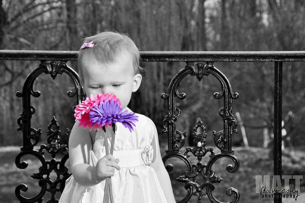
The fact that selective color is the theme of a contest makes me cringe. I'm in agreement that none of these are good uses of selective color. mrpink posted a decent example. You have to think, "Does this help the image, or hurt it?" Think about where the eye is drawn. Whatever is colored will automatically be the first thing people look at in the image, no matter what else is in the image. Coloring secondary objects (like the stuffed animal in the last one) is a no no. The first thing I looked at was this ugly green and red thing, and I almost completely missed the absolutely cute look on the girls face. I wish I had an example for you, but I pretty much refuse to do selective coloring at all. If I ever see a shot of mine where it would work, I might try it, but it's rare.
The suggestion above, about someone in old attire in a modern setting might work well. Keep at it, and the most important thing is that the eye is going to go first to whatever stands out the most. That would be the colored object in a selective color shot.
EDIT: I just thought of one more thing to think about. Since this is for a contest, I would recommend you stay away from flowers. I can pretty much guarantee that half the entries will be flowers colored, and everything else B&W. The judges might pick one out of that group, but I bet most of them will be tossed out in the first round.


![[No title]](/data/xfmg/thumbnail/32/32930-09414fc020c2a60a456ff59a05c5ef8f.jpg?1734162706)


