Selective Coloring in Portraits C & C

BekahAura

TPF Noob!
Joined
Feb 23, 2010
Messages
355
Reaction score
23
Location
Putnam County, New York
Website
reflectivephotos.net
Can others edit my Photos
Photos OK to edit
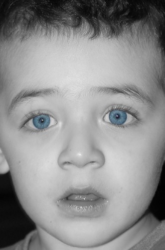
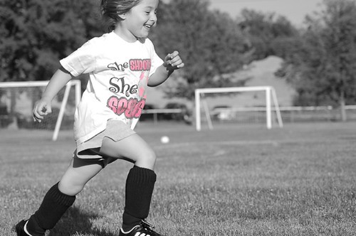
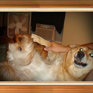
Here are some portraits I took. All of them were originally taken in color, so the color is true (yes his eyes are that blue!) except in #3 which I desaturated a bit. I know many of you seem to hate this kind of PP, but give me the benefit of the doubt. Let me know if you think it works or not.

Also I was wondering if anyone could tell me why my ISO infomation doesn't show up in the file info. I have a Nikon D50.

Any comments or suggestions are appreciated. Thanks!

1 - This shot was taken in film a few years ago, and the photo was scanned in, so I have no info on the aperture or shutter speed.
4456035361_8ef4773ca1.jpg


2 - 1/60 f/5.6
4456813340_04acc075a8.jpg


3 - 1/125 f/3.5
4456035423_2d1dd3ec0e.jpg


4 - 1/1600 f/4.5 PP also included removing a soccer ball in the background that was distracting - can you tell where it was?
4456035443_27c548d800.jpg
 
To be honest, the only one I really think it works with is #2, and only because it puts the attention where it should be, the eyes. #1 looks like a bad sunglasses advertisement. #3, I understand what you were trying to do, but I don't think it works. #4 just looks like you were really wanting to selective color something for that girl, so you picked a random shot and did it. Unfortunately, her head and feet are cut off.

Selective coloring is a tool, and it shouldn't be used on each and every shot. It won't always improve a shot, and more than likely, it will hurt a shot. When applying selective coloring, you need to ask yourself a couple questions.

1) Will this improve the shot?

2) Will the coloring draw the eye to the subject? Or away?

I think only #2 answers both of these questions in the right way. #1 answers question 2 with "to the subject" but I don't think it adequately answers question one. The last two, I don't think, answer either of these questions.

As I've said, selective coloring is a tool and it's use should be pretty limited. I wouldn't de-saturate every shot, or need to correct the horizon on every shot, or whatever, you get the point. I do like the photos, I just don't really like the PP.

I agree and disagree... I agree in your breakdown of selective coloring... but disagree with your selection in photo that looks the best.

I think #1 is awesome, and the coloring really adds to the shot. What bothers me about #2, is that the coloring distracts from the expression on the face. I want to get lost in that expression, but instead, I'm focused on the eyes.
 
I have to wonder why you posted for C&C if you've already made your mind up about the shots.
 
I have to wonder why you posted for C&C if you've already made your mind up about the shots.

Everyone has their own opinions. Doesn't mean that the OP can't have already come to their own conclusion regarding the photos yet want some feedback from others confirming his/her views. I do this...Honestly, I think we all do this from time to time, don't we?

Personally, I think that #1 rocks! I really like #1!!

Just my $0.02...
- Dan
 
C&C is great. But keep in mind everyone has an opinion and that is just what it is...an opinion.

I think if you personally like the selective coloring and it works for you, then it is great.
The purpose of a photo is to invoke an emotion or interest.
These photos did just that!

Selective coloring is not everyone's favorite thing...but I like these, my fav is #3!
 
I understand and maybe I misread the response, but it seems the OP is already defending the shots from the very first critique. But alas, I suppose I could offer something so as not to be a critic of the thread as opposed to a critic of the shots. :)

I think the only one that works for me is 3, because it seems natural that what the kid is drawing would be color... almost like he's adding some cheer to a monochrome world. The drawings themselves almost seem like they were PP'd in, but perhaps maybe some slight desaturation would make it look more natural.

The other's just seem like bad shots to use SC on for the above mentioned reasons.
 
#1 is a great shot for an ad for the glasses. beyond that...selective coloring doesnt do much. it seems obvious why it was done to the eyes, and the valentines decorations. but the shirt? why? isnt the picture about the girl playing soccer?
its best i dont respond to selective color threads lol. im just not a fan.
 
Bazooka,

I didn't mean to defend my shots from the beginning, it's just that I've noticed a lot of bad feedback on selective coloring in general on TPF. I guess what I meant to say is some people just don't like this kind of PP, so if you are a fan of this sort of thing, then let me know what worked. The only thing I'm sure about is I do love SC, but I wasn't completely sure about my own shots.

I did desaturate the color in #3, but maybe I should do it a bit more? My boyfriend had the same comment, that it looked like I painted it in in PS. Actually those aren't window paints, they are these jelly like things that stick to the window and he was just putting them up randomly. Thanks for your comments!

Gaerek,

You are absolutely right! These are all my first attempts at SC, #1 was the 1st one I ever did, and #4 was me trying to find a shot I could color in, out of my bulk photo folder. And I am upset that I cut her head and feet off. I see that SC really really doesn't work in this case.

Thanks for your feedback, I will keep those questions in mind in the future.

Thanks to everyone else who commented as well. I love that everyone seems to differ on their favorites. I now know why #4 doesn't work, and I guess #s 1-3 do and don't work depending on who's looking at them. And that makes me really happy!

:D Bekah
 
I personally fall in the camp that uses selective coloring with reservation. I do still like to see it on shots at times though. Like I said, I tend to be a little reserved, just my taste I guess.

With that said. I like 1 and 3.
1. It just looks cool to me. The eye is drawn to the sunglasses, but the angle of the subject and everything it just seems to work. For me, mainly as a "fun" picture to have as part of the collection.

3. I like this one because what is colored, and the smile on the young boys face both say "love" to me. I can imagine my children doing this very same thing on the window and so that's probably why I am drawn to this image. That's what the selective coloring does for me, focuses on the tender, innocent love of a child which is strengthened by the smile of the child.
 

Most reactions

Back
Top