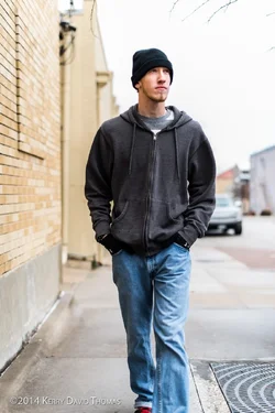
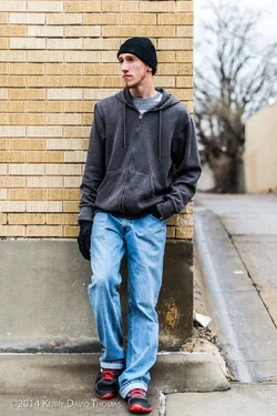
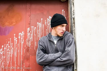
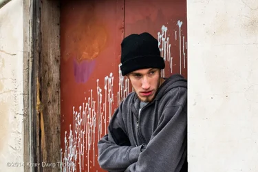
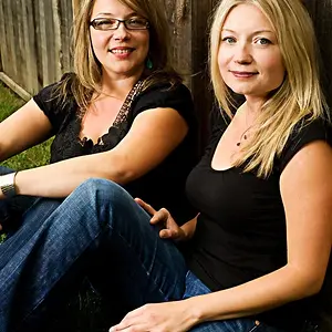
one and two are just normal snaps
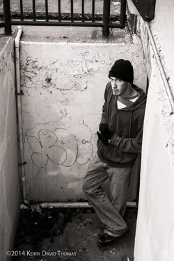
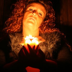
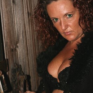
four is quite nice but not as complimentary to the subject
5 and 6 ditto - has sort of a 'sneaky' look that isn't appealing
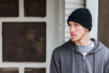
#3, otoh, is just terrific - the squareness of his shoulders is echoed in the frame.
the interesting framing and his engaged concentration across and out of the frame gives it a wistful and compelling look.
The frame right behind him is vertical yet the others are out of true true implying an aging sinking house.
Colors are great and this is a very good look for the model.
If he doesn't like this one, he's nuts.
It is amenable to many different treatments from soft sepia to color as is to even a slightly softened, more saturated look.
IMO, this is a real keeper that you should never, ever loose track of.
(but I would make your logo a bit smaller and put it in the other lower corner - don't mess up the simplicity of that side.)