Shooting w/ 70-200 2.8 II

MohaimenK

TPF Noob!
Joined
Nov 13, 2008
Messages
2,583
Reaction score
11
Location
In between her...
Can others edit my Photos
Photos NOT OK to edit
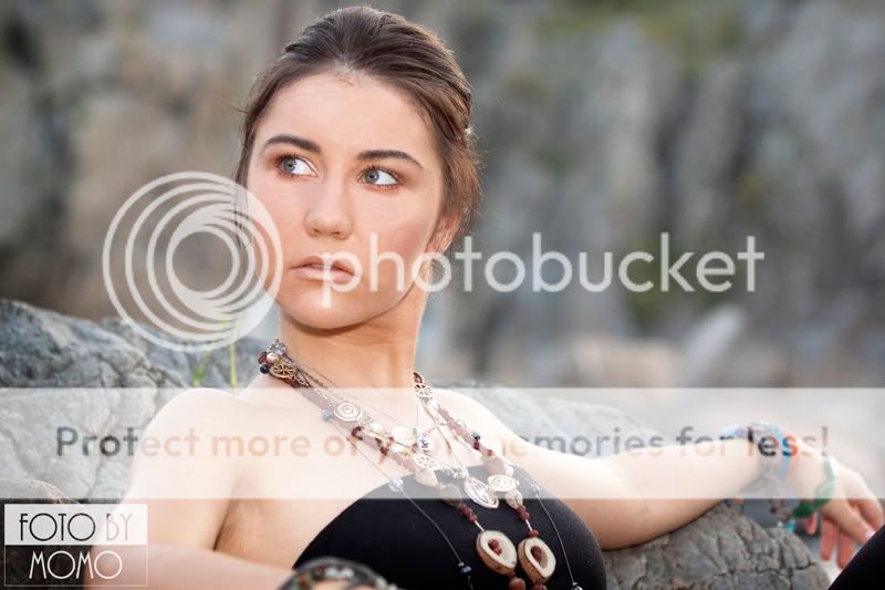
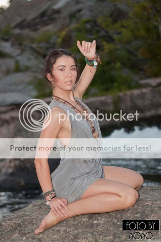
I lowered all the resolution to 800x5xx at 72 DPI for FB uploading purpose. (Yes 3rd is off focus from her face but the picture was so nice I had to keep it) And this is the girl who took the RAW images from me :)

Examples

IMG_7364S.jpg


IMG_7372S.jpg


IMG_7449S.jpg

photo.php
 
Poses all look a little forced on a part of the model.

1st photo seems a tad bit overexposed on the chest area however face looks good. Theres a strand of hair accross the cheek I'd clone out.

2nd images is my fav out of the three you've posted. Looks more natural and the lighting works wonderfully.

I'd crop tighter on the 3rd image. A bit too much emptiness on the top and the background seems a tad underexposed.

Looks like the lens is serving you well though! Wish I had one :(
 
thanks I will fix and I have another shoot coming up w/ her soon
 
Keeping print layouts in mind, you want her gaze across the open space, not looking out of the frame. Picture where the copy might go.
 
Keeping print layouts in mind, you want her gaze across the open space, not looking out of the frame. Picture where the copy might go.

Do you mean the ratio of the images? When I crop I usually do a 4 x 6 crop keeping print in mind. Thats why it's harder to crop something out of picture sometimes. Yeah, I'll post a few more later and I've got really great shots of her. I had her stay in one position and simply move her mouth around and eyes around for different looks.

No, not the ratio. In the first two images, the head is on the left side of the frame and she is looking off to the left. You would want her gaze to fall over the open space to the right or position her on the right side of the frame.
 
No, not the ratio. In the first two images, the head is on the left side of the frame and she is looking off to the left. You would want her gaze to fall over the open space to the right or position her on the right side of the frame.

Ohh I see what you mean. Yeah as I get better at it, I'll learn more about these details. I am gonna go to some local photo workshops soon.
 
I like the first two. Like mentioned, it would be better if she were looking the other way. You picked a good location. It's a nice neutral color and pleasing without being distracting.

#3 I can't say I care for. The sheen on her skin makes her look sweaty and uncomfortable. Also, I don't think you've got the horizon right. She appears to be tilted to the left.

Great shoot. I can see why you were willing to give her the RAWs, lol. :thumbup: You're getting pretty good at portraits. I wish I could say the same, lol. You said you're going to be doing more shoots with this model?

Hey thanks as usual! It's always good to hear from everyone because next time I know what to do and which way to shoot depending on her eyes.

Yup, I am going to do more shoots w/ her and this location is not far from where she lives so it's perfect. We only had a little more than hour to shoot there till it got dark and camera really couldn't see anything but her because of the flash.
 
Since you do not wish edits on you photos, I will link a crop of #1 HERE.

This to only give an idea what the members above were referring to about the framing. This positions her more to the right edge of the frame and places her left eye pretty close on the RoT intersect point. A bit more head room would've helped.

I also took the liberty to adjust the WB slightly to warm up the tone a bit and (poorly) removed the grass behind her.
 
Thanks kundalini! Yeah I'm not as anal about my photos being edited, just don't want like bunch of people start editing them. Has But I did appreciate your reference.
 

Most reactions

Back
Top