What's new

Shoreline for C&C

crimbfighter

Been spending a lot of time on here!
Joined
Jun 4, 2010
Messages
2,219
Reaction score
1,784
Location
Wisconsin, United States
Can others edit my Photos
Photos OK to edit
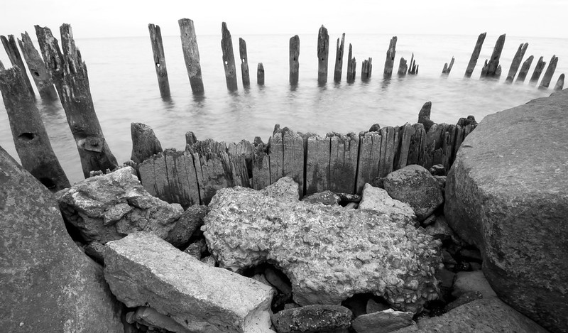
Two different orientations. I wasn't sure which one I liked better. C&C please. Something about the composition still isn't sitting quite right with me, but I can't put my finger on it.

1. Tokina 11-16mm @ 11mm, f/22, 1/2 sec, ISO low 1 (ISO 100 equivalent, I think, either way, lowest my camera can go)
Ideally I wish I had an ND filter, so I could have kept it around f/8, but without one, I was resigned to min aperture to get any measurable amount of creaminess in the water..
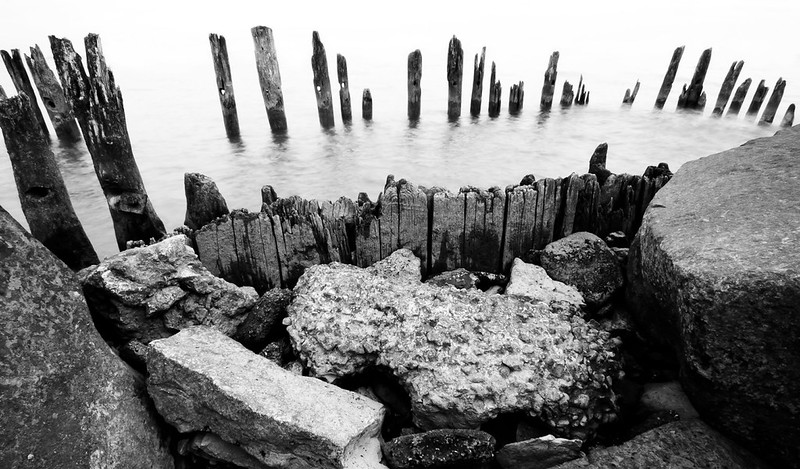
8115282516_d686c6063c_c.jpg


2. Same values as number one, just the different orientation and composition.
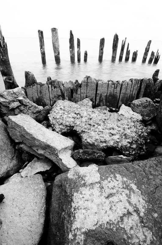
8115275557_34365ebed3_c.jpg
 
I favor the horizontal orientation--it is a shoreline shot. The composition is a good choice for b&w with the tonal ranges.

Yes, more softening of the water would be beneficial to counteract the harshness of the other elements.

Good shot.
 
The first is better, but it's not working for me because the posts on the left are cut off. It also looks a little light on the top, but that may just be the blindingly white background we have here - perhaps a dark frame?
 
It's an interesting classic close landscape shot in not easy lightning conditions. There is lost definition in deep shadows and the highlights. As for shadows it might be consider natural, highlights should not be completely blank. I don't know if this is possible with digital system but for the creamy water there is a trick used in film LF photography; instead of one very long exposure divide it into 15-30 single exposures and execute them on one frame with time intervals. In effect water will be creamy.
 
Thanks for the feedback, everyone.

KenC - I didn't even notice the posts being cut off when I was composing it, but you're right, it does cause an unbalanced feeling to the frame. Thanks for helping me put my finger on what was causing it. The top of the frame was completely blown out due to the horizon being very bright. The dark frame is a good idea. I think I'll even add a small black border a few pixels wide and see if it helps in digital form.

timor - Thanks for the suggestions. I wouldn't have even thought about stacking multiple exposures to get that effect. I think I'll try that. I see your point about lost detail in the shadows and highlights. I post process in Lightroom, but for this I had to export it to Photoshop to make a couple touchups before finishing it off back in Lightroom. When I brought it back into Lightroom, I think I ran another pass of increased contrast and brought the shadows down further with the tone curve. I'm thinking the second pass was too much and probably caused exactly what you're pointing out. Thanks again for the feedback!
 
Here is a re-edit where I leveled out the tone curve a bit, which brought significantly more detail to the shadows and highlights. It does flatten the image out a bit, thought. I also left the faint horizon in the background, which I initially thought hurt the image, but now I think it added some balance to the top of the frame.

Better?
8116853808_258c8b8bc1_c.jpg
 

Create an account or login to comment

You must be a member in order to leave a comment

Create account

Create an account on our community. It's easy!

Log in

Already have an account? Log in here.

New Topics

Back
Top Bottom