brujeria
TPF Noob!
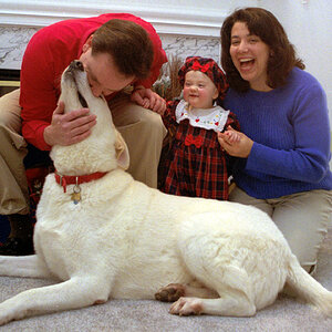
hello.... working (very slowly) on my webside, im picking out pictures
to place them side by side, sometimes it works with different subjects
sometimes it dont. i'v been looking at my pictures so long i turned "blind".
here is a few of them, what work, what dont...?
if you got the time to comment, thanks!
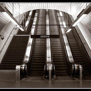
1

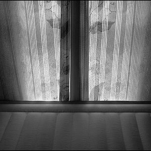
2

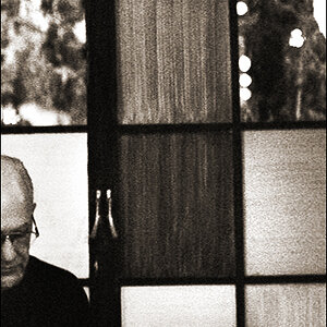
3

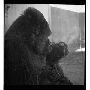
4

5

6

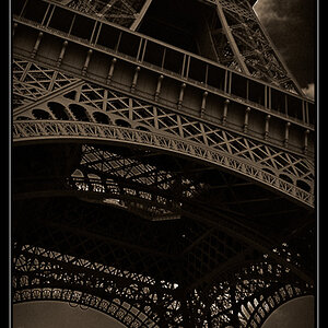
to place them side by side, sometimes it works with different subjects
sometimes it dont. i'v been looking at my pictures so long i turned "blind".
here is a few of them, what work, what dont...?
if you got the time to comment, thanks!
1
2
3
4
5
6