travelguy92
TPF Noob!
- Joined
- Oct 12, 2017
- Messages
- 45
- Reaction score
- 46
- Location
- Nashville, TN
- Can others edit my Photos
- Photos OK to edit
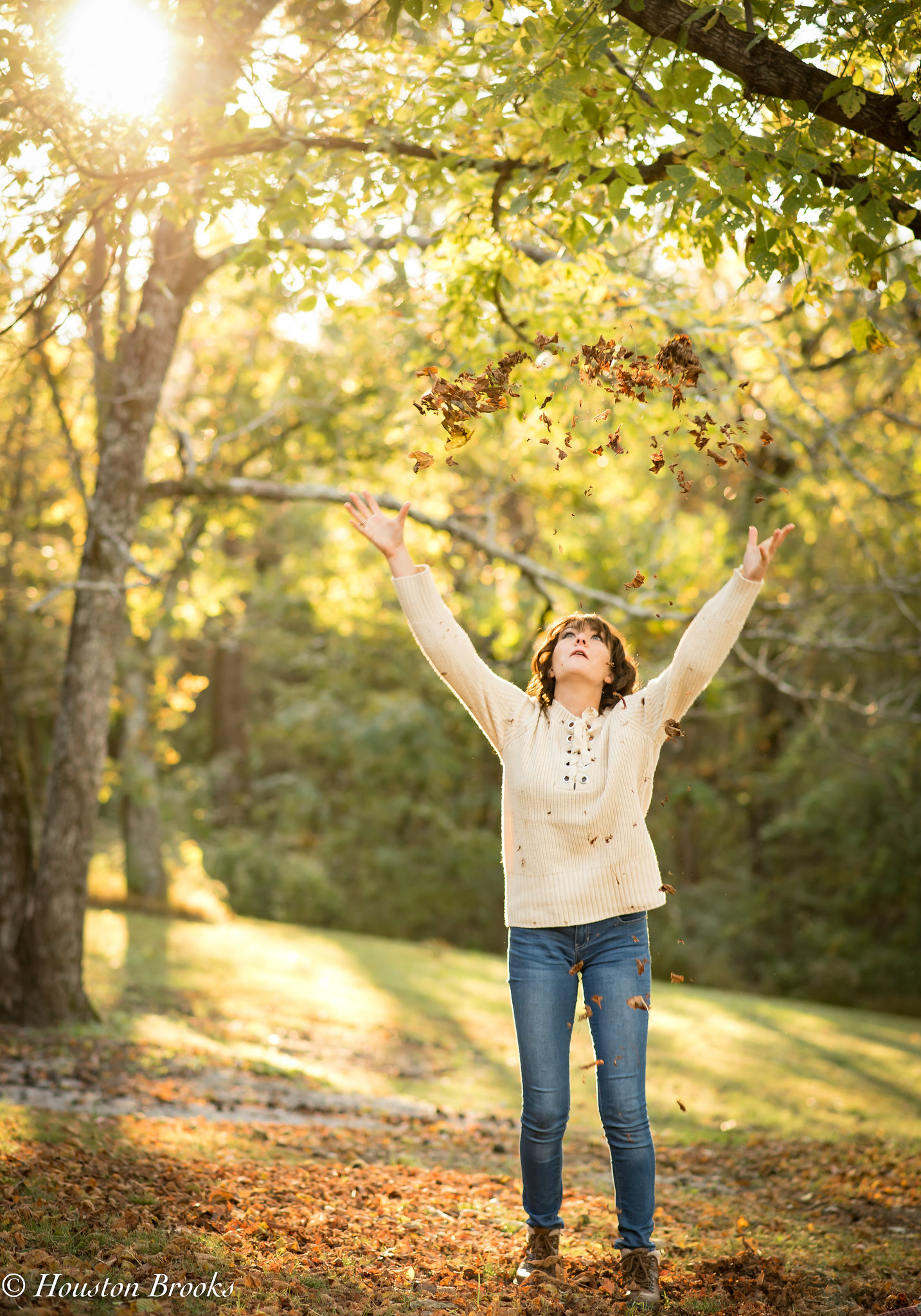
Did a senior session today with a young lady whom I have known for a lonnng time. We had a lot of fun on this shoot. I would love any critique/feedback that may come to your minds. This is a branch of photography that is still relatively new to me and im in the middle of a learning curve. Would appreciate any and all feedback!
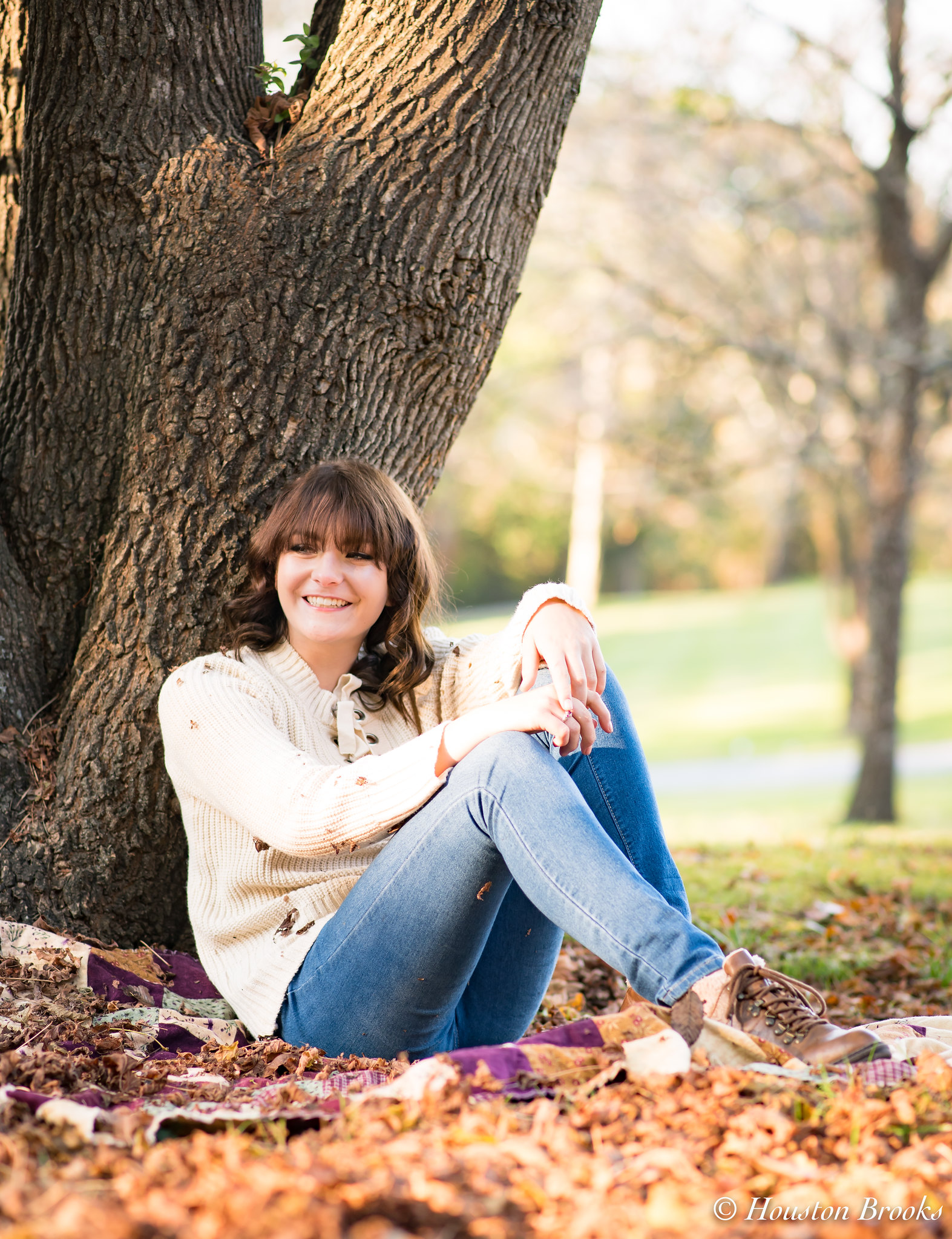
1.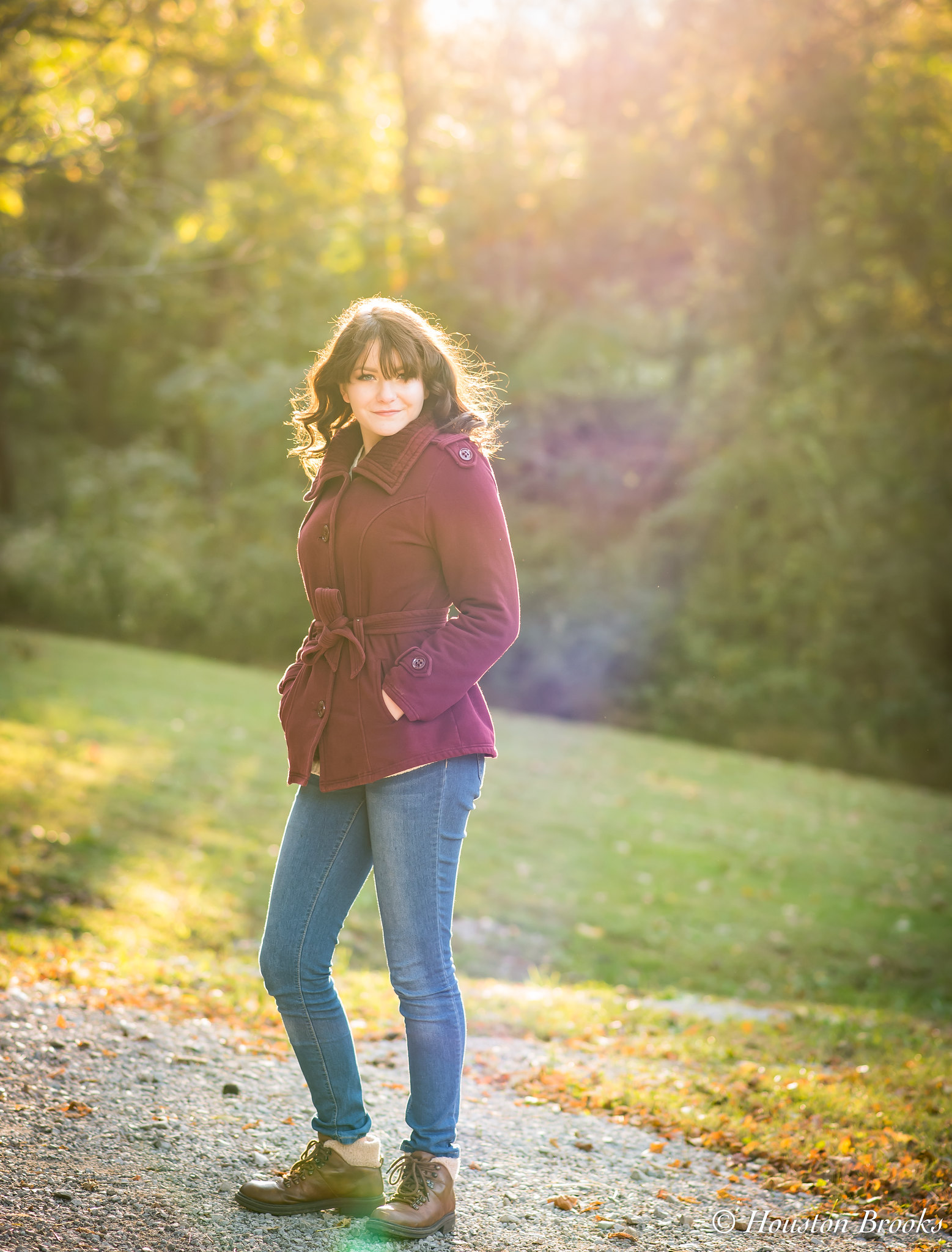 Sierra_23 (1 of 1) by Houston Brooks, on Flickr
2. Sierra_18 (1 of 1) by Houston Brooks, on Flickr
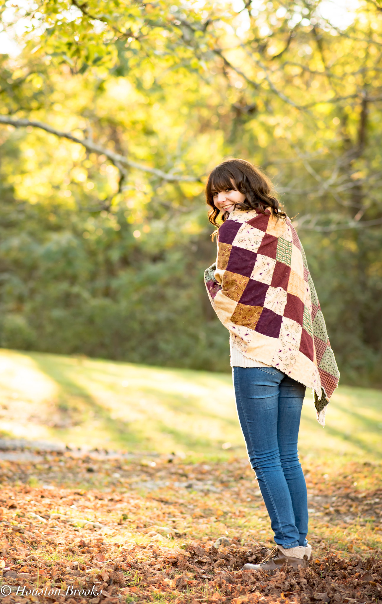
3. Sierra_16 (1 of 1) by Houston Brooks, on Flickr
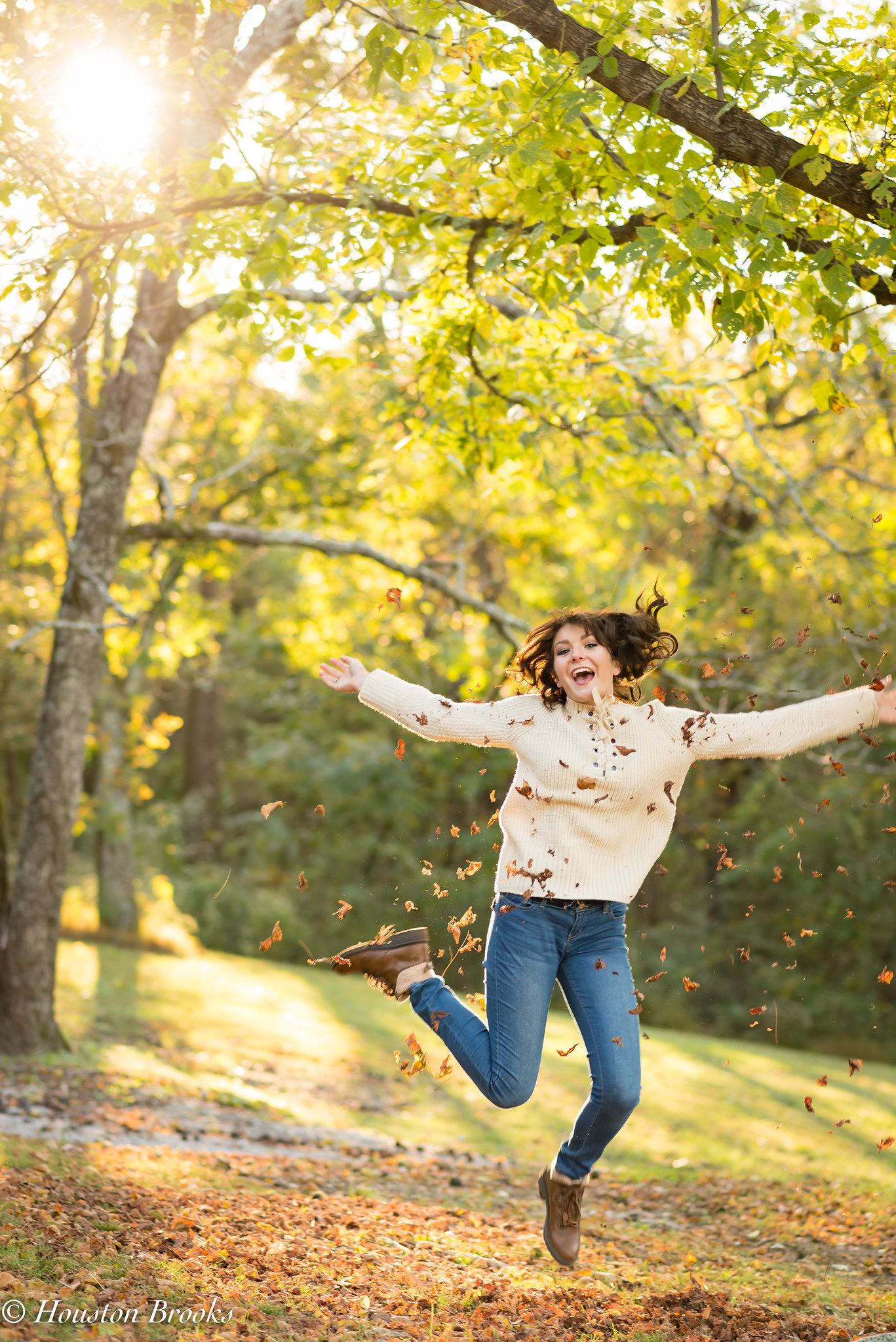
4. Sierra_13 (1 of 1) by Houston Brooks, on Flickr
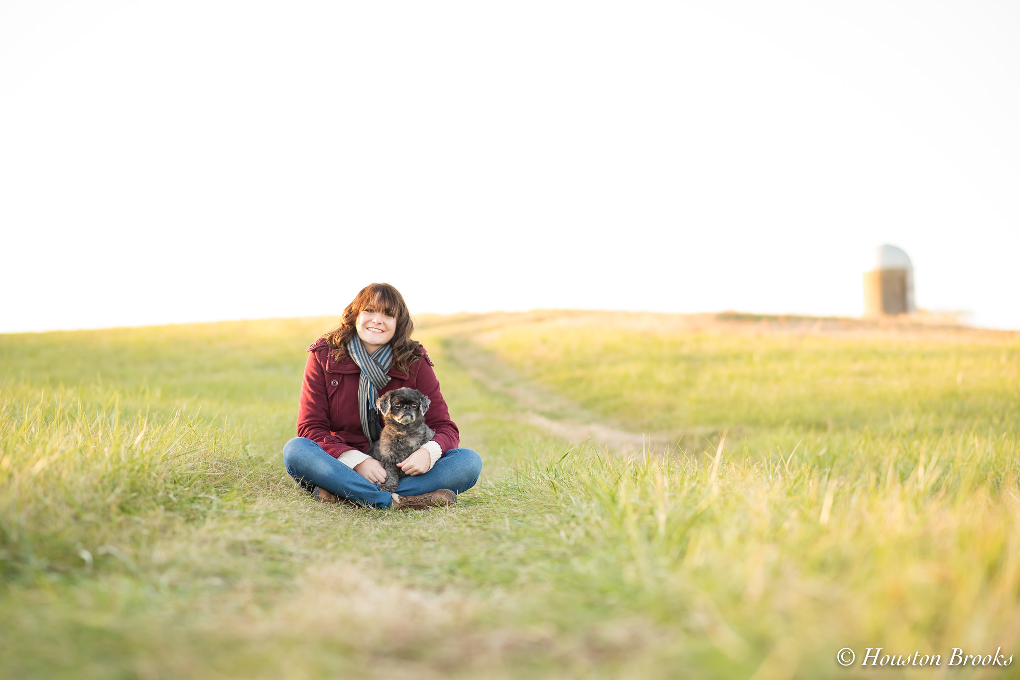
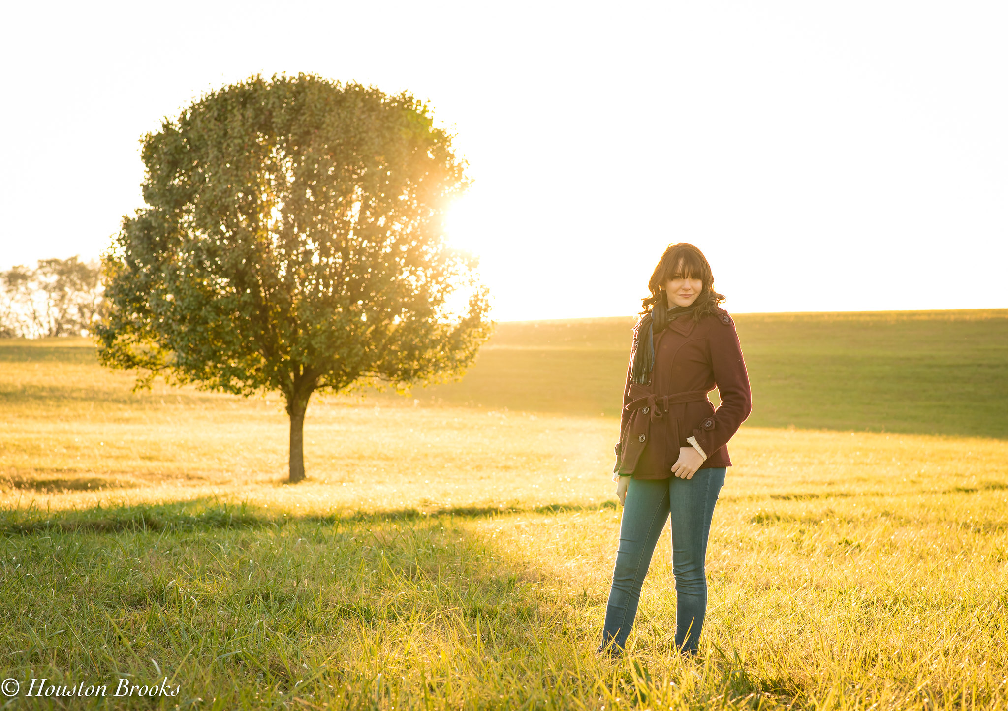
5. Sierra_11 (1 of 1) by Houston Brooks, on Flickr
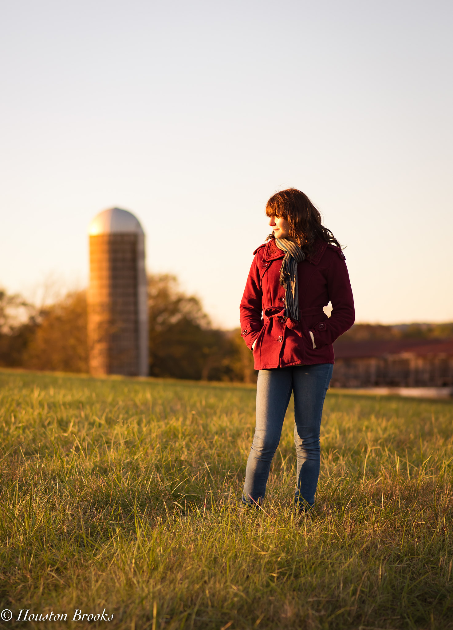
6. Sierra_10 (1 of 1) by Houston Brooks, on Flickr
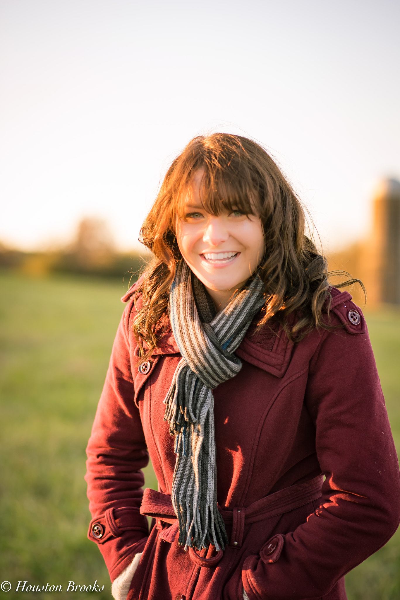
7. Sierra_6 (1 of 1) by Houston Brooks, on Flickr
8. Sierra_4 (1 of 1) by Houston Brooks, on Flickr
9. Sierra_2 (1 of 1) by Houston Brooks, on Flickr
ANNND an obligatory last photo of the pup, mostly because it was a great surprise shot
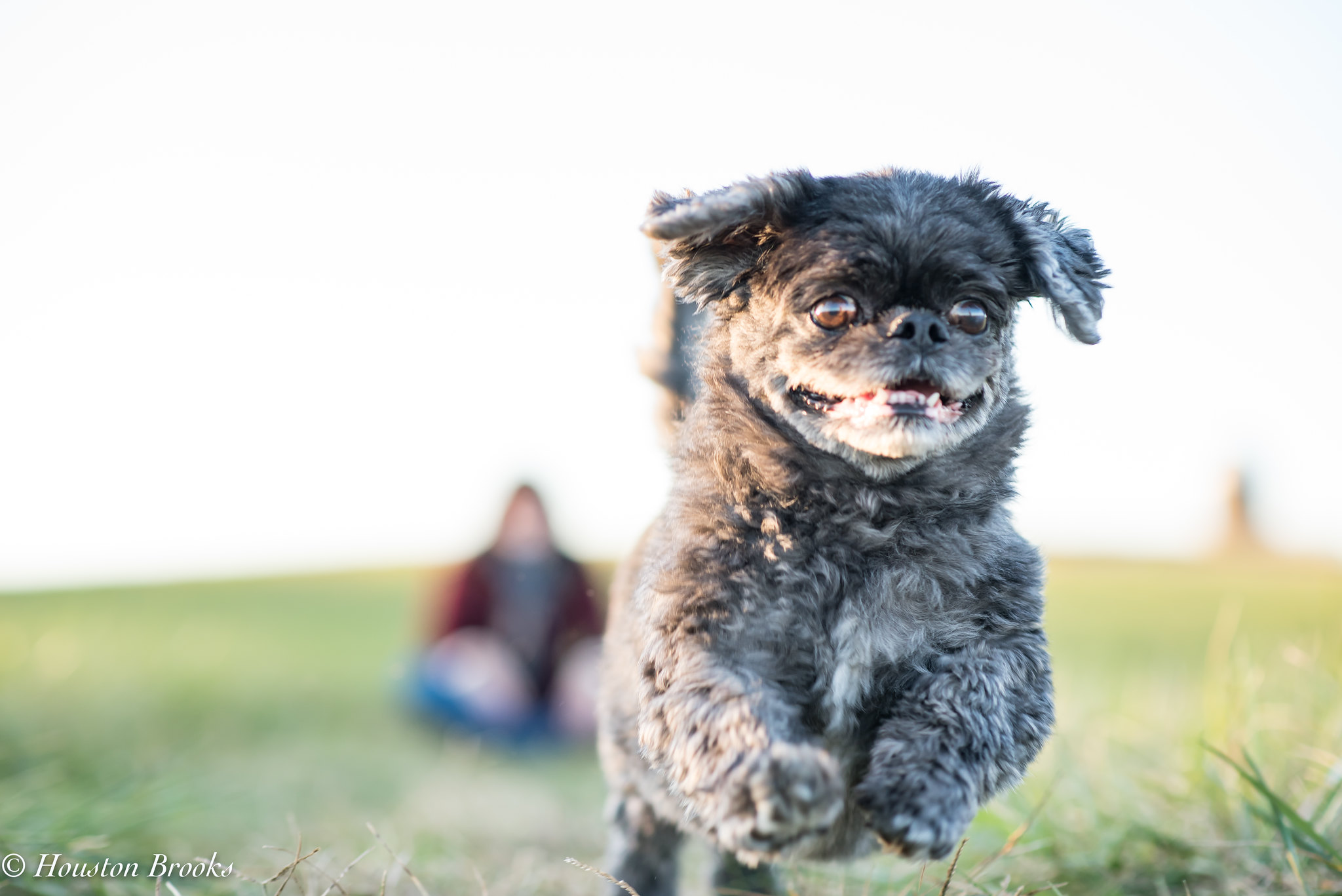 Chunky_02 (1 of 1) by Houston Brooks, on Flickr
1.
Sierra_23 (1 of 1) by Houston Brooks, on Flickr2.
Sierra_18 (1 of 1) by Houston Brooks, on Flickr3.
Sierra_16 (1 of 1) by Houston Brooks, on Flickr4.
Sierra_13 (1 of 1) by Houston Brooks, on Flickr5.
Sierra_11 (1 of 1) by Houston Brooks, on Flickr6.
Sierra_10 (1 of 1) by Houston Brooks, on Flickr7.
Sierra_6 (1 of 1) by Houston Brooks, on Flickr8.
Sierra_4 (1 of 1) by Houston Brooks, on Flickr9.
Sierra_2 (1 of 1) by Houston Brooks, on FlickrANNND an obligatory last photo of the pup, mostly because it was a great surprise shot
Chunky_02 (1 of 1) by Houston Brooks, on Flickr


