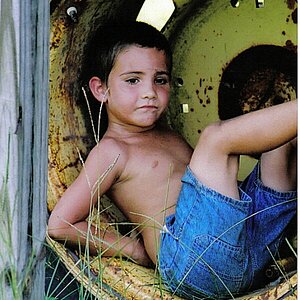
Agree with Mully...even cropping out the hills and sky. It makes a lovely graphic image. I like the figure in the position it is in now once the image is cropped. Without the crop, I want the figure to be symetrical, maybe with back to us on the jetty, looking out over the water.
Any which way, it's a great image, and the conversion is super.




 . I see what you're saying. Maybe it's not coming together as smoothly as I would have hoped.



![[No title]](/data/xfmg/thumbnail/32/32943-1a3c3a399438cf2fc6a21415e9bdedcf.jpg?1734162774)
![[No title]](/data/xfmg/thumbnail/37/37124-e3a7364a555409b3504415a982f9dfe0.jpg?1734169833)
![[No title]](/data/xfmg/thumbnail/33/33023-51777cffdd160249e68e593d19942418.jpg?1734163011)
![[No title]](/data/xfmg/thumbnail/33/33025-0e4fc16dd87a477880f7aa74466d4f56.jpg?1734163021)