Silica

pgriz

Been spending a lot of time on here!
Joined
Jul 30, 2010
Messages
6,734
Reaction score
3,221
Location
Canada
Can others edit my Photos
Photos OK to edit
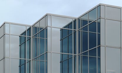
They're growing giant crystals in my part of the world. I passed a set poking out of the ground and liked the way the light played upon them. Whaddayathink?

(oh, and if you've followed Lew's thread... critique away! I can see at least three issues that could be "fixed", but I welcome your opinion, informed or otherwise :D )
$Silica Crystals_9920.jpg

T1i+EF 24-105 f/4 at 60mm, ISO 400, f/8, 1/20 sec; curves, sharpening, perspective correction in Elements 12.
 
Wow, what an awesome find!! All those lines and angles are just yummy! The tonal color changes really brings the whole shot together. =) Great stuff!
 
"I like it, pgriz!"

I'm totally diggin' the decreasing amount of space at the tops of the buildings as the shot moves from left to right. I like the compositional style, the "as in a painting" style, in which the subject matter touches at least three sides of the frame, filling the "canvas" with solid subject matter and very,very little negative space.

And to think, this was shot with a modest T1i, not a 5D-III; shot with a zoom lens, not a fancy tilty-shifty prime, with, gasp!!, digital distortion correction done in Elements, instead of you dropping $1999 for a fancy Canon PC correction lens! Tongue firmly planted in cheek on this last mini-paragraph.

When I was a kid, I never really appreciated this type of modern mostly-glass architecture; I grew up in a mostly bricks- or wooden, stick-built architecture part of the world.
 
(oh, and if you've followed Lew's thread... critique away! I can see at least three issues that could be "fixed", but I welcome your opinion, informed or otherwise :D )
see this is the instance when I want to say more than "I like" but I just can't... I'm stuck with "I like" and "I would like to see this in BW". If I took this photo my choice would be bw here.

I like your way of commenting on photos, and because I got some really nice feedback from you I would like to give you something more than "I like, I like in bw" but I just don't have enough of words to make my comment a bit better. Talking about lines, tones, reflections, noticing all this... Will you get my point even if I'm not capable of giving you my thoughts in a nicer way?

eta: I would correct the building on the right just a bit more
 
Last edited:
It may or may not be fun to go back at different times to see different reflections in the glass. I also would like to see if it works in black and white.
 
"I like it, pgriz!"

I'm totally diggin' the decreasing amount of space at the tops of the buildings as the shot moves from left to right. I like the compositional style, the "as in a painting" style, in which the subject matter touches at least three sides of the frame, filling the "canvas" with solid subject matter and very,very little negative space.

And to think, this was shot with a modest T1i, not a 5D-III; shot with a zoom lens, not a fancy tilty-shifty prime, with, gasp!!, digital distortion correction done in Elements, instead of you dropping $1999 for a fancy Canon PC correction lens! Tongue firmly planted in cheek on this last mini-paragraph.

When I was a kid, I never really appreciated this type of modern mostly-glass architecture; I grew up in a mostly bricks- or wooden, stick-built architecture part of the world.

Thank you, Derrel! It's a building that I go by quite often, but on this day the way the light fell on it made me stop. Being reflective glass, there are times when you can see directly inside, and other times when it's pretty much opaque. It becomes more interesting when you can't see the interiors, and the exterior surfaces play. It also happened during the "golden hour" and the light was both warm and even. As for the choice of composition and framing - it took a bit of hunting around to eliminate the distractions (a big corporate sign on one of the faces, another corporate sign at the front, some reflections from rather bland buildings, etc.).

(oh, and if you've followed Lew's thread... critique away! I can see at least three issues that could be "fixed", but I welcome your opinion, informed or otherwise :D )
see this is the instance when I want to say more than "I like" but I just can't... I'm stuck with "I like" and "I would like to see this in BW". If I took this photo my choice would be bw here.

I like your way of commenting on photos, and because I got some really nice feedback from you I would like to give you something more than "I like, I like in bw" but I just don't have enough of words to make my comment a bit better. Talking about lines, tones, reflections, noticing all this... Will you get my point even if I'm not capable of giving you my thoughts in a nicer way?

eta: I would correct the building on the right just a bit more

Mmaria, any comment from you is a gift. So thank you. As for the perspective correction - that's a bit of a dilemma. I was surprised to discover that straightening the outside lines didn't guarantee that the inside lines would also straighten out. In the end, I decided that make sure that the outside lines, being closest to the straight edges, should be the priority. As for B&W, I'm going to have to figure out how to do this. I have rather basic processing tools (Elements 12), and will need to look into how to do B&W conversions.

It may or may not be fun to go back at different times to see different reflections in the glass. I also would like to see if it works in black and white.

Thank you, EOV for your comments! As I noted to my reply to Derrel, this building takes on very different appearances as the direction of light changes. It was the reflective opacity that happened at that particular time, that transformed it into the giant crystals. But you are right, it's certainly worth keeping an eye on for other interesting appearances. As for B&W, as I replied to mmaria, I haven't done these yet, and will need to figure out how.
 
Mmaria, any comment from you is a gift. So thank you. As for the perspective correction - that's a bit of a dilemma. I was surprised to discover that straightening the outside lines didn't guarantee that the inside lines would also straighten out. In the end, I decided that make sure that the outside lines, being closest to the straight edges, should be the priority. As for B&W, I'm going to have to figure out how to do this. I have rather basic processing tools (Elements 12), and will need to look into how to do B&W conversions.
see again....
I have no powers to say something that nice.... thank you, you're too sweet :blushing:

as for straightening... I like pp, but one of the things I don't like the most is straightening lines. It's a pain!
 

Most reactions

New Topics

Back
Top