What's new

Simply Lake Huron

PixelRabbit

A naughty little bunny...
Joined
Nov 28, 2011
Messages
6,593
Reaction score
3,719
Location
Ontario
Can others edit my Photos
Photos NOT OK to edit
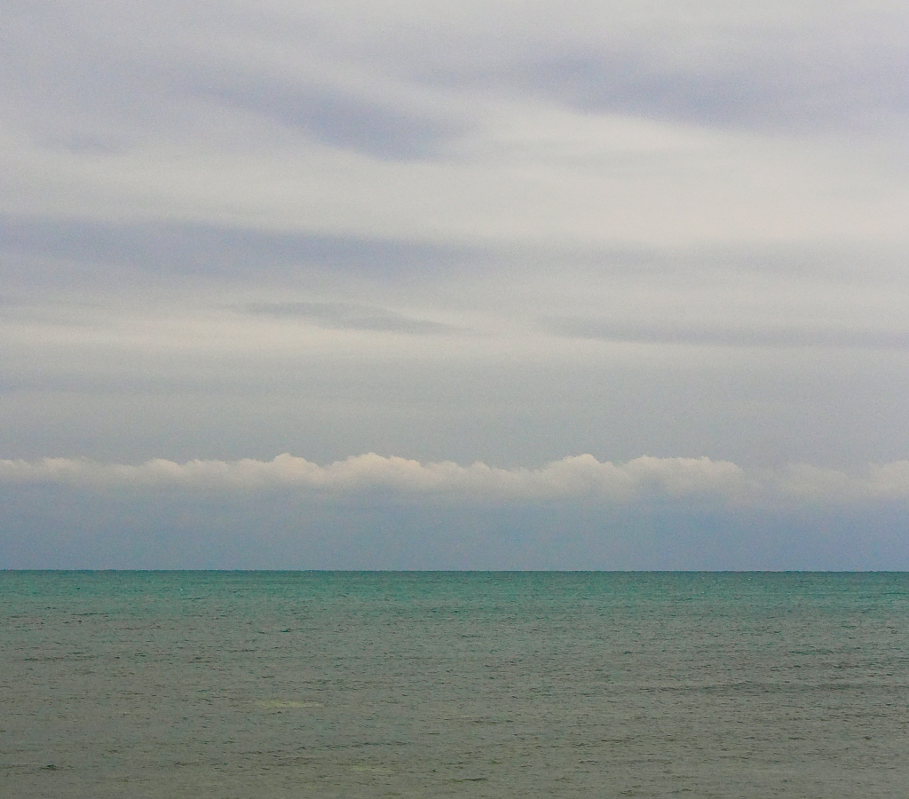
This is a shot I took on a dreary day at the cottage, I took many with the shoreline included but the light was just flat. I liked the muted colours so I cropped the shore out of this one.
I'm normally partial to rich vibrant colours so this is a different feel for me.
I like the simplicity of the shot.


Would love to hear your thoughts!

IMG_0341 by Judi Smelko, on Flickr
 
I also like the simplicity! The best thing about this is the cloud above the sea that runs parallel, it's pleasing on the eye!
 
Well, it's good good balance and a formal compositional style. It doesn't "do" anything positive or good for me, at a visceral or emotional level though. I can recognize it for what it is, but it has about as much appeal as a butterknife. It's utilitarian. Simple. Plain. I've fished on Lake Huron. I've been there. This photo conveys that massive, empty, Great Lakes kinda' feeling. It has a rather "detached" and "dispassionate" feeling to it; a sort of modern landscape type of emptiness, or a feeling of a dry, distant "observation" of the landscape. This photo looks almost like some kind of album cover artwork shot for some trippy, downer-music band. I'm not saying this is a bad photo, but rather am trying to give my impression of the feelings I get when I look at it. The fact that you can see, shoot, and present this photo in this manner tells me that you are conversant in this type of cultural observation, this aspect of the modern visual language that we in western culture have. So...there ya go. That'll be $5.
 
Derrel said:
?.. it has about as much appeal as a butterknife. That'll be $5.

$5 to tell her it has the appeal of a butter knife, I need that job. ;)
 
Strange, but I kind'a like it, and I don't even know why :confused:

We certainly can't accuse it of being too busy, and yes the horizon is level and making good use of my personal favorite... The rule of thirds.

I think I like the peaceful, calming affect.
 
Strange, but I kind'a like it, and I don't even know why :confused:

We certainly can't accuse it of being too busy, and yes the horizon is level and making good use of my personal favorite... The rule of thirds.

I think I like the peaceful, calming affect.

It's like visual Valium, eh?
 
Thanks everyone!
Derrel, I love it when you ramble! I will gladly pay you Tuesday for your C&C today ;)

Rick, that is totally cool that it makes you stop and wonder why you like it. I actually felt the same when I was working on it, I was really liking it and couldn't justify why, I think Derrel hit the nail on the head in his post, it's like visual Valium!
 
Bah. What does Derrel know? ;) Now, I look at that and I love the simplicity. The two elements of antiquity meeting together. In fact, I would consider putting the horizon smack dab in the middle (yes, the horror! :shock: ) just to emphasize the symmetry. Part of what makes the image interesting for me is the colour transition of the water at the horizon. Call this visual comfort food. :D
 
Very similar to "Rhein II".
 
Thanks everyone!
Derrel, I love it when you ramble! I will gladly pay you Tuesday for your C&C today ;)

Rick, that is totally cool that it makes you stop and wonder why you like it. I actually felt the same when I was working on it, I was really liking it and couldn't justify why, I think Derrel hit the nail on the head in his post, it's like visual Valium!

I think the reason I like it is because it hits home for me. I'm a Chesapeake Bay boater, and looking at your photo reminds me of many mornings climbing out of the cabin and sitting in the cockpit watching the morning unfold. Sometimes less is more.
 
Bah. What does Derrel know? ;) Now, I look at that and I love the simplicity. The two elements of antiquity meeting together. In fact, I would consider putting the horizon smack dab in the middle (yes, the horror! :shock: ) just to emphasize the symmetry. Part of what makes the image interesting for me is the colour transition of the water at the horizon. Call this visual comfort food. :D
Thanks Pgriz :) I actually did mess with it with the horizon in the middle and I felt like there was way too much texture on the bottom half and it just took over the image but it was a cool take on it in a very different way. I too love the turquoise transition, that is actually what kept me working at finding the image hidden in the set (I had written the set off for a while but didn't delete it because there was "something" right in them.
Very similar to "Rhein II".
Ok I just googled that, saw the picture, yes quite similar! Saw what it sold for .... :shock: ...
Thanks everyone!
Derrel, I love it when you ramble! I will gladly pay you Tuesday for your C&C today ;)

Rick, that is totally cool that it makes you stop and wonder why you like it. I actually felt the same when I was working on it, I was really liking it and couldn't justify why, I think Derrel hit the nail on the head in his post, it's like visual Valium!

I think the reason I like it is because it hits home for me. I'm a Chesapeake Bay boater, and looking at your photo reminds me of many mornings climbing out of the cabin and sitting in the cockpit watching the morning unfold. Sometimes less is more.
Ah that makes sense Rick! Probably anyone who has spent time on big water will feel at least a familiarity with this kind of shot I think.
 
Would love to hear your thoughts!

I like it too, but I'd like it even better with about one-fourth of the sky cropped off the top. Try it!
 

Create an account or login to comment

You must be a member in order to leave a comment

Create account

Create an account on our community. It's easy!

Log in

Already have an account? Log in here.

New Topics

Back
Top Bottom