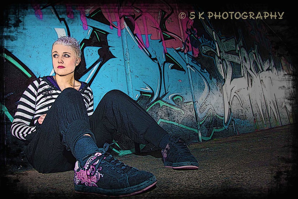
I like the graphic simplicity of the first shot, but I wish there was just a little bit more of the front edge of the board visible. Maybe you could enlarge the canvas a little bit on the left side?? I dunno...the boarder is visually slamming into the left hand side of the image. Still, I like the treatment you've gone with--it looks good. The girl--doesn't work for me. She looks upset, or avoidant, she has no board, and it doesn't make sense to me,and the huge size disparity betwen her closest foot and her other foot caused by such a short focal length so close to her and her extended foot--that degree of foreshortening looks awkward and weird in this instance.
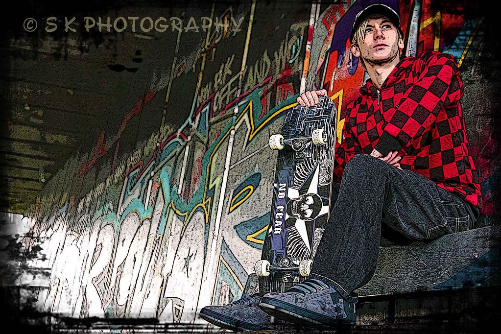
The guy with the checked shirt--I like that shot more than the middle one. Mainly because he has a board with him! I also like the border effects used in the shot. Overall, I am not sure why he is looking out of the frame,and I think there's too much negative space to the left of the frame,and not enough for him to "look into" on the right hand side. So, in a way, the first photo and the third photo share the same imbalance, and the middle photo too--all have the direction of subject 'movement' or subject gaze abruptly curtailed by the side of the frame. I LOVE your post processing treatments on all three of these, but the compositions need more room for the subjects to either move into, or to look into.
A fun exercise would be to move shot 3, of the guy looking to the right, to the left hand side of shot two, of the girl looking to the left, and then see how the large expanses of negative space opposite their line of gaze looks.
Just sort of a thought problem,as it were.


")


