This is a toughie because I think these fail on a lot of points.
What a picture 'means' to a viewer depends on there being enough content in the image and enough shared ideas/knowledge with the viewer that the concept of the photographer comes across.
Beyond that the picture must be edited so that the viewer sees what the photographer wants the viewer to see. The viewer might be unknowing or confused as to the real meaning but they really must know where to look.
So, the viewer sees in two dimension what the photographer has presented and the first thing the viewer does is true to parse the elements in the picture; he/she tries to decide what is important and what is not. The photographer uses composition, placement, colors, tone, every item to guide the viewer. The role of everything done after the shutter button is pressed is to maximize important stuff and minimize unimportant stuff so that the viewer is guided to the impressions the photographer wants.
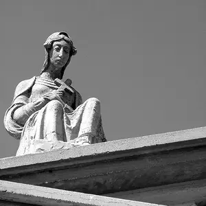
Looking at #1 and #3, we see a similar and large background so I must think that the background is important. In the first picture the female figure seems completely neutral, no expression, no definition and she is rendered in such dull, boring tones that I can't understand why she is there, what she or you might be thinking.
#3 has much more emotion in the figure, much more tension and I can see the dichotomy between the praying hands and the strained look on her face as she looks away but the composition fails here. You include fragments of text that don't mean anything. Yes, they give us a hint that this may be Atlanta but so what. Knowing it is Atlanta doesn't add and deciphering the text draws attention.
The praying hands are clipped - does that mean they aren't important compared to her bag and pants that you included?
Plus her pocketbook sticks out and her loud patterned pants draw attention. (and her arm is brighter than her face and draws attention.)
Force the viewer to see what you are thinking with the elements as important as you think of them.
A different framing would make the praying hands much more of an addition than a distraction and her look would contrast with the image of the hands.
#2 – misses for me entirely.
Her face dissolves into the background and is wayyyy too small in the frame for me to understand that's what you want me to see. The red pants draw my eye, a total distraction and a tone that fights what you said you were thinking, and I don't get what you are trying to show. A change in position to outline her face against the background might have made this effective.