Tim Tucker
No longer a newbie, moving up!
- Joined
- Mar 23, 2015
- Messages
- 660
- Reaction score
- 579
- Can others edit my Photos
- Photos NOT OK to edit
Here we go again, Tim's off on one... 
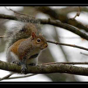
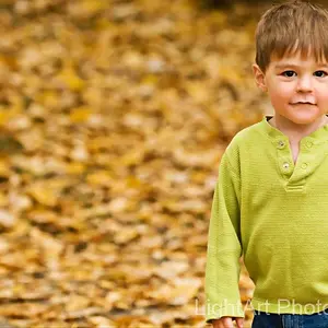
I'd just like to show you something. Just look at the images and ask, "why does the same thing look different depending on the ground it's against?"
Brightness is a property of colour. Therefore contrast is not separate from colour but inseparable from colour. It's not about a separate black and white element in your images but part of the way colour works.
Things are not absolute.
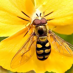
Here is the orange from the flower in your second image. But I've isolated it and placed it against a different grounds at the extremes of the scale available:

Yes, it's exactly the same orange in both middle squares.
Now you may look at it and say that contrasting against black brings out the colour. I would say that the colour is 91% saturated and 87% bright anyway, do you really need to contrast it against the extreme of scale to make it look bright and vibrant?
I would also say that against the white you could use a brighter and less saturated colour and make it look better than the more vibrant colour against black. At 81% saturation and 95% brightness:

Does it really change much against the black compared to the white?
Here it is again against colour, the same orange. This time though I've placed it against the same hue with the same saturation. Only the brightness varies. This is purely to show how changing the relative brightness between two colours affects the impression of colour. Yes, you may say, but in digital editing it's done all the time. Many of the common sliders equalise the values through an image. You bring shadows up and highlights down towards the same range of brightness, you bring colours towards the same range of brightness. I'm just trying to give visual examples of how levels of brightness and distribution of contrast affect colour:

So the point? It's not a case of how can we edit the image, but how we can light it to bring the variations in brightness between colours that would make them stand out more. Editing alone doesn't really do this, but I think illustrates how balance can affect colour, open them in separate tabs and flick between the two:

I'd just like to show you something. Just look at the images and ask, "why does the same thing look different depending on the ground it's against?"
Brightness is a property of colour. Therefore contrast is not separate from colour but inseparable from colour. It's not about a separate black and white element in your images but part of the way colour works.
Things are not absolute.
Here is the orange from the flower in your second image. But I've isolated it and placed it against a different grounds at the extremes of the scale available:
Yes, it's exactly the same orange in both middle squares.
Now you may look at it and say that contrasting against black brings out the colour. I would say that the colour is 91% saturated and 87% bright anyway, do you really need to contrast it against the extreme of scale to make it look bright and vibrant?
I would also say that against the white you could use a brighter and less saturated colour and make it look better than the more vibrant colour against black. At 81% saturation and 95% brightness:
Does it really change much against the black compared to the white?
Here it is again against colour, the same orange. This time though I've placed it against the same hue with the same saturation. Only the brightness varies. This is purely to show how changing the relative brightness between two colours affects the impression of colour. Yes, you may say, but in digital editing it's done all the time. Many of the common sliders equalise the values through an image. You bring shadows up and highlights down towards the same range of brightness, you bring colours towards the same range of brightness. I'm just trying to give visual examples of how levels of brightness and distribution of contrast affect colour:
So the point? It's not a case of how can we edit the image, but how we can light it to bring the variations in brightness between colours that would make them stand out more. Editing alone doesn't really do this, but I think illustrates how balance can affect colour, open them in separate tabs and flick between the two:


![[No title]](/data/xfmg/thumbnail/40/40301-fa48a5125a6849a0a400dff1599c4b30.jpg?1734174710)
![[No title]](/data/xfmg/thumbnail/30/30887-70db98f68651b2f6c62119e611f707c0.jpg?1734158896)
![[No title]](/data/xfmg/thumbnail/40/40302-79b0636c0b67a1ed65f8ad9e01c690e7.jpg?1734174711)
![[No title]](/data/xfmg/thumbnail/35/35878-753a9d58c095f0e1aaa96d03c025f6ce.jpg?1734167627)
![[No title]](/data/xfmg/thumbnail/35/35879-b9a5a75c88f724f404f976b0c0e67dbd.jpg?1734167633)