Navigation
Install the app
How to install the app on iOS
Follow along with the video below to see how to install our site as a web app on your home screen.

Note: This feature currently requires accessing the site using the built-in Safari browser.
More options
You are using an out of date browser. It may not display this or other websites correctly.
You should upgrade or use an alternative browser.
You should upgrade or use an alternative browser.
Some flowers and stuff
- Thread starter amolitor
- Start date
ronlane
What's next?
- Joined
- Aug 3, 2012
- Messages
- 10,224
- Reaction score
- 4,961
- Location
- Mustang Oklahoma
- Website
- www.lane-images.com
- Can others edit my Photos
- Photos OK to edit
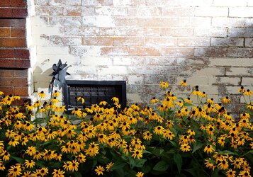
It looks to me like you were still shooting down on the flowers. Would the perspective be better having set the camera on the ground and shooting up at the flowers? I think everything is there for an interesting picture though.
Derrel
Mr. Rain Cloud
- Joined
- Jul 23, 2009
- Messages
- 48,225
- Reaction score
- 18,941
- Location
- USA
- Website
- www.pbase.com
- Can others edit my Photos
- Photos OK to edit
I really like the way the highlights in this photo have been rendered. The shadow play from the iron flower on the white bricks is a delightful detail. The slight diagonal shadow on the wall seems like an important element, yet another clue as to the angle the sunlight was coming in at. But what bugs me, what really prevents this shot from totally singing, is the way the shadowed area is rendered--just too light, too transparent. The flowers across the bottom are nice, but this just doesn't seem to be rendered naturally...it seemed to me to be manipulated a bit too much toward an open, light look, and the way the highlights are wayyyy up there, this just seems,well, "wrong". Not enough contrast between the shadow values and those lovely, bright, delicate highlights on that whitewash. It's not that every shot needs to be rendered in a realistic style, but this shot is very much an observation about light, and here the light just looks like it's been manipulated in such a way that the light does not seem authentic.
amolitor
TPF Noob!
- Joined
- May 18, 2012
- Messages
- 6,320
- Reaction score
- 2,131
- Location
- Virginia
- Can others edit my Photos
- Photos OK to edit
This is actually an experiment, which may explain some of your concerns.
I've seen this display for a few weeks now, but it was flat. What it needed, I decided, was a shadow. Since that particular wall is in fact in indirect sunlight all day long, I made myself a shadow. That's a Vivitar 285 and a cardboard box The shadow is thus quite "open". Also, I completely failed to do a few things in post that I meant to do..
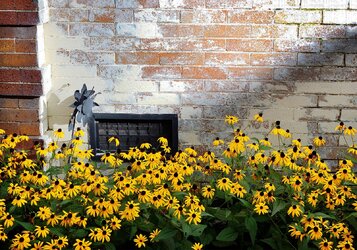
Here's a rework based on your various suggestions, and also some stuff I meant to do but forgot:
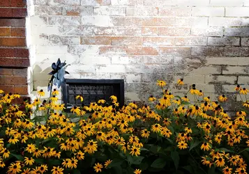
I've seen this display for a few weeks now, but it was flat. What it needed, I decided, was a shadow. Since that particular wall is in fact in indirect sunlight all day long, I made myself a shadow. That's a Vivitar 285 and a cardboard box
Here's a rework based on your various suggestions, and also some stuff I meant to do but forgot:

Last edited:
KenC
Been spending a lot of time on here!
- Joined
- Jan 18, 2010
- Messages
- 5,700
- Reaction score
- 1,472
- Location
- Philadelphia
- Can others edit my Photos
- Photos NOT OK to edit
I actually don't see much difference between the original and the last post, but I haven't downloaded them and put them side by side. In any event, I like the composition of this a lot. The shadow line is in just the right place, both relative to the lighter bricks and in intersecting the window. This just wouldn't work without that shadow. I think I'd prefer it without the unpainted part of the wall along the left edge, which just doesn't seem to fit in as far as I can tell.
amolitor
TPF Noob!
- Joined
- May 18, 2012
- Messages
- 6,320
- Reaction score
- 2,131
- Location
- Virginia
- Can others edit my Photos
- Photos OK to edit
My changes were fairly minor, the overall structure of the picture is obviously the same.
I liked Chris's take on the wall, so I brought back some of the texture and color in the unpainted sections of brick, I thickened up the shadow a bit to make it more credible per Derrel, and then I tried to make that black metal flower thing pop a bit more. Darker metal, lighter background. The shadow was specifically cast to lead there, since it's an obvious focal point.
Having seen the first one, the edit isn't going to read that much differently, but I like to imagine that the edit would read better if seen by itself.

