They're all on there. For the landscape ones, I used P and the landscape mode. I was playing around with ISO and exposure for about 45 minutes which is why there are 3/4 ones of the same picture, just slightly different. For the car ones, I used a tripod and P mode, again, playing with settings.
I think 1 is spectacular. The wires are unfortunate, though you might be able to remove those if you get an editing tool. (photoshop, gimp...)
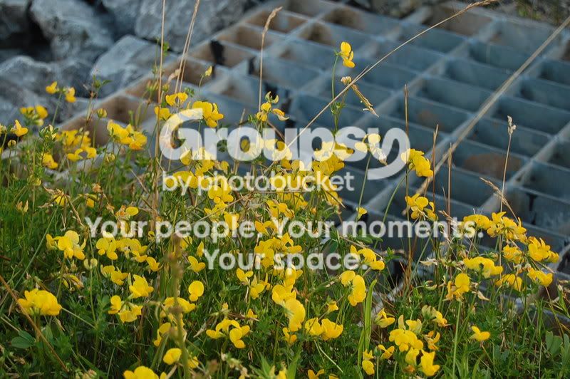
2 was kinda neat for me, but I suspect some might complain that you lack a subject in some ways. The shot isn't interesting, I guess, but it appeals to me anyway. I'm a bad judge on this because I seem to like shots that most people find almost offensively dull. (I'm not saying yours is... just many of mine are.)
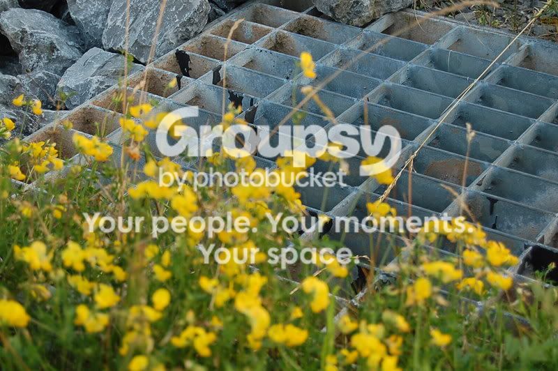
I don't think 3 worked as well as 2... the switch of focus is interesting, but in this case with this composition it makes it look like you made a slight focusing error. The flowers are clearly the primary thing to look at here, imo.
I actually thought 1 was horrible . Just because where it's black, is where the trees were supposed to be like in 4 and 5. The camera focused on the sun so it blacked out everything below the horizon. But now that you mention it, it actually does look really nice.
I had a feeling 2 and 3 weren't great. I just wanted to try a close-up shot and flowers were the only thing within 100 feet of me lol. And that storm drain.
And I just like how 4 and 5 turned out since you can actually see below the horizon. Though I prefer 4 over 5 with the whole 2/3 composition thing.
All a matter of preference. People around here will give you all kinds of critique... some helpful, some not. ...but if you like it, you like it. Be proud of what you've got.
I see why you would like the one where you can see the trees more. Others, I'm sure, would agree. I happen to like the more dramatic version, but both are nice.



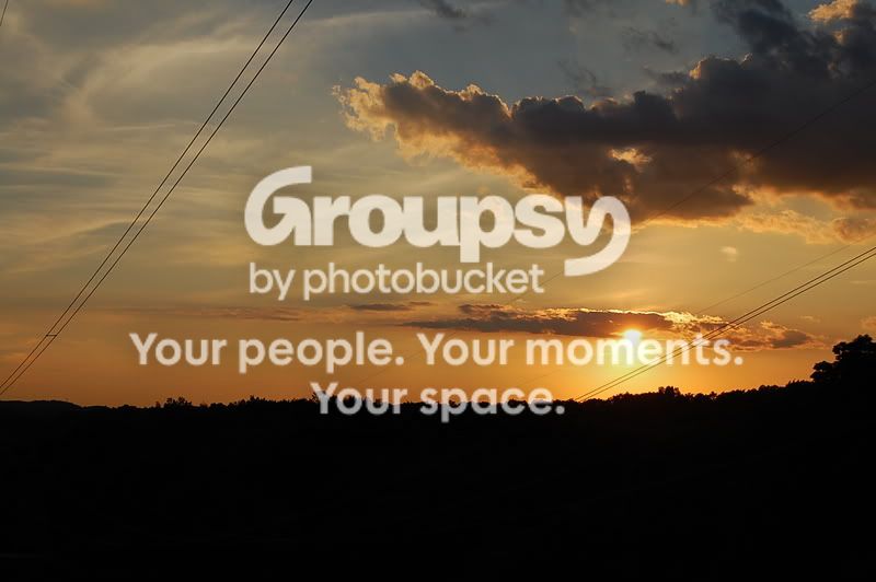
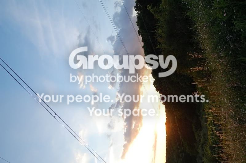


 . Just because where it's black, is where the trees were supposed to be like in 4 and 5. The camera focused on the sun so it blacked out everything below the horizon. But now that you mention it, it actually does look really nice.