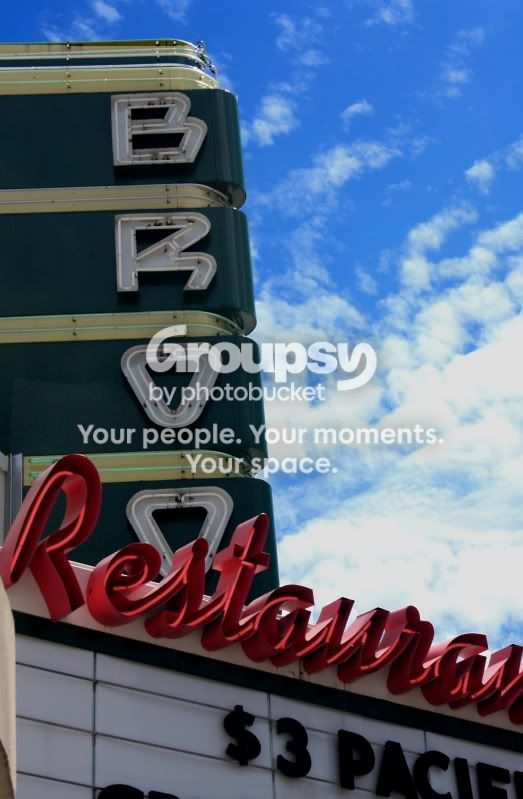
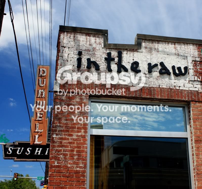
1. Framing is awkward. I think the signs could've been framed better. The sky looks great but obviously at the expense of exposing the sign in the foreground. Looks flat and soft.
2. Like the colors but the image doesn't do anything for me.
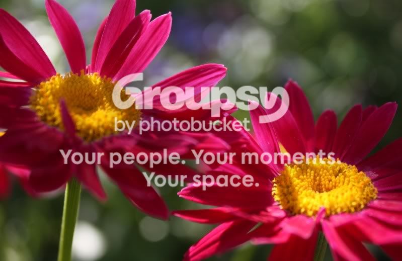
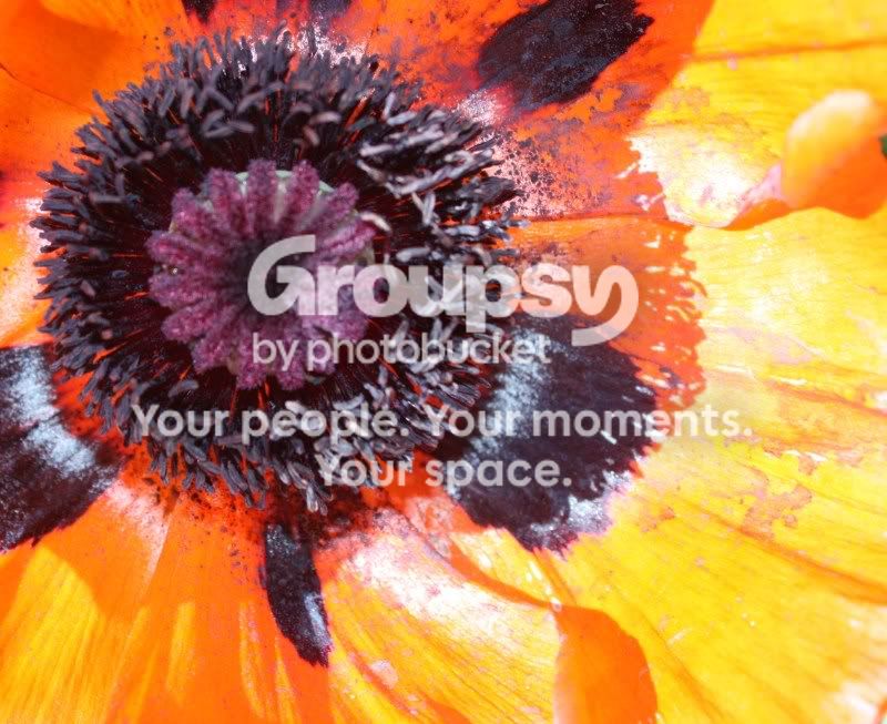
3. The out-of-focus pedals to the fore are distracting. The hard shadows on the flower are distracting. Maybe provide some fill?
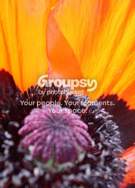
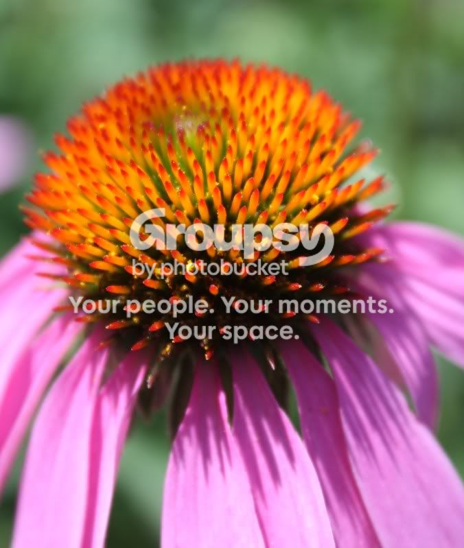
4. Great color but I'd like to see the focus move forward on the flower. The selective focus on the backside of the flower bugs me for some reason, but that is a matter of preference.
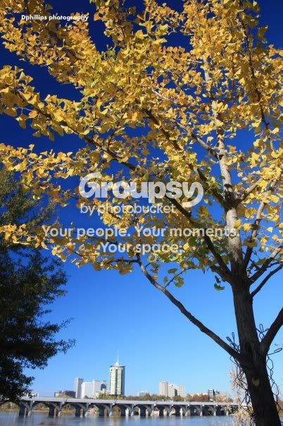
5. I like the colors and the exposure, except for the blown highlight on the buildings. Maybe it just the dumbed down resolution but it looks oversharped on my monitor, may just be me though.
I like the color and sharpness of 2, but not a fan of the comp. The last picture is really nice. I think it has a lot of potential. I like the framing and the tree in the foreground. Nice job!
Thanks,I agree with comments, I will mention on the two pink flowers being out of focus, there was a gust of wind when I took that, I liked they were out of focus, give the blowing in the wind look... which they really were.
I will try and post a few more later today!