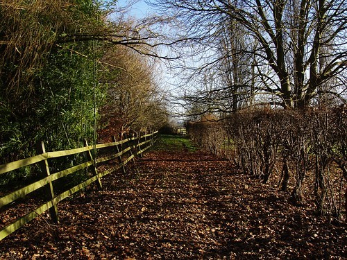
Yes. I like the second photo a lot, too. Granted, you went a tad too far in the sharpening, but knowing that it need not necessarily be this sharp, I like what I see, I like the vanishing point element with the converging lines, the repetition that the shadows of the hedge is giving, the colours, and the feeling of rustling leaves that this photo gives me. Show it less sharpened and a bit larger, and you're there.
The first looks odd, yes: it isn't your standard photo size, as chrisburke is pointing out, and there is no reason (that I would recognise as one) for this crop. There is way too much sky above the tree. If there was something on the side that you needed to "get rid of" by cropping the photo on its sides, then go on and crop of sky until you reach the top branch, and water until you reach the top branch. Make it a "play-card"-effect photo with the horizon RIGHT in the middle and the same above and below. I think it'd work.


![[No title]](/data/xfmg/thumbnail/41/41799-fe172a668fba7717bf773664387d64aa.jpg?1734176110)


![[No title]](/data/xfmg/thumbnail/41/41800-9fad93555f178073cae2f303c5ef4e23.jpg?1734176111)

