sauce839
TPF Noob!
- Joined
- Mar 13, 2009
- Messages
- 76
- Reaction score
- 0
- Location
- Calgary, Alberta, Canada
- Can others edit my Photos
- Photos OK to edit
Here are some of my photos that I have taken over the years. I haven't played around with photoshop too much, and on most of my photos, I've only done minor adjustments since most camera software is pretty limited. Let me know what you think.
1. With Canon powershot A70. Basement of Mont St. Michel. This picture has a bunch of noise in it, but thats what you get when shooting in a dark room with little natural light and minimal flash.

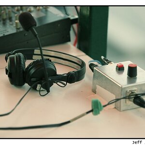
2. Nikon d50. Some color and contrast adjustments.
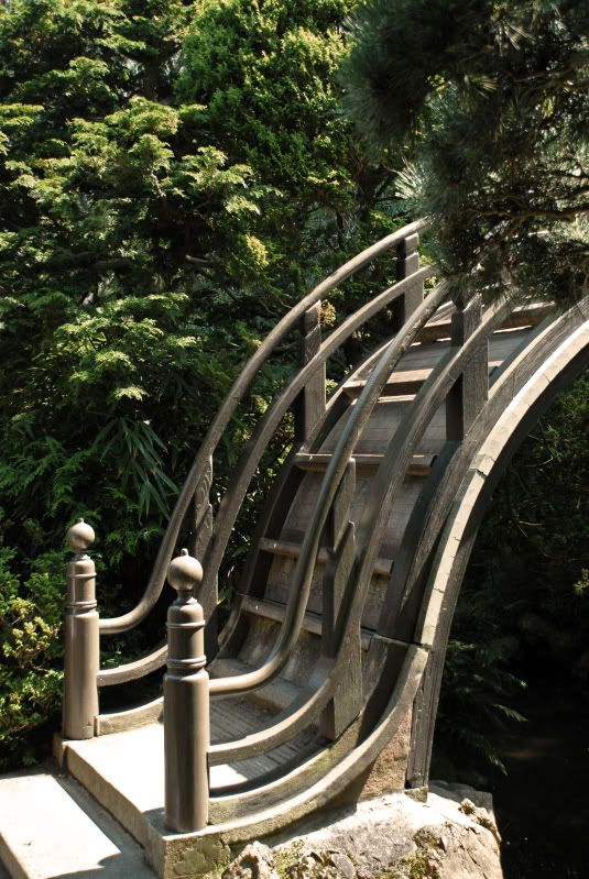
3. Nikon D200 70-200mm .San Francisco Golden Gate Park... I know some of the highlights are blownout... I've tried to fix this in my trial edition of photoshop, and it just created grey blotches everywhere. opps.
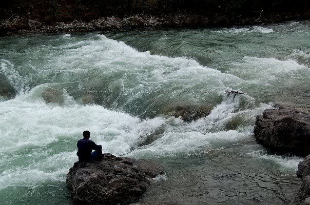
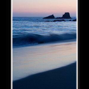
4. Nikon D200 70-200. I just really like the texture of the water in this one. This started out with me playing around with the rule of thirds and I really liked how this turned out.

1. With Canon powershot A70. Basement of Mont St. Michel. This picture has a bunch of noise in it, but thats what you get when shooting in a dark room with little natural light and minimal flash.
2. Nikon d50. Some color and contrast adjustments.
3. Nikon D200 70-200mm .San Francisco Golden Gate Park... I know some of the highlights are blownout... I've tried to fix this in my trial edition of photoshop, and it just created grey blotches everywhere. opps.
4. Nikon D200 70-200. I just really like the texture of the water in this one. This started out with me playing around with the rule of thirds and I really liked how this turned out.
Last edited:
")


![[No title]](/data/xfmg/thumbnail/42/42018-14ee16974751322cd63966d43d655995.jpg?1619739979)

![[No title]](/data/xfmg/thumbnail/37/37602-1ef8dbb1c2d0e4ff347ee65d328c3603.jpg?1619738147)
![[No title]](/data/xfmg/thumbnail/42/42019-e6f4e7422d2f8ec66dade714c8b21766.jpg?1619739979)


![[No title]](/data/xfmg/thumbnail/33/33437-e75ccdc53ab9428f2dd0218e568181b1.jpg?1619735969)