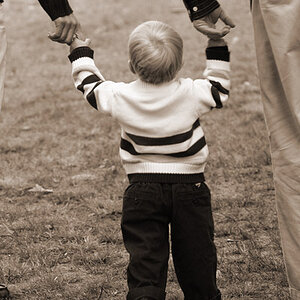
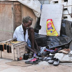
There isn't anything particularly compelling about #1-3. You were shooting down at the subject. Give us a new perspective if you want to generate interest. The frame is really cluttered in each of them.
Colors are flat in #1-5. Then need to "pop." All look over-sharped.
There is an interesting composition somewhere in #4 but I'm afraid you missed it. It seems to this viewer that you stood over them, framed a random shot and snapped the shutter release = snapshot. And the exposure is off. You have shadows with no texture and blown highlights. My eye is drawn to the light head in the center and it is blown and OOF.
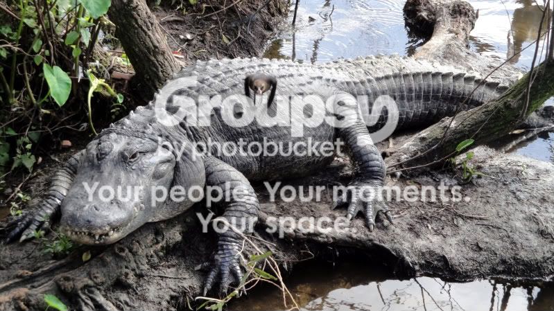
#5 has some promise but IMHO there is something awkward about the composition. For whatever reason I get a sense of the gator moving toward the camera but the frame abruptly cuts off where the gator would be moving. That is awkward for me. The gator's face is OOF and the whole image looks way oversharped.
#6 doesn't do anything for me. Way oversharped again.

 1
1 2
2 3
3 4
4 5
5 6
6


![[No title]](/data/xfmg/thumbnail/39/39529-3b8de3decb03849c8e9c6abdae9650cf.jpg?1734173673)
![[No title]](/data/xfmg/thumbnail/34/34076-d491e0e556e88ef7f797efcbe6083299.jpg?1734164514)
![[No title]](/data/xfmg/thumbnail/34/34072-be456691237ae73cb2936416e2e9e8c0.jpg?1734164508)
![[No title]](/data/xfmg/thumbnail/34/34687-f643984276d5d6af7e697542a2e81c23.jpg?1734165693)
![[No title]](/data/xfmg/thumbnail/35/35957-c79b37130dc06cbdee3b56de92a35fe6.jpg?1734167784)

![[No title]](/data/xfmg/thumbnail/34/34688-a1ead83a3067b449d62078d1170e00f6.jpg?1734165694)