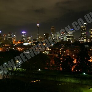
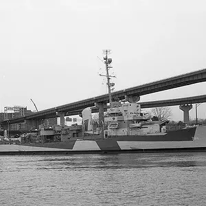
#1 is a little too bright for me. It also appears that you might have taken it a little out of focus, then oversharpened in pp. Nice job leveling the horizon.
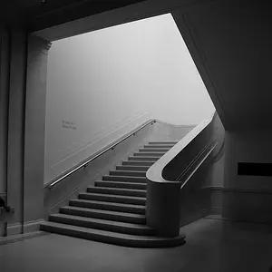
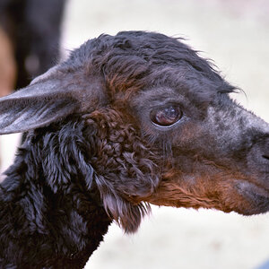
#2 is my fav. I wouldn't change a thing.
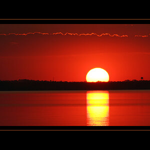
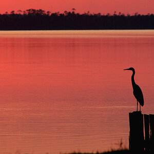
#3 is a little off level. If you had done this intentionally, perhaps rotating just a little more to show that you meant to do that. Nice DOF
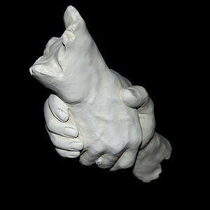
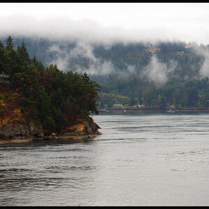
#4 is a little boring to me. I don't see how you could have made this shot look any better.
#2 definitely stands out, but I feel it can be so much better! I hope you don't mind, but I had a quick go at it. I found your conversion a bit too grey.