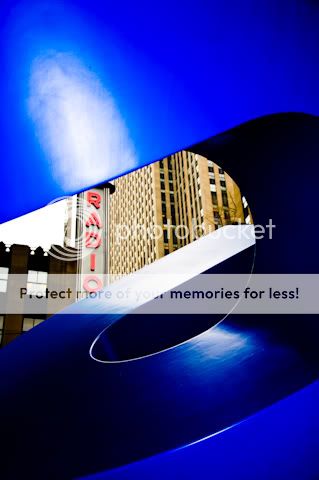
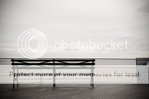
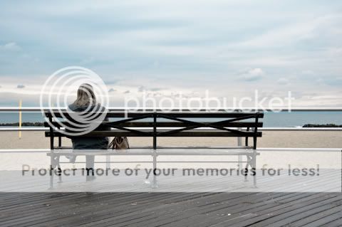
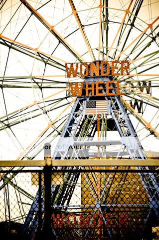
M Mitch1640 TPF Noob! Joined Jul 10, 2008 Messages 180 Reaction score 0 Can others edit my Photos Photos OK to edit Apr 20, 2009 #1 1 2 3 4 5 6 7 i know some of these arent landscapes or cityscapes but i didnt know where else to put them. C&C please
1 2 3 4 5 6 7 i know some of these arent landscapes or cityscapes but i didnt know where else to put them. C&C please
Mersad TPF Noob! Joined Aug 11, 2008 Messages 1,165 Reaction score 1 Location Sarajevo, Bosna i Hercegovina Can others edit my Photos Photos NOT OK to edit Apr 21, 2009 #2 These are great images. You did a really good job here. I love nr. 1, 4, 5 and 7. They are my favorites.:thumbup:
These are great images. You did a really good job here. I love nr. 1, 4, 5 and 7. They are my favorites.:thumbup:
Flower Child TPF Noob! Joined Oct 19, 2008 Messages 778 Reaction score 4 Location Southeastern Kansas Can others edit my Photos Photos OK to edit Apr 21, 2009 #3 There are some VERY creative photos here. I really like the 2nd 3rd and last. The last one reminds me of something you would see a really long time ago.
There are some VERY creative photos here. I really like the 2nd 3rd and last. The last one reminds me of something you would see a really long time ago.
ernie TPF Noob! Joined Feb 21, 2007 Messages 897 Reaction score 0 Location Belgium Can others edit my Photos Photos OK to edit Apr 21, 2009 #4 wonderful. 2nd is just fantastic. a bit bigger format would be nice though ...
daithi33 TPF Noob! Joined Oct 7, 2008 Messages 207 Reaction score 0 Location Ireland Can others edit my Photos Photos OK to edit Apr 22, 2009 #5 The second image from your set is the one that stands out for me - original and well thought out composition. It's a pity the guy on the far left isn't fully in the frame but that doesn't take from the picture. Black and white was a good option for this - well suited - nice shot ! daithi
The second image from your set is the one that stands out for me - original and well thought out composition. It's a pity the guy on the far left isn't fully in the frame but that doesn't take from the picture. Black and white was a good option for this - well suited - nice shot ! daithi