Some random shots for my course work

MrsMoo

TPF Noob!
Joined
Nov 10, 2008
Messages
209
Reaction score
1
Location
Fife, Scotland
Can others edit my Photos
Photos OK to edit
lemmie know what you all think :)

I actually bothered to go get the cards from my camera case :lol:

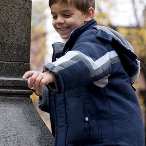
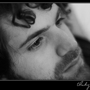
#1 -Portrait of someone I know well (window light)
PortraitWindowLight.jpg


#2 - Portrait of someone I dont know well (studio light)
PortraitHKdontknowwell.jpg


#3 - Potrait of someone I know well (studio light)
Daniel8.jpg


#4 - Transport - DOF
Outcome4iii.jpg


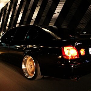
#5 - Transport - asymmetry
OriginalMerc.jpg
 
The shot of the Mercedes-Benz's star is very good. I like it a lot.
 
#1 - I like the first one. Little more blur in the background would have made it even better. Great expression.

#2 – She looks really uncomfortable in this pose. The bright dress really detracts. Check this out. http://super.nova.org/DPR/ (Thanks to my friends at PhotographyReview)

#3 – Need some light for the left eye unless he really did get punched.

Note that all three of these portraits are much better than anything I’ve done. People are tough.

TF
 
2 is very bright, and whats up with the i know well and i dont know well lol
 
The first one is lacking a good focal point that is in focus. He near eye might be sharp, but we can't really see it. The rest of his facial details are not sharp. I'd like to see a little more DOF here. Nice light though.

#2 has some nice studio lighting, but the pose and the expression are lacking (IMO). This could be a lot better if she looked comfortable. Also, I think it could use a little boost to the contrast (maybe with curves). My eye is drawn to her eyes, which is good but I find that I'm slightly disapointed when I get there. If you could give the eyes some 'pop'...it would really make it a stronger portrait.
 
i like # 2, like big mike say, she needs to be more comfy, ( i wish i know her well ). # 1 maybe in B/wW would be nice.
 
#2 I find her eyes look almost like cat eyes which I find really nifty if you were going for that.....

#1 is definitely my favorite
 
#1 - I like the first one. Little more blur in the background would have made it even better. Great expression.

#2 – She looks really uncomfortable in this pose. The bright dress really detracts. Check this out. http://super.nova.org/DPR/ (Thanks to my friends at PhotographyReview)

#3 – Need some light for the left eye unless he really did get punched.

Note that all three of these portraits are much better than anything I’ve done. People are tough.

TF

Thanks :)

for #3 we tried a reflector, but it wasn't doing much for us
 

Most reactions

New Topics

Back
Top