You are using an out of date browser. It may not display this or other websites correctly.
You should upgrade or use an alternative browser.
You should upgrade or use an alternative browser.
Some recent pictures from this week...
- Thread Starter cosmom3
- Start date
Steph
No longer a newbie, moving up!
- Joined
- Oct 18, 2006
- Messages
- 1,314
- Reaction score
- 1
- Location
- Steventon, Oxfordshire, UK
- Can others edit my Photos
- Photos NOT OK to edit
The first one does not do anything for me; it is just a picture of a concrete wall. The subject does not appeal to me.
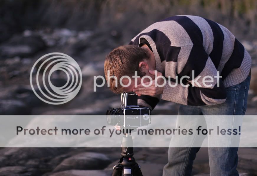
In the second one the Hasselblad seems to be in focus, not the head of the photographer. That is disturbing. A smaller aperture would have insured that both were in focus. Also, the camera bag in the bottom right corner is disturbing and does not add anything to the picture
In the second one the Hasselblad seems to be in focus, not the head of the photographer. That is disturbing. A smaller aperture would have insured that both were in focus. Also, the camera bag in the bottom right corner is disturbing and does not add anything to the picture
- Joined
- Feb 1, 2004
- Messages
- 34,813
- Reaction score
- 822
- Location
- Lower Saxony, Germany
- Can others edit my Photos
- Photos NOT OK to edit
- Moderator 🛠️
- #4
Well, despite the funny colour in the first, that one at least made me want to play with it a little. I did (you say you are ok with your photos being edited, right?) ... the version is a bit surrealistic now, but in my version it becomes the more obvious that something is missing in front of the bare wall.
I find the second lacks quite a bit compositionally. His head is in the very centre of the frame, he has a bit of room to photograph into, but not really much, I would expect him to be more over on the right (no camera bag to be seen) with more room in front of him. Your frame also cuts right through his one knee and we see some of the tripod but not much - that, too, looks ... unplanned.
I find the second lacks quite a bit compositionally. His head is in the very centre of the frame, he has a bit of room to photograph into, but not really much, I would expect him to be more over on the right (no camera bag to be seen) with more room in front of him. Your frame also cuts right through his one knee and we see some of the tripod but not much - that, too, looks ... unplanned.
ernie
TPF Noob!
- Joined
- Feb 21, 2007
- Messages
- 897
- Reaction score
- 0
- Location
- Belgium
- Can others edit my Photos
- Photos OK to edit
I like the first one. You should just include the lights that gave the walls that overall yellow color. Than maybe add some people in there for some casting shadows.
Anyway, just my opinion.
Anyway, just my opinion.
mdcrisp2000
TPF Noob!
- Joined
- Sep 16, 2007
- Messages
- 276
- Reaction score
- 0
- Location
- Edinburgh, UK
- Can others edit my Photos
- Photos NOT OK to edit
I edit the 2nd one a bit. Its still fairly red, but taking anymore out starts to flatten the image. I cropped him closer to the right edge as well and took out the bag. I tried to bring his head back into focus too.
Its not the best, but I think its an improvement:

Its not the best, but I think its an improvement:

cosmom3
TPF Noob!
- Joined
- Apr 14, 2007
- Messages
- 112
- Reaction score
- 0
- Can others edit my Photos
- Photos OK to edit
- Thread Starter 🔹
- #8
Great, thanks very much guys. The second picture was just a snap shop while we were shooting something else (he didnt know he was being shot, somewhat of a candid picture)
Oh and the first pictures lights were tinted yellow, so that may be why your not liking the colors.
Oh and the first pictures lights were tinted yellow, so that may be why your not liking the colors.
plentygood
TPF Noob!
- Joined
- Aug 18, 2007
- Messages
- 434
- Reaction score
- 0
- Location
- Arr-Kan-Saw
- Can others edit my Photos
- Photos OK to edit
I like the 1st shot, but I think it could be made way better if you were to add a subject (person or object) on the benches.
Lorielle99
TPF Noob!
- Joined
- Dec 3, 2007
- Messages
- 733
- Reaction score
- 0
- Location
- south, new jersey
- Can others edit my Photos
- Photos OK to edit
the first one is a kind of boring subject, but you made the best of it because the lines are really intriguing. as for the second, well i like your friend because he wears good jeans. yes i have a jean fetish.
cosmom3
TPF Noob!
- Joined
- Apr 14, 2007
- Messages
- 112
- Reaction score
- 0
- Can others edit my Photos
- Photos OK to edit
- Thread Starter 🔹
- #11
When I scan the med format picture's there will be a couple with objects on that wall, hopefully the test shots were indeed inferior than the real shots we took that night.I like the 1st shot, but I think it could be made way better if you were to add a subject (person or object) on the benches.
Similar threads
- Replies
- 2
- Views
- 367


