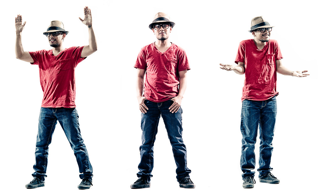
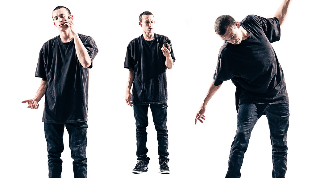
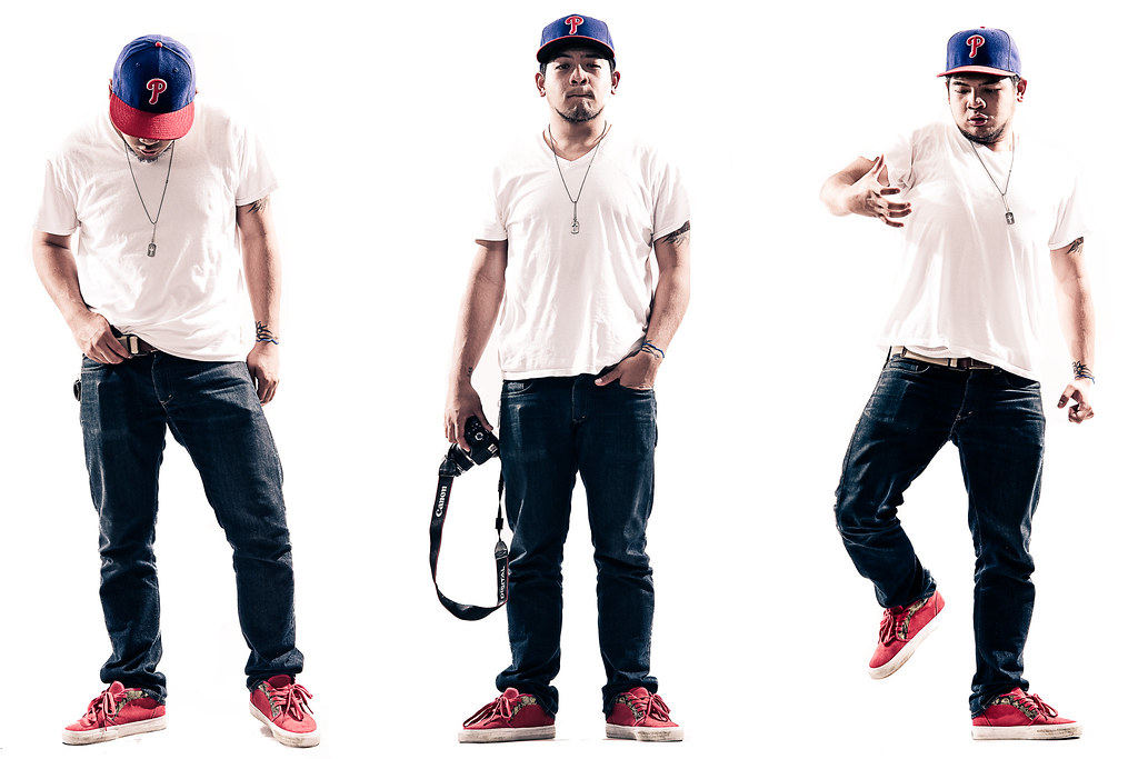
The highlights are a bit too strong for my taste, not sure if that is what you were going for. I find them very distracting and actually blowing out the subject to the white of the background.
I find the first one to be the most interesting with this over blown look, specifically the one of him in the middle.
The other two just lose me as the highlights are far too distracting to look at them for a length of time :|
Think you need to tone down the background a bit as well as the light hitting them





![[No title]](/data/xfmg/thumbnail/33/33847-620ea3a471c8ec2ae89451f9ee9dcb84.jpg?1734164166)
![[No title]](/data/xfmg/thumbnail/37/37625-7e132688457d56e50320a8c99a79fe38.jpg?1734170749)