C&C per req:
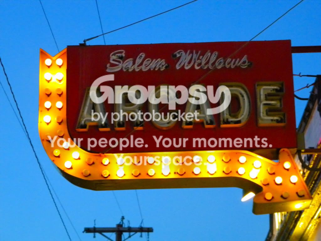
1. I love old signs; this one is especially nice. A shame more of it wasn't illuminated, but you take what you can get. I would suggest a slightly tighter crop to eliminate the top of the telephone pole, lower right, and perhaps clone out the bit of the spotlight visible behind the head of the arrow. I would also suggest cropping this so that the sign is level. This is best done when taking the picture to avoid the chance of losing important information in post.
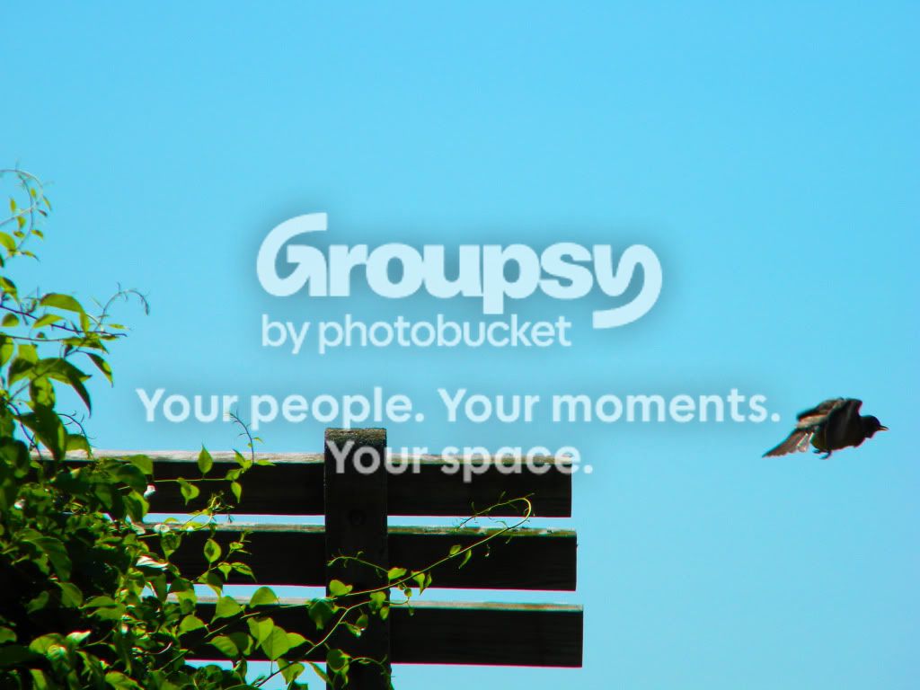
2. I find something oddly appealing about this image, but I would much prefer to see a little more space image right; it appears that the bird is about to fly smack in to a wall.
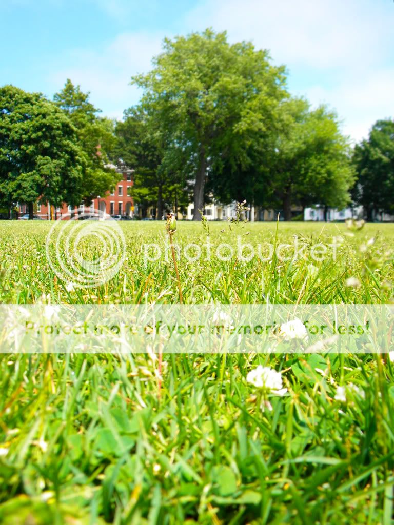
3. This is a nice enough image, slighly over-exposed and suffering from a washed out sky, but I'm not sure what the main subject is supposed to be. I would definitely consider purchasing a polarizing filter (CPOL) which would help immensely by deepening the blue of the sky and increasing the contrast of the clouds as well as a general boost in saturation.
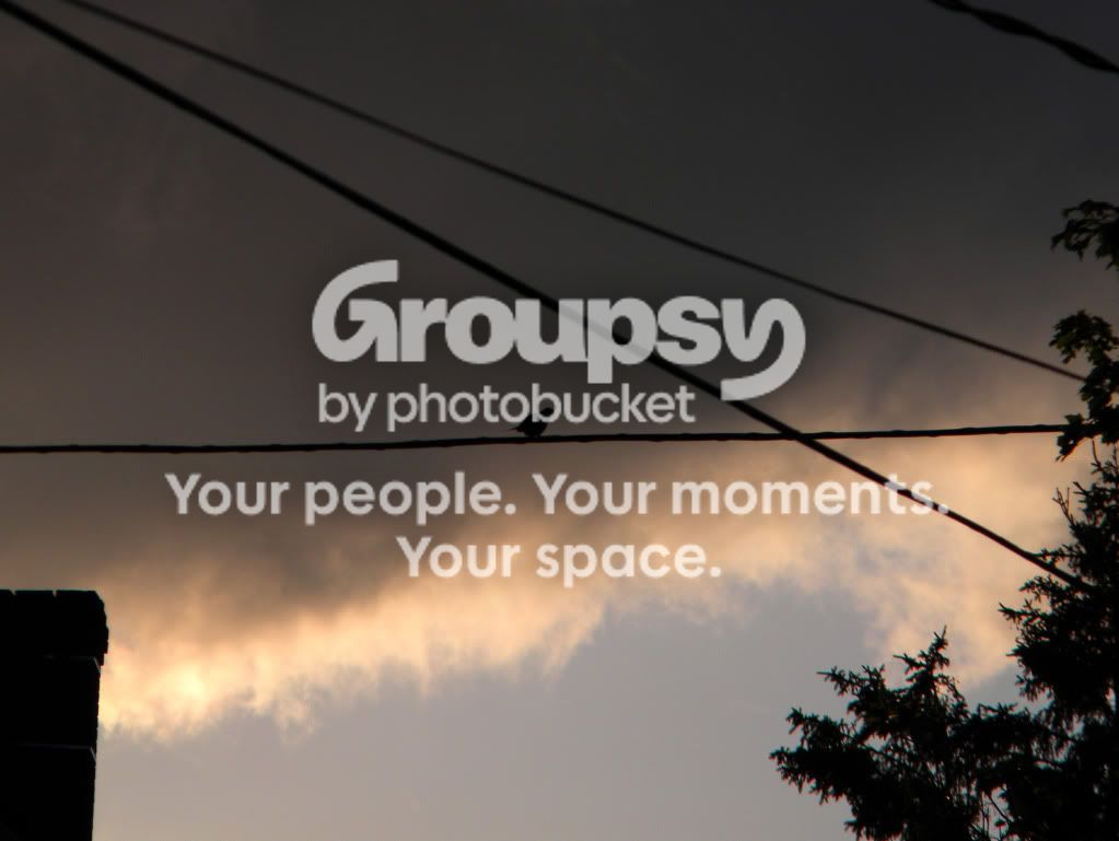
4. Another lonely bird - an interesting, dark, almost gloomy image. The problem here is the bright area below the cloud layer, especially near the LH side of the image. The eye is naturally drawn to bright areas over dark meaning that the eye barely sees the bird. Perhaps a tighter crop to eliminate most of the blue and brighter areas.
Just my $00.02 worth - your mileage may vary
~John