What's new

Some Urban Decay

rexbobcat

Been spending a lot of time on here!
Joined
Nov 28, 2011
Messages
5,014
Reaction score
1,968
Location
United States
Can others edit my Photos
Photos OK to edit
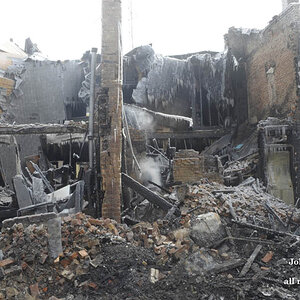
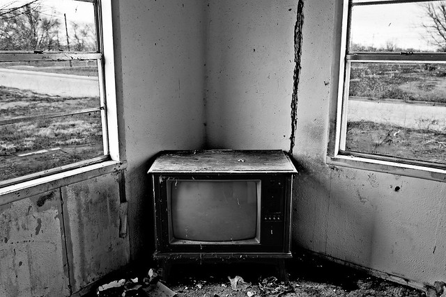
I was looking through my 8+ memory cards intending on cleaning them and I found these two shots from last winter. I had thought that they were lost forever on another card.

This is a re-edit. The first time I edited this photo in December it was just....BAD. There is no other word to describe it other than BAD.
7735151838_12f80484dc_z.jpg


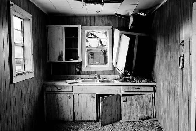
This is a photo from, I think, the same house.
7735152660_6b681e41f1_z.jpg


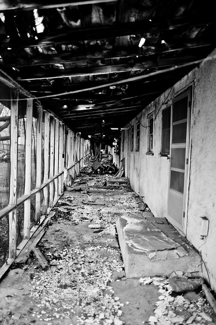
And here is the weakest of the three, I believe. I had just gotten my 24mm f/1.4 so I was playing with wide apertures and I think I forgot to change it for this shot (durhur).
7735153382_a840169b19_z.jpg
 
For some reason, I love pics of old run down buildings. Wish I could find something like this in my area.
 
I really love the second and third. I think I'd like the first one better if it were from lower. As if I were watching the TV.
 
I like these shots a lot....my kind of photographs!!! But looks more rural than urban bro ;)

Wish you had centered horizontally that tv as well...too much on he right....just a tiny bit
 
Thanks. Heh. Yeah, it's more rural, but my MORE rural decay photographs don't fit in with these so I didn't really know if calling it rural decay would do it justice. lol

Yeah, I think I cropped it too far and that's why. Originally was slightly over to the left and I guess I over-did it.
 
Not quite sure why you centered all these up like that. It works very well for the first one, you have the echoed shapes of windows/TV in a nice traditional triad, bam bam bam.

Not loving the second one, the centering of the kitchen doesn't seem to buy you the same muscularity here, the wall on the right has some interest, but not enough to be Interesting, and it's not bland enough or well placed to serve as balancing negative space. I also can't tell if the window is actually sloped out like that, or if there's some lens distortion of other error -- I assume it's the window, but the fact that it FEELS like lens distortion or similar makes the image feel less good.

The third one is potentially interesting. I like the left/right geometry with similarity of shape and differing texture. It's much too busy to be viewed small, it's just a pile of chaos. Large, the chaos might resolve into something interesting, but I can't be sure.

Contrast seems a little high throughout, to my taste. The visual drama of High! Contrast! doesn't really work for me in these scenes. Personally, I would push more of the range into the midtones and try for a feeling of drabness and desolation. Of course, leave some shadows black, just not the masses of black you've got here.
 
I think I centered them, because, well, there's just something about the bluntness of a simple, almost indeliberate seeming composition when it comes to decay/decrepitation that just causes me disease. There are probably other, more innovative compositions, but photographic creativity and innovation was not really as important to me as the content itself with these.

I do think that the window is like that. I tried getting rid of distortion, but then the line of the edge of the counter bends and the windows doesn't change perspective. Either that, or it's some weird inherent distortion property of the lens itself.

At first I tried them in lower contrast, but every time I looked at it I kept feeling that it softens the image. I do think I need to work on the mass of black on the left of the second photo, maybe lessen it a bit. I just feel that different b&w processing produces different kinds of feelings towards an image (well, duh). I do think that desolation/drabness is one direction that could certainly work for these, I wanted to convey some sense of foreboding I guess. I think pushing them into the midtones would be more tragic or somber sense, but the high-contrast gives a (figuratively) darker, more sinister scene.

Maybe I just have personal bias because I was the one who took the photos, but there's just something peculiar about these images that makes me feel like I, personally, will not find these scenes very often; and as a result, I just can't get myself to dislike them for what they are, even if they are technically imperfect/lacking.

Except for maybe the last one. It's just...too much detail in one scene, so that it becomes kind of muddy...
 
Interesting take, but now that you mention it I do get a "zombie movie" vibe. This is cheesy, but it might be effective to rotate the frame a bit in some cases to get more of that movie vibe.
 
Not quite sure why you centered all these up like that. It works very well for the first one, you have the echoed shapes of windows/TV in a nice traditional triad, bam bam bam.

Not loving the second one, the centering of the kitchen doesn't seem to buy you the same muscularity here, the wall on the right has some interest, but not enough to be Interesting, and it's not bland enough or well placed to serve as balancing negative space. I also can't tell if the window is actually sloped out like that, or if there's some lens distortion of other error -- I assume it's the window, but the fact that it FEELS like lens distortion or similar makes the image feel less good.

The third one is potentially interesting. I like the left/right geometry with similarity of shape and differing texture. It's much too busy to be viewed small, it's just a pile of chaos. Large, the chaos might resolve into something interesting, but I can't be sure.

Contrast seems a little high throughout, to my taste. The visual drama of High! Contrast! doesn't really work for me in these scenes. Personally, I would push more of the range into the midtones and try for a feeling of drabness and desolation. Of course, leave some shadows black, just not the masses of black you've got here.

I love how we get vastly differing opinions on one image. While I see the point amolitor is making and he's right, I also really love the kitchen image as it is.
Here's my take on it: I found it perfect centered because I can envision some little old lady in there making dinner or doing the dishes. It's in what you don't see. Isn't that much of what urban decay is about? Giving a feeling of what is no longer there.
 
Honestly, I'm just psyched to see a photographer actually thinking this stuff through rather than going 'I like contrast! WHAM!'
 

Create an account or login to comment

You must be a member in order to leave a comment

Create account

Create an account on our community. It's easy!

Log in

Already have an account? Log in here.

Back
Top Bottom