What's new

Some W&B's [CC if you want]

JimmyO

TPF Noob!
Joined
Feb 3, 2008
Messages
2,131
Reaction score
0
Location
NJ
Can others edit my Photos
Photos NOT OK to edit
4462676093_9d5070beeb_b.jpg


4463453716_bfed645c42_b.jpg


4462676337_2f81ca56f7_b.jpg


4463398486_498901b4cf_b.jpg
 
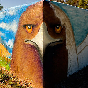
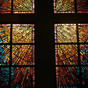
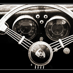
I don't think the subject in any of them is interesting. Its just shots of random objects. I mean if thats what you are going for then thats fine, but they don't really do anything for me. #2 is too soft on the focus. ( 3 is the best out of the 4 I think in terms of subject matter but is overexposed and parts of the cat are blown out it appears ).
 
The exhaust is pretty cool shot. The others don't do much for me. The wall in #1 is pretty blown out as well as the cat's fur.
 
  • Thread Starter 🔹
  • Banned
  • #4
Thanks guys. Neither the fur, nor the wall in #1 are blown out, just bright.
 
uninteresting subjects, with the exception of the cat- good capture there would've been even better with the fur not blown out...fyi highlights too bright = blown out.;)
 
Heres the thing.. the fact that they are uninteresting makes them interesting to me. I, not a professinal by any means, appreciate them. And I think my fave is #1..
 
#1 is interesting. I think the composition could be improved if the cords were removed, and the camera was titled down slightly so the dark line crosses the picture on a third (i.e., "rule of thirds"). Good texture on the wall, and I agree that it is not blown out.

The cords are not "bad", though. I am just interested in what the picture looks like without them. An alternate idea is to have the cords exit the frame on the dark line, instead of crossing like they do in the original photo. I'm also wondering if purposely underexposing by a stop or two would turn the cords pure black. That might be interesting.

 
Last edited:
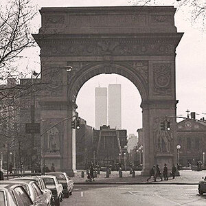
I like the composition in #4... a simple object making and interesting photo...

The first one is nice but doesn't ring any bell for me... I get caught in watching the outlet crooked, but actually the floor is leveled...

Just my 2 cents
 
I think these are pretty nice. The kitten is so cute.
 
I consider "blown out" when the highlights are completly white with no detail. I trippled checked the histogram.

Ill post another of the kitten later.

Thanks for the kind words
 
Thanks guys. Neither the fur, nor the wall in #1 are blown out, just bright.


Regardless, its pretty unanimous that everyone seems to think they are too bright. So call it what you want, the point is, they need to be darkened up a bit. I think even just a little "dodging and burning" would make a world of difference on the cat because it is a pretty decent pic. I also agree that #1 might be cooler with no cables. Also, I see a lot of texture and aging to that wall. I think bringing up the contrast on it will really add to the picture. Its not that it looks bad now, just think you are losing some of the details that could make it better.
 
I consider "blown out" when the highlights are completly white with no detail. I trippled checked the histogram.

Ill post another of the kitten later.

Thanks for the kind words

I agree that is what it is, some times the term is casually used rather than just saying too bright, the cat being my fav. if you do look hard enough you can see there is detail there....so I'll change my terminology to "a touch too bright" maybe you could do a low opacity burn of the shadows and bring the detail out a hair and you'd be good to go.:thumbup:

I do agree some times the "simple" is what makes it interesting....just didn't do it for me thats all.
 
No clipping on the cats fur on your histogram? Hmmm.

I am fond of the last one. But I'm a car guy, so I think that has something to do with it.
 
I like #1. Just seems a little too bright top left corner.
Don't like #2.
# 3 would be cool if you could slide the cat down in the frame. Also too bright.
I like #4 also. The dust adds to it. (I would use the word "texture" but I hate that word. lol.)
 

Create an account or login to comment

You must be a member in order to leave a comment

Create account

Create an account on our community. It's easy!

Log in

Already have an account? Log in here.

Back
Top Bottom