What's new

Some Wedding Photo's--My first one, any comments and critiques?!

D-B-J

Been spending a lot of time on here!
Joined
Apr 13, 2010
Messages
9,027
Reaction score
2,175
Can others edit my Photos
Photos OK to edit
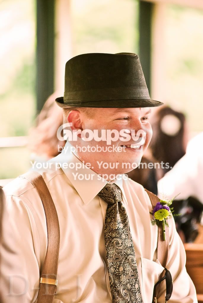
So i "Second shot" my sisters wedding, but really was there for her wedding and brought my camera and took as many shots as i could. Any comments and critiques?
Thanks!


1.
kw8.jpg


2.
kw6.jpg


3.
kw5.jpg


4.
kw3.jpg


5.
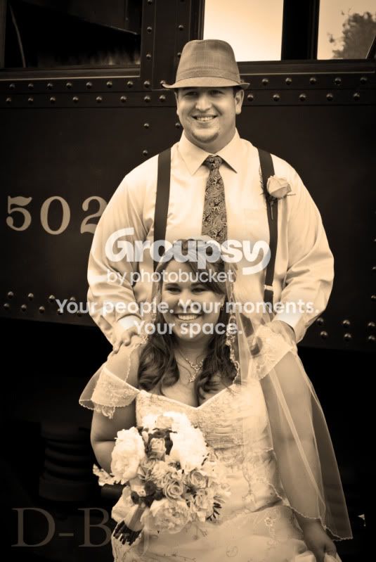
kw.jpg


6.
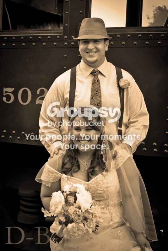
kw-2.jpg


7.
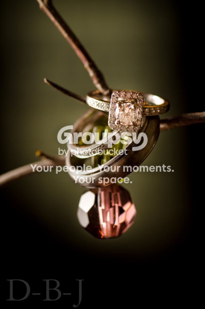
KatesRing.jpg


8.
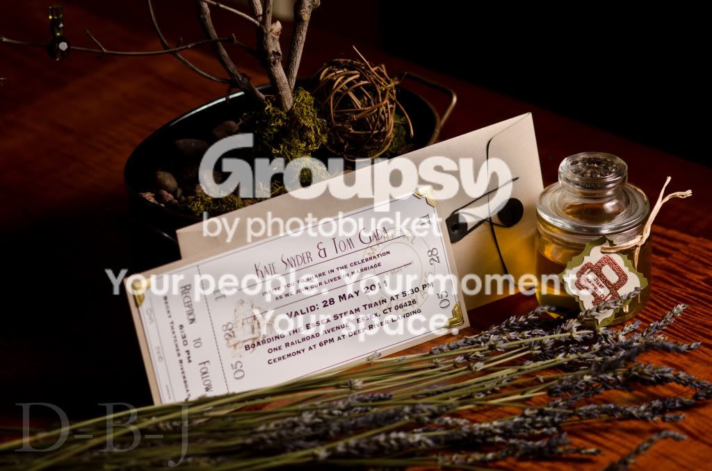
FullSetup.jpg


All comments are welcome! And remember, i have alot to learn, so nothing is "obvious"


Regards,
Jake
 
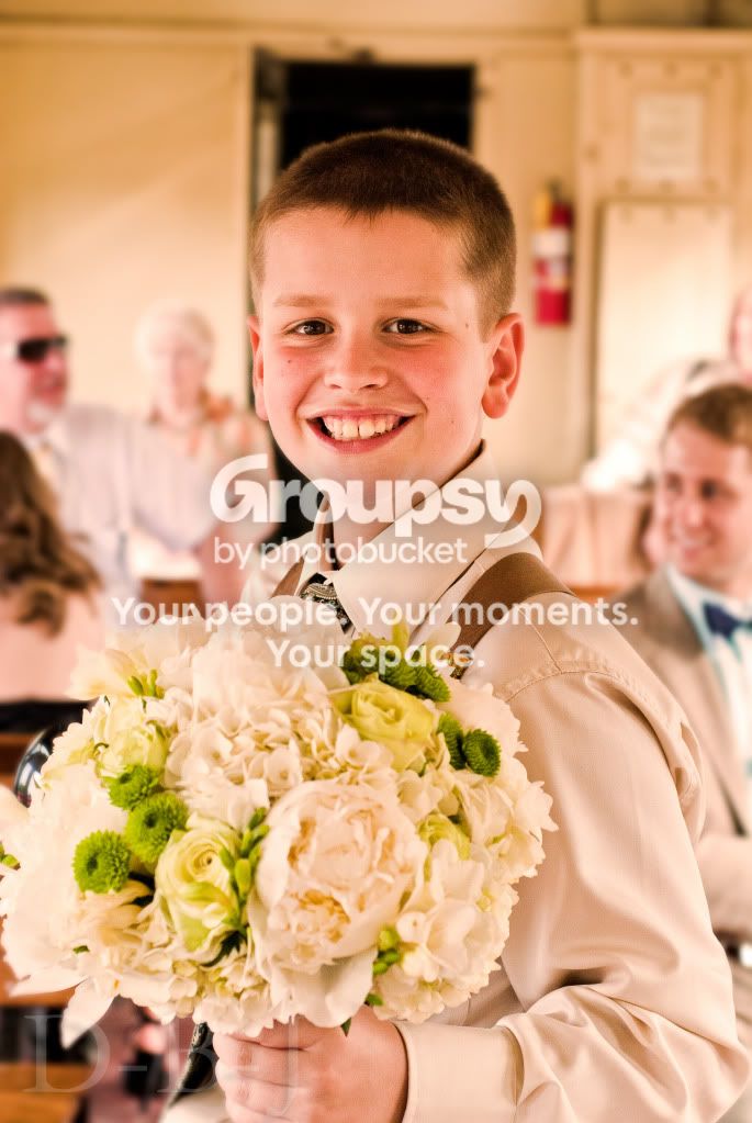
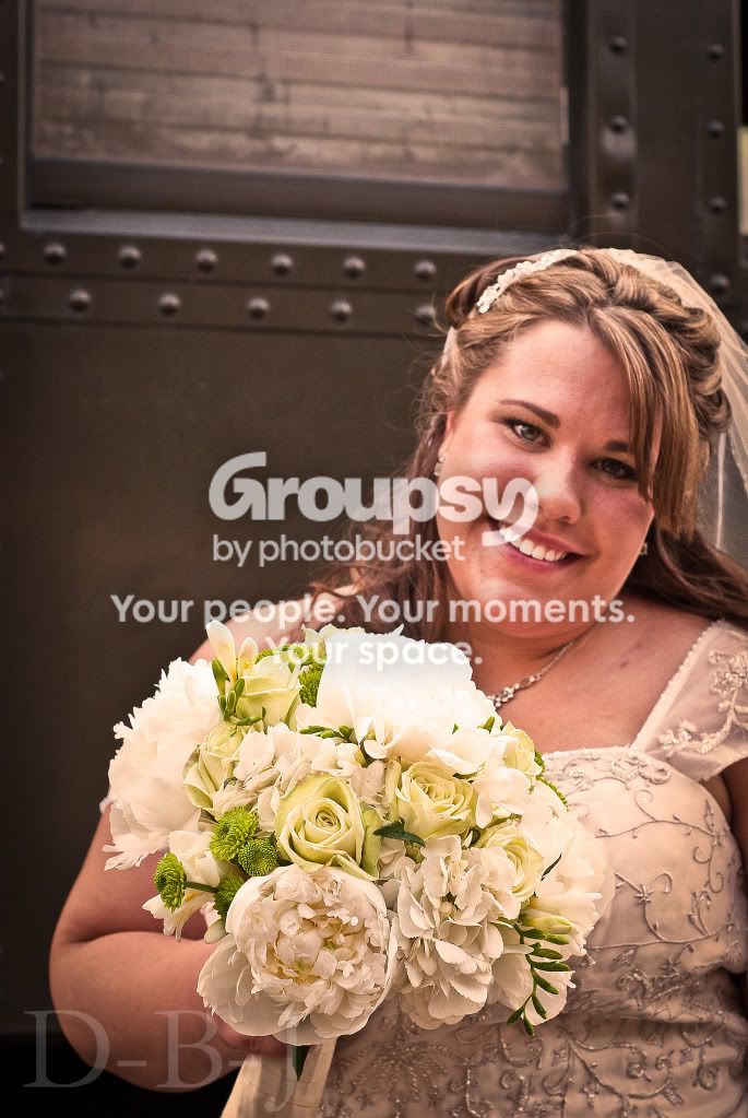
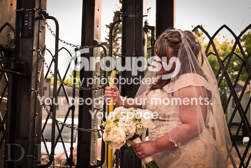
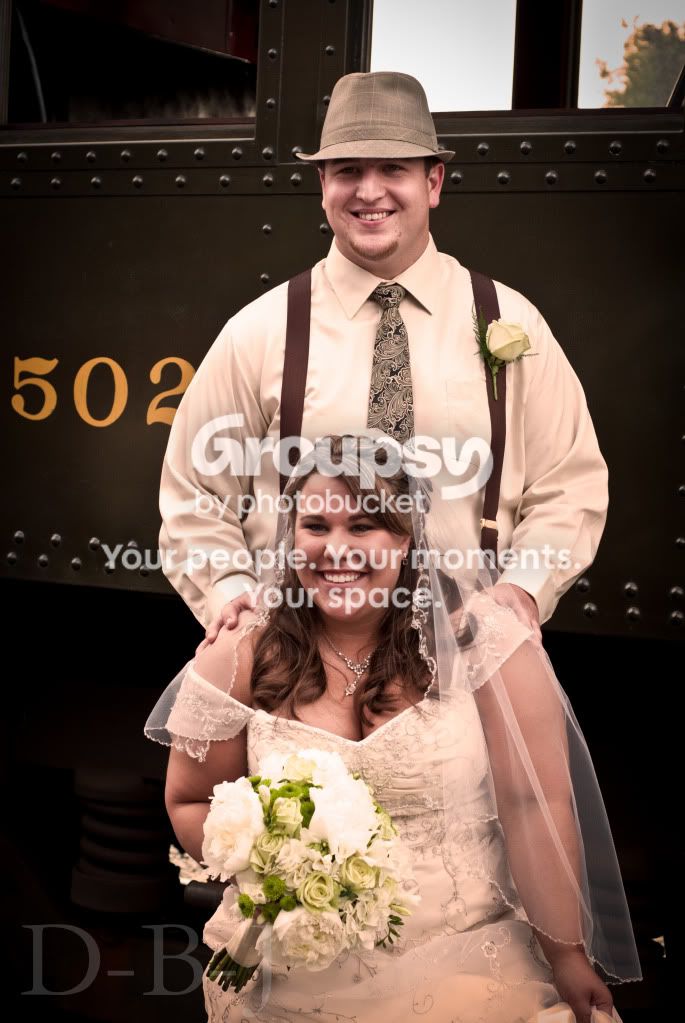
The first 4 look a bit on the pinkish side to me. For 5 and 6, I can appreciate the old timey feel that you imparted, but they also seem a bit pink and without knowing the story, they don't really do much for me. For 7, I don't think you got the lighting quite right because that diamond really needs to sparkle, and it looks a bit dull and/or out of focus.

8 is good, but with the chopped off plant, the composition just seems a bit awkward.

I think 7 is the best of the bunch, but it just doesn't play to the strengths of the brides ring as much as it could have.
 
The first 2 are not my favourite, they seem over exposed and the backround colors are too similar to the foreground and overshadow the focus and detail of the person in the portrait, but I love the old fashioned look you have achieved on the other pictures and the detail of the rings is great... I too am a beginner, so im no expert, this is merely my opinion, but the shot of the rings... to me... could be an ad for a jewellers! :)
 
The detail shots are the best imo.
 
Except the last shots looks like the WB may be off?
 
Except the last shots looks like the WB may be off?

It is a sepia/warm tone, to impart the "old time" feel of the depression-era and such times. So of course they are not proper wb.
 
The first 2 are not my favourite, they seem over exposed and the backround colors are too similar to the foreground and overshadow the focus and detail of the person in the portrait, but I love the old fashioned look you have achieved on the other pictures and the detail of the rings is great... I too am a beginner, so im no expert, this is merely my opinion, but the shot of the rings... to me... could be an ad for a jewellers! :)


Thanks!
 
The first 4 look a bit on the pinkish side to me. For 5 and 6, I can appreciate the old timey feel that you imparted, but they also seem a bit pink and without knowing the story, they don't really do much for me. For 7, I don't think you got the lighting quite right because that diamond really needs to sparkle, and it looks a bit dull and/or out of focus.

8 is good, but with the chopped off plant, the composition just seems a bit awkward.

I think 7 is the best of the bunch, but it just doesn't play to the strengths of the brides ring as much as it could have.

What's the best way to get rid of the pinkish hue? Lower the temperature? A cooling filter? Because i want to keep the sepia tone, but i do see how they are pinkish.

Thanks!
 
After further notice i came to like #6, nice work mane.
 
I'm not sure if the first six shots are supposed to have that warm,red, ruddy look, or if that is accidental, or a product of your monitor calibration, or what. If it is a filter or an effect or an action, it's not quite "enough" to convey the fact that the images are supposed to be extra ruddy. I like the lst detail shot a fair amount....that's a nice, memorable detail to include! A steam train trip is actually kind of a memorable experience these days, even if it's just a short run. One thing about family wedding photos is that they have a lot of sentimental value to you, and other family members, especially as the years pass and the actual memories grow dimmer...the photos help bring the events and people of the day all back.
 
The retro look is very big with weddings these days so I understand where you are going with the colors chosen. It's hard to get the retro feel just right in editing, but you are pretty close. As far as the photos before editing. Nice composure, great DOF, and the ring shot is top notch, on par with a seasoned high end wedding photographer.
 
I played with #1, I actually like it in B&W, I was going to save it and post, but I am too darn tired to go on photobucket. The pink hue is too much, this doesnt convey sephia tone to me, just too warm. Even if you dont go B&W, try desaturating them some, I think it looked better this way.
 
#1, #2 look fine to me as regards focus, composition, but I have to agree with the comments on the colour, which looks very odd. Is that deliberate, or did something strange go wrong with your white balance or monitor?

#3 you've centred the shot on the flowers, and it's a disaster in terms of composition - how awkward does it look that you've amputated her right arm at the shoulder?

#4 ... no eye contact, no clear focus, no interest

#5 is not flattering for either of them; a pose that angled them would have been much kinder.

#6 is a good shot for him; I feel a slightly wider crop, maybe to show his whole body, would have been better though.

#7 and #8 I think are good just as they are.

I enjoyed the pictures. Thanks for posting.
 
If you want to go the sepia look, maybe desaturate them first before adding a sepia filter.

kw.jpg


You could also play with your shadow and highlights.
kw-1.jpg
 

Create an account or login to comment

You must be a member in order to leave a comment

Create account

Create an account on our community. It's easy!

Log in

Already have an account? Log in here.

New Topics

Back
Top Bottom